Westeroscraft Texture Pack Megathread

Every point of view is valid being it coming from a probation builder, a builder, an editor, a moderator or an admin. Nowhere in this thread has the feedback of anyone been neglected or brushed aside. Presenting counter arguments against a point of view is as valid (and it’s not under appreciating the other person’s points or abusing of power dynamics) as someone having an opinion about the subject.

Regardless if it’s a bad or good change, we are clearly forgetting that the change was made to benefit the server and it’s quality. Perhaps the result wasn’t as expected by a lot of people and the opinions are polarising, but there was care and time taken into creating this change and we should cherish that and not be entitled to the point of making it a me problem, everyone that’s a builder has been affected the same way with their builds (being them small or huge). I’m positive Thamus and Emot are more than open to receive feedback, and they haven’t demonstrated otherwise. So please, let’s be objective about this and take it calmly. If you have really strong feelings about the change present solutions and incite ideas, don’t just say you don’t like it or it affected you this way or this way (a completely valid thought, builds take hours upon hours to make so it’s normal it’s a touchy subject, but bringing that into the conversation isn’t productive in the least)

Obviously Thamus didn’t create the textures to spite people or devalue their projects and builds so let’s not act that this was an act against them.

Lastly I’d like to underline that I’m not criticising anyone, all points brought in the thread are valid in their own way

Let’s continue to discuss changes and solutions in a positive manner
:)
 
Last edited:

_Simbaa

Printmaker
Okay, now that my initial outrage is over, Ill post more honest feedback for the texture, it may have been said before, but anyway here it is:
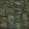
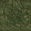
Apart from the River terrain set, I do think the textures look very good by themselves, however the main issue I am seeing is the drastic change in style - from my PoV it seems that the aim was to make the look highly realistic, and they are and look great in that case. However I think they clash with the more cartoony/minecrafty style of our older textures based around multiple texturepacks such as dokucraft. While the old textures might have been used as placeholders it seems to me that a lot of our block textures were crafted around them or vice versa - the terrain set used to include cobblestone & stone based textures, these textures allowed for great blending between terrain and the buildings or were used to in combination with wall & slab blocks to create various schemsets, probably the main issue I am seeing here is, that without an update to most of our pallete I dont see a way to fix this, and even trying to fix the schemsets - boulders etc... by introducing slabs/stairs/walls seems to be quite the challenge, as it would most likely require alot of manual work with smaller selections in WE, (I may be wrong here) as for example alot of the slabs & wall blocks are placed in areas where the texture should remain the same, therefore removing the option of mass selecting an area.

Now for the textures itself, as I said I am mostly a fan of them, however for example for the river terrain set I dislike the general color pattern of the texture - they are yellowish in the center framed by green/grayish border, which causes them to not blend well even between themselves. If we plan on sticking to them, I would also like to recommend to add an alternative rock type to each of the main terrain set, as otherwise we might end up with having an entire region look bland.

Lastly, I would like to apologize to Thamus & mod team for any insult I may have caused with my inappropriate reaction. I do believe you all are doing what you think is best for the server and as far as I am aware its mostly in the right direction.
 

Emoticone11

The Dark Lord Sauron
Staff member
Thanks Simb.

Regarding fixing the placed schemsets, I think it should definitely be possible to use large selections and just use an adjacency mask to select blocks adjacent to the terrainset. This would only be a concern if there were houses which had cobble slabs/stairs/etc. adjacent to terrainset, which shouldn't be a problem if we just draw our selections to avoid villages and the like.

The style comparison is something I was initially concerned about, but has become less of a concern for me after a number of successive improvements by Tham, as well as just using the pack myself for a while and getting used to it. The goal of them was certainly to make the terrainsets more realistic (i.e. not having manmade cobble textures mixed randomly in them), but not necessarily to go down a "hyper-realistic" track at the expense of our other textures. I think that overall the new terrainsets do preserve some of the "cartoony" quality of the other textures that you mention, which you can see if you compare them to e.g. Conquest's gritty stone textures. IMO it's only the river terrainset which currently looks out of place due to its high contrast & internal color variation and the strong border effect of the texture.
 

Thamus_Knoward

Shadowbinder
Just to reiterate, this is what I'm planning to do to address the freedback:
- Add vertical overlay CTM for limestone similar to the dark streaks you see in the photograph
- Add one alt color and pattern (with increased contrast/depth) variant for each principal set which you can sprinkle in with terraforming (emote would have to add new blocks for these)
- Add a smooth blending overlay between all terrainsets, their variants, and the corresponding pebble blocks which will essentially give you 4 terrainset blocks per set (current [DONE], variant, wet and dry pebbles)
- Fix the high contrast & internal color variation and the strong border effect of the river terrainset by giving the entire limestone set a makeover, and that particular subset a total redo.
- I want to redo the hues and strata for all sandstone subsets. I believe I can do a much better job to introduce variation.
- I want to remove all moss from the Iron and Eastern Islands sets and instead introduce a biome shaded Cushion Moss block that overlays over any terrainset.
- I want to remake my ore textures from 2013 with textures that can work with ANY terrainset.
- Optionally: We can then decide to add streaks or discoloration patterns on a large scale with overlay_repeat (similar to the Eyrie example above).
 

Emoticone11

The Dark Lord Sauron
Staff member
I agree with those Tham! My only skepticism is with the vertical overlay CTM. I believe you tried something like this initially, and it didn't look great - if you have a 45° rock face for instance, the vertical CTM would be applied to the sides of every individual block, rather than having those dark streaks on a macro scale. Feel free to try experimenting with it more, of course, but IMO it's not priority.

Here is my proposal for future action, grouped in terms of immediacy:

1. Short-term

- Add stair, slab, wall, and fence blocks for each of the 11 primary terrainsets.
- Rename terrainsets? They're not really "sets" anymore for one, and their use isn't restricted completely to their named regions (though they will still form the predominant stone type in those regions, so maybe those are worth keeping in the names). I'm wondering if it's worth corresponding them to real rock types, e.g. "Westerlands Karst" or "Northern Granite" or something.
- Fix the high contrast & internal color variation and the strong border effect of the river terrainset by giving the entire limestone set a makeover, and that particular subset a total redo.
- Redo the hues and strata for all sandstone subsets.

2. Middle-term

- Add 11 secondary rock variants to be used as accents in terraforming (although specific number may be a bit flexible). I currently do not plan to add stairs/slabs/etc. variants or pebbles for these given their secondary status.
- Add a smooth blending overlay between all terrainsets, their variants, and the corresponding pebble blocks which will essentially give you 4 terrainset blocks per set (current [DONE], variant, wet and dry pebbles)
- Remove all moss from the Iron and Eastern Islands sets and instead introduce a new biome shaded Cushion Moss block that overlays over any terrainset.
- Remake all ore blocks with textures that can work with ANY terrainset.

3. Long-term

- Add subtle streaks or discoloration patterns on a large scale with overlay_repeat (similar to the Eyrie example above), in order to retroactively improve the parts of the maps which aren't manually updated.
- Experiment with vertical overlay CTM for limestone blocks.

Let me know your thoughts about these items. The immediacy classifications are just flexible suggestions for what I think the priorities should be.
 

Auscarbone

Street Preacher
Quick question, what would the stair and slab variations if the terrain blocks be used for? I love the new textures, however I’m just not so sure about adding stair and slab terrain blocks. IMO doing so would reduce the 'blockiness', which I feel is very important to maintain in the terrain (we are ‘a game of blocks’ after all!). Also wouldn’t this have a whole bunch of practical problems because you would have to redo terra for all old projects that don’t incorporate the slab/star terra blocks? Just my two cents :D
 
  • Angry
Reactions: Margaery_Tyrell

Emoticone11

The Dark Lord Sauron
Staff member
Well, people already combine cobble stairs/slabs/etc. with the terrainsets for various things - for example, the schemset rocks which we've been using for the past few years, stalactites in caves, and sometimes just ordinary cliffs (e.g. in a few places at Duskendale). This was never ideal, but the update made it a bit more obvious. So most immediately the terrainset variants would just be intended to replace these.

It's true that they could potentially be used for making e.g. an entire mountain seem like a higher "resolution", and that this might lead to a slippery slope wrt. outdating old projects, but I think in practice it will be limited. Trying to add stairs/slabs/walls to a large-scale terraform will be an incredibly tedious process, to the point where I anticipate most will just prefer to not do so, and the secondary rock types should be plenty to allow sufficiently interesting terraforms without messing with the "resolution" at all.

I just took a look at Ardacraft, where they've had stone slabs/stairs/walls/layers/everything for ages, and even there the majority of their custom terraforming at major locations still uses primarily full stone blocks. So I think that gives a lot of support to my above claim. The slab and stair blocks are added manually, it seems, to do things like these striations. The terraforming in that picture is something we could definitely pull off with just some more variety of subtle rock types plus terrainset variants, and it should even be straightforward enough to add the secondary rock types to existing terrain using perlin noise.
 

Thamus_Knoward

Shadowbinder
- Fix the high contrast & internal color variation and the strong border effect of the river terrainset by giving the entire limestone set a makeover, and that particular subset a total redo.
- Redo the hues and strata for all sandstone subsets.

I remade the Limestone from scratch and changed the hues/ internal strata for the Sandstone, in the process I also made a suggestion to the Stormlands Sandstone.

Reach Limestone:
Current:
2820
Overhaul:
2821

Westerlands Limestone:
Current:
2822
Overhaul:
2823

River Boulders:
Current:
2824
Overhaul:
2825

Dorne/Arbor Sandstone:
Current:
2826
Overhaul:
2827

Red Mountain Sandstone:
Current:
2828
Overhaul:
2829
...
 

Thamus_Knoward

Shadowbinder
...
Stormlands Sandstone:
Current:
2830
Overhaul:
2831

Hey @Kor_Bro, while the river rock definitely looks better now at Felwood, I'd beseech you to use the Stormlands sandstone there pending the overhauled version to be implemented. Like I've done with the mussels in the ocean terrain set, I was planning on adding sticks, leaves and other riverine debris to the river set.

New River Boulders set:
2832

New Stormlands Sandstone:
2833

Other places with the overhauled sets.

Banefort:
2834

Yronwood:
2835

High Hermitage:
2836

Bandallon:
2837

I've noticed a few things that we could fix along the way:
- Replace the dirt part of the side grass texture in desert biomes with dry soil.
- Come up with a clear concept for the Stormlands.. that place is .. well.. it is something.
- Keep the original/ current textures I made for Limestone and Sandstone as alt sets. That way we only need to tweak the hue a little bit. The original limestone is much smoother which I've seen plenty of times.

I've also added overlay blending to all the new sets:
2838

I'm going to upload my pack in a bit! Will edit this post when I get around to it!
 
Last edited:

Thamus_Knoward

Shadowbinder
Maybe we won't need to tweak the hues of the alt sets after all.

From top to bottom: Red Mountain + Alt, Dorne/Arbor + Alt, Reach + Alt, Westerlands + Alt

2839

I uploaded my packs for you to check out here:
 
Last edited:
looks really nice, what's with all the tiny little scratched up bits on the limestone though? Seems a bit concentrated in the middle of the texture and it looks like it was manmade...
 

SeapunkPeaches

Cersei's Left Bob
Hey, I think the Westerlands, Reach and Dorne ts could all be a bit warmer and closer to the blocks used in the region in order to blend better with our structures. Also, it would be better if these screenshots had our Lannisport brick and sandstone textures in them, so we can see how they interact with the proposed changes. One more thing, I think it would fit more with our style if the alt sets were grainier and busier than the main ones, rather than smoother.
 
Last edited:

Emoticone11

The Dark Lord Sauron
Staff member
Looks good Tham, though I was imagining the river terrainset having something closer to the new color of the stormlands terrainset that you made, but with the new limestone texture. I'm not sure about such a drastic change in the color of the Stormlands terrainset to fit the use case at Felwood, since the rest of the region is based on the dark brown stone color - Felwood and Haystack hall are exceptions since they lie in the transition area to the north. I'll take a look at these in-game a bit later though.
 

Iwan

Boldtown
As far as I'm concerned, the entire Stormlands texture/colour palette needs an overhaul - it's a wild mix of chocolate brown, dark gray and light gray, and these palettes neither blend within the region, nor, at least in case of the dark brown one, with its neighbours.

E: and red, of course (Summerhall, and - on the complete other side of the region and a completely different red - Griffins Roost).
EE: AND BLACK
 
Last edited:

Thamus_Knoward

Shadowbinder
Hey, I think the Westerlands, Reach and Dorne ts could all be a bit warmer and closer to the blocks used in the region in order to blend better with our structures. Also, it would be better if these screenshots had our Lannisport brick and sandstone textures in them, so we can see how they interact with the proposed changes. One more thing, I think it would fit more with our style if the alt sets were grainier and busier than the main ones, rather than smoother.

I get your point about warmth. I disagree about adding more grain. Maybe Emote could isolate the terrainsets from my pack so you can see it alongside the common sandstone textures. For me doing that just for taking screens adds another level of context switching that I simply don’t have time for.
 
  • Like
Reactions: SseriousBusiness

Thamus_Knoward

Shadowbinder
I made a prototype moss block too:

e9bddfb8d3.jpg
 

Emoticone11

The Dark Lord Sauron
Staff member
Got a bunch of comparison pictures:

Reach

Old -- Current -- New (Bandallon)

Old -- Current -- New (Starpike)

Westerlands

Old -- Current -- New (Banefort)

Old -- Current -- New (Silverhill 1)

Old -- Current -- New (Silverhill 2)

River

Old -- Current -- New (Felwood)

Old -- Current -- New (Wickenden)

Dorne/Arbor

Old -- Current -- New (High Hermitage)

Red Mountains

Old -- Current -- New (Wyl)

Old -- Current -- New (Prince's Pass)

Stormlands

Old -- Current -- New (Griffin's Roost)

Old -- Current -- New (Crow's Nest)

Old -- Current -- New (Gallows Grey)

Old -- Current -- New (Blackhaven)

Old -- Current -- New (Summerhall)

-------------------------------------------------------------------------------------------------------------------

Feedback:

- I'd really rather not entangle the terrain revamp with a discussion of what the ideal Stormlands style should be or whether we should overhaul that whole region. I can't remember why we decided to go with the dark brown palette a while ago or what the canon behind that was (if any), but nonetheless we did make that decision, and tons of projects have been designed with that style in mind. My focus here is revamping the terrainsets in a way which respects their uses in the map as closely as possible (excepting things that were based on them blending with artificial cobble slab/stair/etc. blocks, which as mentioned is being fixed in a different way). Stormlands discussion can be made independently so as to not hold up this discussion. Exploring the stormlands, I haven't found anywhere which looks egregiously bad with the grayer terrainset, but it still feels a bit unnatural in many areas and decreases the realism of the dark brown stone bricks. Have you tried more moderate changes in the grayer/less saturated direction?

- The new river terrainset is much too light & green. Felwood aside, it also looks pretty bad in my Wickenden forest which uses the river terrainset for some glacial rock formations. Also, the terrainset should continue to blend (color-wise) with dark cobble & small stone brick IMO, even if the slab issue will be fixed in the future. I think the color of the previous river terrainset along with the new texture might look nice.

- For the rest of the new terrainsets, I think the textures look better and help address some of the feedback given before. However, the colors should be made a little more vibrant to match the colors of the current terrainsets. The red mountain one in particular looks a bit too pink & washed out in the new version. The reach terrainset should be more of a warmer pinkish-brown hue like the old reach terrainset, as Seri mentioned earlier.