Hello!
First congratulations guys for this project! It's a really exciting mega build

I'm frustrated I couldn't make this post a bit sooner before the building began, but the past half year I was very busy and didn't even realise this was being done. But I guess better late than never.
I have some feedback to give and I'll try my best to make it as summarised and clear as possible.
1- Starting with roads and gates. The current layout doesn't make sense to me, for 3 reasons:
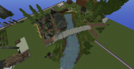
Gates of a city/town wall were only constructed based on the roads that joined at the location and necessity to leave the walled in area and lack of exit for a big distance. Right now the gates you have have somewhat redundant positions, looking at the two gates in the western wall they not only are very close in distance to each other, they also branch out roads that go in the same southwest direction with the northernmost one looking like a secondary field road. My suggestion for these 2 would be to create one gate that has one clear larger road heading southwest to the bridge (the bridge being more upstream than it is right now).
Second reason is the main square not being anywhere near the crossroad of the main roads, yes main squares have all shapes and sizes and some of them appear in very odd areas (although these cases usually relate to irregular geography) but 99% of the time not only were they pretty central the main roads would join in the square too, and right now the main square you plotted sits in a slightly awkward position (while this town is in a very flat area), only one of the roads that merge in the square is a main one coming from the gate and going to the castle gate, the others are secondary. The shape of the square looks like this:
View attachment 13253
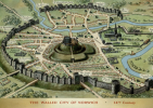
A shape that should be avoided at all times for squares that aren't in cities since only then could there be a bigger public construction work that has planning and people designing the space, besides that squares would only appear where naturally quicker and easier paths for roads would appear (like slime mold). Here are some examples of various "centres" of settlements:
Mind you these squares can be even more diverse with the planning of secondary roads etc but I didn't want to waste too much time on it.
Third reason is that the roads just don't have a natural look to them. There shouldn't be any "city block" type of plotting, those are reserved for the largest cities we have on this map and really only in the centre and they still would be a lot more organic and following the existing natural roads, in the plotting you made you have houses arranging themselves around blocks when they would arrange themselves around the roads. I did a very quick and simplified plotting of how structures could interact with roads:
View attachment 13254
The thickness of the roads also should be changed, the bigger roads should be the main ones coming from the gates and heading to the castle gate, and still there should be a hierarchy, 1 will probably be the widest and the other 2 smaller depending on the importance of the road.
Here's a suggestion of a layout based on all of the points above, mind you a lot of it has creative ideas of mine to change up a bit some aspects, so those can be completely disregarded, the main thing is just the feedback I gave (with the palisade continuing on the lake side and a harbour that would be just a promenade with a wooden wall (idk how those are called, the walls in harbours that go to the water so ships can sail close and unload resources) with no jutting out piers the boats here would be pretty small so no ships so the need for wood piers that stretch inside the water doesn't make sense to me since the water lake isn't too shallow for the smalll boats):
View attachment 13258
View attachment 13260
Harbour sort of like this but a lot less developed with wooden palisade instead of stone wall etc.
2- Size of the town:
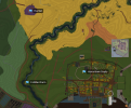
-For me the discussion around the sizes of towns are never about the actual square block the town occupies but more so how the town interacts with the area in terms of scale and plotting. I pasted my own town of Starpike near Harrentown to get a sense of scale since nowadays I don't leave that area at all so the scales and proportions are always off for me.
View attachment 13255
Starpike town being a smaller town is from my (very superficial) calculations around 2/5 of Harrentown it's slightly bigger than a third but not quite half so two fifths is the measure I came up. When I counted the structures that I have (doesn't include structures like firewood sheds, cart sheds, stables, work sheds, thatch storage sheds, cemetery, extensions of the houses like storage buildings, etc) it amounts to 26. Currently Harrentown has 141 unique structures that correspond to different households/buildings, if Harrentown had the same building density as Starpike town, it would have 65 unique structures less than half of what it currently has. And the main reason for this is the lack of utility buildings, road space, yard space, and general working space for people to walk around with carts, produce, places to store wood, barrels, animals, random necessities and utilities, places to store carts, wagons and other means of transportation, farming equipment, places for industry to happen, this town is large enough to have at least 1 industrial complex of something that gets exported (be it pottery, a tanner, a large trader, etc). Here are 2 screenshots from Kingdom Come Deliverance of houses from a far smaller village (skalitz to be exact):
Now this happens more on flatter terrain where there is more free space to utilise, but even then all settlements should have some sort of plotting that takes into account a layout like this, because for people to work and live in they need space to do it, and places to utilize for all the functions they need that I've listed above. And right now the plotting you have doesn't translate that.
(All the examples I showed aren't to deal with style but layout and plotting only)
3- Houses:
I've mentioned already the plotting in relation to road layout but now I will expand upon the topic above I was talking about. There should be a ban of houses with a 5 blocks big wall, unless it's a very poor but longer like you can see in the rightmost house of the level I houses in the manor lords tweet, and like a shack type of house almost all houses should have a configuration of 6x(number bigger than 6 if it's not a square layout) or a 7x(number bigger than 7 if it's not a square layout) or larger of course. These houses wouldn't suffice for anyone to live in and I know we like to think that medieval time corresponds to super tight living spaces, but they weren't as small as we make them, the problem was it was a lot of people living inside them (specially in cities, other settlements like towns and villages they generally had more space than the current below-average city dweller in an apartment), buildings 5 wide can be storehouses, utility buildings and other structures, I'm not saying there aren't cases where a house being 5 wide doesn't work, but it should be a lot less common than we make them.
View attachment 13256
Even the poorest farmer in this settlement would have maybe a longer house with some type of shed, if you place a shed here then you make it difficult to enter the yard space.
In general there's a huge lack of space and empty places too like grass between roads and houses and other spots where it would just be empty. the main roads are narrow and the secondary roads are wide and too regular, houses are too on top of the roads in places of less density (away from main roads and big trading areas). Houses should keep a fairly simple and geometric layout based in rectangles with branching rectangles of other structures that belong to the house and not like corner houses:
View attachment 13257
Lastly I like the idea of the palisade but the execution isn't great, I think you can modify a bit specially the inside of the wall, look up images of kingdom come deliverance a lot of the settlements there have palisades that look great with nice gatehouses too (skalitz for example).
View attachment 13259
You can stick with the log design but just make the inside of the palisade higher than the outside and make the walkway like the first and second images show maybe.
I think that's all for now, I hope I wasn't too annoying with this and I'm sorry again for not writing this sooner when the planning stage was happening, but I also didn't want to not say anything because not only is it an awesome project in an iconic location but also cuz I think ya'll have really creative ideas and very good building skill, so this is me trying to help in anyway I can. Also any feedback that I give that maybe wrong or historically inaccurate please do let me know.
Thanks for reading!
Seri


