Westeroscraft Texture Pack Megathread

Emoticone11

The Dark Lord Sauron
Staff member
Yeah, I gotta say, smooth rock and smooth bark do look very similar even IRL.

I think the main issue I had was the shading on the edges of the texture. Maybe "bark-like" wasn't the right word, but it sort of accentuates the vertical pole-like look of the block. Our log blocks also have this shading, and it's fine there because tree trunks are usually more pole-like, but it looks weird in stalactites which are naturally tapered. The unshaded terrainset blocks look better as stalactites for this reason IMO.

Although, I do want to add that it won't be very realistic to use the stalacmite/ flowstone block as stalactites. ... The reach/motm sets may work well with the alt textures, but the new textures are much too coarse imo.

Right, either of these options comes with a small decrease in realism, but I think it's in the spirit of the compromise that we talked about in Disc. Aesthetically I thought the reach & westerlands terrainsets looked very nice as stalactites when I tried it after adding the wall/fence blocks, and the coarseness is pretty difficult to notice unless one is being incredibly picky. I will say that I'm also unsure about adding a stalactite web block; something about mixing and matching the "full bodied" blocks with the cross-hatch web textures in cave systems just looks odd to me.

Yeah, I scratched that for now, since we agreed to wait for feedback to only implement whatever is still necessary. From my own testing it didn't seem like it was. The alt sets really tie the pink/tan/buff terrainsets (reach, wl, dorne, rm) together and the four existing variants of metamorphic rock (north, ironislands, eastern islands, eyrie) already work as alt sets within each other. With the colour change and dedicated alt I've added for the stormlands set, this now works both with the biome shaded eastern islands set, the regular iron islands set AND with the red mountains sets.

Ah, alright. I still have to test the alt sets. Have you made any tests specifically using the primary terrainsets and the slightly-different alts in the same rock face? IIRC the main textures and the alts you made were pretty similar color-wise, so I'm just wondering how useful those alts are compared to something with a little more variation in hues, as well as possibly an additional rock type, as we discussed in Disc earlier.

I'll give it all a look this weekend to try to get a better sense of what needs to be done, though.

In addition, some of the ores, specifically the iron ore might work like a charm to create banding in the red mountains set, while the silver and gold ores should go really well with the westerlands and possibly reach sets. Coal works well with Iron islands, north, lava and possibly the stormlands set. And, albeit some of them are visually distinct (I'm looking at you, copper ore), generally all of them overlay nicely with all terrainsets.

Is it realistic for bands of ore to be exposed on the outer faces of rock like that, or would the ore here be representing some other stone type? If the latter, do you think it would make sense to instead add another stone type filling in the "gap" in hues/textures that the ores are being used to fill in, to avoid tying our hands wrt. the textures of the ores like that?
 

Thamus_Knoward

Shadowbinder
I think the main issue I had was the shading on the edges of the texture. Maybe "bark-like" wasn't the right word, but it sort of accentuates the vertical pole-like look of the block. Our log blocks also have this shading, and it's fine there because tree trunks are usually more pole-like, but it looks weird in stalactites which are naturally tapered. The unshaded terrainset blocks look better as stalactites for this reason IMO.

Right, either of these options comes with a small decrease in realism, but I think it's in the spirit of the compromise that we talked about in Disc. Aesthetically I thought the reach & westerlands terrainsets looked very nice as stalactites when I tried it after adding the wall/fence blocks, and the coarseness is pretty difficult to notice unless one is being incredibly picky. I will say that I'm also unsure about adding a stalactite web block; something about mixing and matching the "full bodied" blocks with the cross-hatch web textures in cave systems just looks odd to me.
Promise me to test all blocks thoroughly. I have no hard feelings either way: if we just scrap all variants of the stalactite block, if we only keep one of them, or if you want me to fix the cylindrical look I gave it.

Have you made any tests specifically using the primary terrainsets and the slightly-different alts in the same rock face? IIRC the main textures and the alts you made were pretty similar color-wise, so I'm just wondering how useful those alts are compared to something with a little more variation in hues, as well as possibly an additional rock type, as we discussed in Disc earlier.

Yeah, the white-gray cliff at /warp overlaytest uses the reach alt set sparsely for accent (2nd pic here). Also, there is an entire wall that shows #simplex combinations of alt and main straight on (seen to the right side in this pic). They are close enough color-wise to enable striation, but different enough to be distinct. We still have options to add more, of course, but if this solves all issues we've had with terrainsets previously (not blending well, looking odd against the construction blocks), well then I think we shouldn't force more additions. Again, test it, tell me if you think some transitions are especially awkward and would benefit from an additional step, and we can discuss how that additional step could look like.

Is it realistic for bands of ore to be exposed on the outer faces of rock like that, or would the ore here be representing some other stone type? If the latter, do you think it would make sense to instead add another stone type filling in the "gap" in hues/textures that the ores are being used to fill in, to avoid tying our hands wrt. the textures of the ores like that?

I am not an expert but I'd say, it depends!

For iron and coal at least I've seen exposed bands. For coal and iron I posted real life examples of that as images 2 and 10 here. Cassiterite (Tin ore) rather seems to be formed inside of quartz veins so it is not very likely to be exposed unless it has been mined previously (some glamour shots of abandoned cassiterite mines). Electrum and Galena may look different from how I depicted them when exposed to weathering and in larger quantities, my reference images are only small fragments. Malachite could be exposed if I interpret these images correctly, but then again, the rock here could have been cracked open. In one image it looks like Malachite could be more of a geode type mineral..No idea /shrug

I made the ores to represent coal, hematite, cassiterite, galena, electrum, and malachite, the principal sources for coal, iron, tin, silver, gold, and copper, respectively. I'm not saying we SHOULD use them to fill the gaps, instead, we COULD use them to make a rock face interesting. As an accent block with imbued meaning if you will. For instance, the iron islands could be textured using mostly the main iron islands set, as alt, meaningless accents it could use the north, eastern island and stormlands main set, and as an additional, meaningful, canon-backed accent it could use the hematite/ iron ore block.
 
Last edited:

Emoticone11

The Dark Lord Sauron
Staff member
Made a version of the resource pack with Tham's updated terrainsets without the other textures from his dev pack. The alts are on the stone metadata (1:1-1:6) as before. However, I switched the alt & primary terrainsets for the Red Mountains and the Stormlands terrainsets, as the alt ones were closer in color to the original terrainsets, and we decided not to mess with the overall Stormlands color choices for now. I haven't touched /warp overlaytest at all, so those will probably not look entirely accurate. Also, the overlay pack isn't updated yet (so if you use the overlay pack to test the ore textures, the transition might be broken), and this doesn't include the stalagtite/stalagmite textures, which you'll need to add separately.


Also, got a few updated before/after pictures:

Old -- Current -- New (Banefort)

Old -- Current -- New (Silverhill)

Old -- Current -- New (Starpike)

Old -- Current -- New (Boneway)

Old -- Current -- New (Wickenden forest)

------------------------------------------------------------------------------------

Feedback:

- The new Westerlands and Reach terrainsets look good!

- I personally like the more vibrant red color of the Red Mountain terrainset that we have currently. The new version of the textures feel a bit more muted. I don't feel super strongly either way, though, so some more opinions here would be good to have.

- The brown Stormlands terrainset (the alt one in ThamCraft, but the main one in my modified pack above) seems like it's been reverted to the lighter maroon-ish color that you had initially, which doesn't really go with current Stormlands builds super well. If both the grayer terrainset you made for the Stormlands as well as the lighter maroon-ish one are useful to have, I think they can both be added as alt variants, but I do like the brown Stormlands terrainset that we have currently. Again, I don't really want to open any can of worms about the Stormlands palette more broadly right now, but am just trying to ensure that our new primary terrainsets match the color of the old ones as close as possible - this is the best way to avoid any unanticipated messing up of existing builds.

- The River terrainset still doesn't feel like it's quite there yet - in this case, it feels a bit too homogeneous and saturated green, whereas the old version is more gray with subtle greens. I actually think the current version is not bad in terms of color, but just needs the reds to be toned down and removing the strong border effect (which the new texture should help with).

- Regarding the moss texture, I know it's a WIP, but do you think there might be any way to get some dappled moss (like is on the current version of the eastern island & iron island terrainsets, but not the new ones), rather than the more blocky texture? I think those textures look quite nice on the island terrainsets, the issue of course being that it's impossible to control where they show up when they're part of the random CTM. Or is the overlay method too limited to do this?
 

Thamus_Knoward

Shadowbinder
- The new Westerlands and Reach terrainsets look good!
Awesome, I'll leave them as they are then.


- I personally like the more vibrant red color of the Red Mountain terrainset that we have currently. The new version of the textures feel a bit more muted. I don't feel super strongly either way, though, so some more opinions here would be good to have.
Ok. I'll wait for a unified decision here then. My personal opinion: The more the merrier :D Let't have the current one be the main and the two new ones be alt sets to complement the desert palette.

- The River terrainset still doesn't feel like it's quite there yet - in this case, it feels a bit too homogeneous and saturated green, whereas the old version is more gray with subtle greens. I actually think the current version is not bad in terms of color, but just needs the reds to be toned down and removing the strong border effect (which the new texture should help with).
Now that you can mix the sets, try a mix of iron or eastern islands with the river set and see if you can get the effect! The way I made the new texture makes it much harder to get that same look as on the current set. In other words, I'm not sure if I can transfer the color to the new textures without also getting the border effect back...
In any case, what you wanted to achieve was this so a carefully painted mix of river set (which I propose to rename to just "wet rock") with II or EI sets will get you much closer than a single set could.

Especially if you add a non-patchy a blanket moss texture to the mix. Which brings me to:

- Regarding the moss texture, I know it's a WIP, but do you think there might be any way to get some dappled moss (like is on the current version of the eastern island & iron island terrainsets, but not the new ones), rather than the more blocky texture? I think those textures look quite nice on the island terrainsets, the issue of course being that it's impossible to control where they show up when they're part of the random CTM. Or is the overlay method too limited to do this?

I showed a dappled moss texture previously using the exact same patches of moss that were previously on II and EI sets. Wasn't too well received so I tried something closer to this:
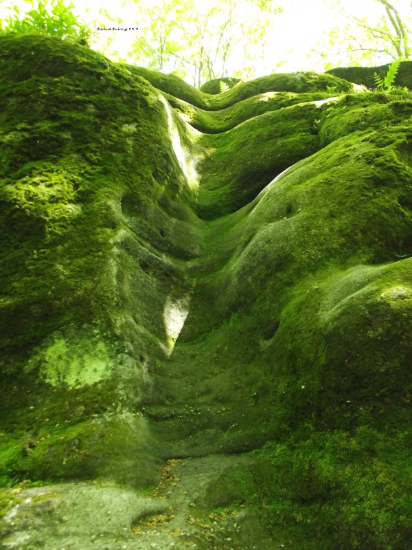
moss-covered-rock.jpg


Unified in one block:
7e3a658852.jpg

I think the new block manages to tick a couple of necessary boxes:
- The moss has to fill the entire block. Not like mossy cobblestone where the moss was added to only in the cracks of the regular cobblestone texture. It has to be the full block to work next to any other rock texture to create the illusion of that and the rock underneath the moss being the same material.
- It has to be a dedicated, full block for the overlay to work. The kind of overlay I added extends a fading moss texture over to any adjacent full, terrainset block. This way, the moss can quite literally overgrow any terrainset. The transparency is a bit buggy in my test pack, working only for the reach and I believe arbor dorne or was it stormlands terrainsets? (the two that are not on 2029)

I could try a reverse overlay where the terrainsets overlay onto the moss block, which might actually fix the transparency issues! I don't think dabbled moss is the way to go anymore.


haven't touched /warp overlaytest at all, so those will probably not look entirely accurate. Also, the overlay pack isn't updated yet (so if you use the overlay pack to test the ore textures, the transition might be broken), and this doesn't include the stalagtite/stalagmite textures, which you'll need to add separately.

I understand why you did this Emote, but for testing the blending between sets the working overlay CTM is kind of essential. I hope some of us still manage to download the ThamCraft and Overlay packs despite the convenience of having Emote's version to see that effect work as intended in-game.

- The brown Stormlands terrainset (the alt one in ThamCraft, but the main one in my modified pack above) seems like it's been reverted to the lighter maroon-ish color that you had initially, which doesn't really go with current Stormlands builds super well. If both the grayer terrainset you made for the Stormlands as well as the lighter maroon-ish one are useful to have, I think they can both be added as alt variants, but I do like the brown Stormlands terrainset that we have currently. Again, I don't really want to open any can of worms about the Stormlands palette more broadly right now, but am just trying to ensure that our new primary terrainsets match the color of the old ones as close as possible - this is the best way to avoid any unanticipated messing up of existing builds.
Fair enough. I personally can't stand the chocolate mountains and much less the chocolate castles, even with my 'improved' version of terrainset those just don't look right to me anymore. However, enough people seem to dig it so stick with the current one as the main set but do consider the two additional ones as alt sets for the transition regions or those regions within the stormlands where we have the canon of red/greyish rock.
 
Last edited:

Emoticone11

The Dark Lord Sauron
Staff member
Now that you can mix the sets, try a mix of iron or eastern islands with the river set and see if you can get the effect! The way I made the new texture makes it much harder to get that same look as on the current set. In other words, I'm not sure if I can transfer the color to the new textures without also getting the border effect back...
In any case, what you wanted to achieve was this so a carefully painted mix of river set (which I propose to rename to just "wet rock") with II or EI sets will get you much closer than a single set could.

Okay, I'm convinced! The mix of iron islands & river that you tried looks very nice. I think the river terrainset is used for boulders/cliffs in few enough areas (just Felwood uses it for cliffs that I'm aware of) that we can just try to update those locations. If anyone else is familiar with any other locations where river terrainset is used in these ways, it would be helpful.

I showed a dappled moss texture previously using the exact same patches of moss that were previously on II and EI sets. Wasn't too well received so I tried something closer to this:

I guess what I mean is having this exact moss texture, but being able to be used on any terrainset. The dappled moss texture that you linked is sort of like that, but since it's based on overlay, it always requires an adjacent block to get that effect. As a result, you'd never be able to get something more subtle like in the image I linked, because the blocks not completely surrounded by terrainset will just show the full block moss texture.

I sort of had an idea though - what if we added a 6-way cuboid block (i.e. like duckweed but also able to be placed vertically like vines) with a transparent dappled moss CTM, so that it can be placed over terrainset blocks? This would be in addition to the thicker carpet moss block with overlay CTM that you're working on. Granted, it'll probably be used on bricks and other things as well, but that might be fine.

I understand why you did this Emote, but for testing the blending between sets the working overlay CTM is kind of essential. I hope some of us still manage to download the ThamCraft and Overlay packs despite the convenience of having Emote's version to see that effect work as intended in-game.

Would it be possible to swap the alts & primary in ThamCraft as well, and update the Overlay pack correspondingly? It was just a really simple switch of the .properties files between the two directories. Since you've been testing by copying over areas and replacing placeholders I feel like it shouldn't make testing more difficult. I'm just trying to ensure that it's convenient for people to put on the dev pack and test things in practice, without having the inconvenience of their projects in production getting affected by drastically different textures.
 

ContraBlonde

Prophet
This is a random idea I’m posting rn so I don’t forget but what if there was a broken glass shard block? Similar to coins and blood. This block could be used for raided/destroyed locations.
This is not too serious of a suggestion, just an idea.
 

AerioOndos

Donkey Lord
Staff member
Pronouns
they/them
Would it be used on the ground as a horizontal block or as a pane? Because if it were horizontal it’s be possible to also use it as frost/ice
 
  • Like
Reactions: ContraBlonde

Emoticone11

The Dark Lord Sauron
Staff member
PSA: we still need people to help test terraforming with the different terrainsets (e.g., making dioramas), and giving feedback on which colors/textures/etc. would be useful that are missing currently. Specifically, what additional variants are needed to help with realistic transitions, striations, rock discoloration, etc.? Any future progress on the terrainsets depends on this feedback.
 
For me, the main thing is connected textures. I remember seeing a screenshot by Tham where he did connected textures of the terrain sets each with several different ones and with only that the terrain mixing would already be able to be very diverse. As for secondary sets it’s really hard to tell. Some irl inspiration I take from normally has the general looking feel of the terrain set I’m using but there’s normally variations of saturation (more saturated or less) and lightness. In the southern reach for example it would be beneficial to me to have a slightly darker variation and warmer as an intermediate between reach and Dorne terrain sets. But I don’t know for the rest of the terrain sets.
 

Emoticone11

The Dark Lord Sauron
Staff member
Yeah, the "blur" effect between the terrainsets is done with overlay, which is a type of CTM. That'll appear in the future "automagically" once we finalize the different terrainset textures we have - for now, just do your testing imagining the smoother transitions. What's most important is just knowing what additional colors/textures people would like, which terraforming inspiration is currently difficult to capture, which terrainsets are difficult to transition, etc.

Also, some of the variants in Tham's image above aren't added to the main pack yet, but you can find them as alts in the pack that I uploaded above.
I think my suggestion still holds some importance. There has been some talks about a cohesive Marcher lands area and a secondary warmer and slightly darker option to the reach one would be of great use in the multiple projects for the marcher houses.
 
  • Like
Reactions: IronGentleGiant

Emoticone11

The Dark Lord Sauron
Staff member
Yeah sorry, didn’t mean to seem dismissive of that! Was just responding to the overlay thing.

Do you have an example in mind of what you mean? IRL inspiration images as well as “attempted dioramas” (showing the need for the suggested option) would both be helpful to provide for anyone giving suggestions.
 
Here's an imgur album of various images of the colors I was talking about:
There's a general pasty grey/pinkish stone that's perfect as the Reach terrain set, and there's 2 variations overall a darker grey variation and a similarly light warmer variation.

18-cópia.jpg

The grey square is the darker less warm variation (which we have existent terrain sets that could fulfill this color), the pink one is the warmer similarly light variation and the white one is the equivalent to our reach terrain set right now.

The pink square I think is the image that represents best how I think a secondary terrain set for the reach would look like. Maybe not as pink, maybe shift slightly to the orange-y spectrum, here I leave for you to discuss since you are experts in the textures area.