Block Change 
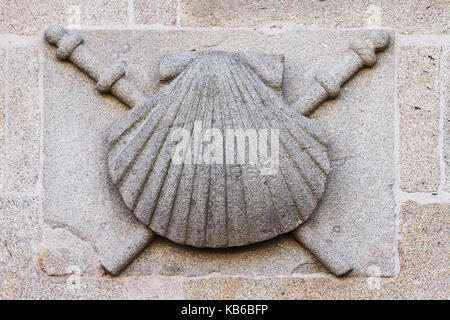
Request: Arbor/OT/Dorne Colored Carved Faith Stone

Thamus_Knoward

Shadowbinder
Hey I tried something different and I haven't tested in in game yet. What do you think of this approach?

I was inspired by the scallop shell of Santiago de Compostella:

72bd373c58.png


santiago-shell-carved-in-stone-santiago-de-compostela-galicia-spain-kb6bfp.jpg
 

Thamus_Knoward

Shadowbinder
Hmm.. so it's too organic? I could try making it more angular? Please use some words to describe the issue :/ I do see your association but it would help to spell out feedback.
 

Elduwin

Skinchanger
Staff member
Might want to coordinate the coloring of that new Faith block with the update on the Arbor brick block texture, as it's also meant to come with the next update.
 
  • Like
Reactions: SseriousBusiness

CashBanks

A Knight at the Opera
Staff member
I feel that this block looks too much like a starfish, and not faith esque. it would be a great accent block for dorne and the arbor but not really faith to me.
I get what you’re saying but it’s hard to avoid when the Faith’s symbol just looks like a starfish anyway. Cutting the wavy accents on either side might help with reducing the Atlantis vibe but It should look ok either way in context.
 
Personally I'd prefer without the top and bottom borders, to let the design breath more, it seems a bit cramped rn. But the texture as is is awesome too, I feel it could be cool to have something sort of like this stock-photo-old-stone-star-of-david-on-the-old-city-wall-jerusalem-1486897.jpg , the circle gives a nice frame to it, and the middle would be the faith of the seven emblem.
 

Thamus_Knoward

Shadowbinder
SseriousBusiness examples like that really, really help.

Also @CashBank, Jakethesnake8_8 and Iwan again for making me ponder the starfish-like-ness of the faith symbol. I've decided to nab the one the show uses.

So how's this in terms of general direction? It's a rough draft but before I chip my time away at shading I wanna know if the general shape is less starfishy >.>


16f70dfc63.png
 
Last edited:
I think that's the right direction to go. If you can have the angles be more tight instead of such broad triangles like this image: 1613921668766.png
Would be awesome! I'm not sure if the texture would become too detailed because of the tighter angles and close lines, and be a bit less defined or if too contrasty it could be a bit noisy, but it's a matter of trying and seeing how it looks.