Block Change Request: Arbor/OT/Dorne Colored Carved Faith Stone
- Thread starter Margaery_Tyrell
- Start date
-
The Spring 2023 edition of The Rookery is now out! Take a look to see the latest builds, guides, progress and development updates on the upcoming 1.18.2 switch. You can read it here:
https://indd.adobe.com/view/f943da18-ed77-4d55-845d-fee9bfa14247
You are using an out of date browser. It may not display this or other websites correctly.
You should upgrade or use an alternative browser.
You should upgrade or use an alternative browser.
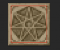
That looks amazing!Like so?
Or with some more decoration?
OOoooooooooh I love the more decorated one of the new batch. Super awesome!
Marg's way of saying: it's the with decoration one or the Reach will start a revolt and kill everyone opposing the superior designI vastly prefer the with decoration
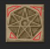
I don't think I agree that stretching the lines out is a good idea because that would cut into the heptagon. Since it seems that the majority are happy, and given the fact that this is a massive improvement over the existing designs, I'll propagate this to the other blocks and we'll try it out for a while. If it starts bothering people down the line we can always go back and change it since this block is one of the few that has a single unique use.i think the decorated one is a step in the right direction, but it kinda reminds me of a QR code scanner lol. I suggest trying to make the dark lines on the outside go all around the block. but looking amazingView attachment 7289

Looking great Tham! Seeing it in the images though, I'm wondering it it might be better to go in the less decorated direction, or perhaps a third direction which would be to make the circumscribed heptagon a simple bevel. The corners and solid edges currently make it look like a metallic plate attached over the stone, rather than a carved section of the stone.
Could you also do a version with a circle instead of a heptagon? Right now it looks distributed a bit irregularly in the square area because the upper end ends on a corner and the lower end ends on a side. And almost all depictions of faith symbols use a 7 sided star enclosed by a circle so.
Alright folks just cast your vote will ya:
"Nice"-Smiley: Heptagon no decoration

"Seriously?"-Smiley: Heptagon with decoration either the full carving or just the squiggles (that's something we can still determine after):


"Like"-Smiley: Circle without decoration

"Love"-Smiley: Circle with decoration either just the squiggles or the full carving (which of the two we determine after agreeing on the base shape and whether we want decoration at all):


Those are all the options you're getting for now. I'd like to revisit this only after you've tried it out in-game for a while.
"Nice"-Smiley: Heptagon no decoration

"Seriously?"-Smiley: Heptagon with decoration either the full carving or just the squiggles (that's something we can still determine after):


"Like"-Smiley: Circle without decoration

"Love"-Smiley: Circle with decoration either just the squiggles or the full carving (which of the two we determine after agreeing on the base shape and whether we want decoration at all):


Those are all the options you're getting for now. I'd like to revisit this only after you've tried it out in-game for a while.
How do I test them in-game, Tham? Did you upload the tiles somewhere?
I realise that what I said was misleading. Imma share the version we vote on and then freeze comments until people have checked that one out is what I meant!How do I test them in-game, Tham? Did you upload the tiles somewhere?
Hmm do you think it would be better to do it the other way around? I’m finding it a bit hard to cast my vote without seeing the options in practice.
It's not like the brightness/ colours are insanely different between the options. BUUUUT if you realllly need it. I might set aside some time for it tomorrow. JeezHmm do you think it would be better to do it the other way around? I’m finding it a bit hard to cast my vote without seeing the options in practice.
I'm considering this done and delivered. Any further tweaks are on Emoticone11 or CashBanks.
Which texture ended up being chosen of the 4 you made?I'm considering this done and delivered. Any further tweaks are on Emoticone11 or CashBanks.
Share:


