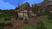
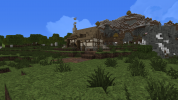
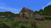
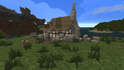
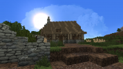
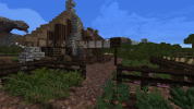
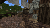
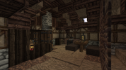
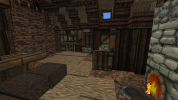
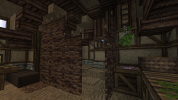
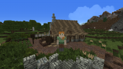
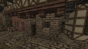
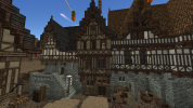
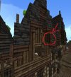
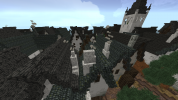
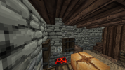
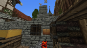
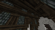
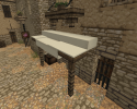
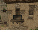
Horsthausen Builder Application

Horsthausen

Bard
What is your Minecraft username?
Horsthausen

What is your age?
17-20

In what country are you living?
Germany

Where did you first hear about WesterosCraft?
Youtube

What do you like the most about GoT/ASoIaF?
I'm fascinated by the level of realism and depth each charakter, place, house, etc. gets, especially with their backgrounds and history. Also I love the writing style of GRRM, which made me finish the books in no time.

What is your favorite build on our server?
I especially like Pyke with its inner keep reaching out into the ocean on stone pillars.

Why do you want to join our server?
I want to get more invested in the world of ice and fire and also happen to enjoy building in Minecraft. And I have a lot of free time as of now as I just finished school.
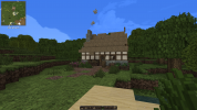
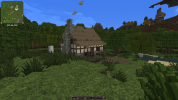
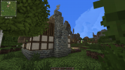
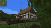
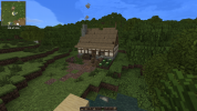
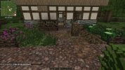
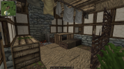
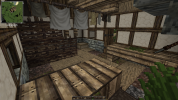
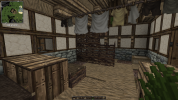
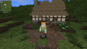
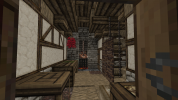
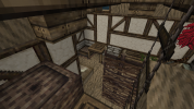
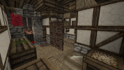
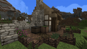
2021-07-05_18.11.11.png2021-07-05_18.11.21.png2021-07-05_18.11.48.png2021-07-05_18.11.59.png2021-07-05_18.12.13.png2021-07-05_18.12.41.png2021-07-05_18.12.52.png2021-07-05_18.13.12.png2021-07-05_18.13.25.png2021-07-05_18.25.43.png

Did you follow the application rules?
You know nothing, Jon Snow
 

Ric

Ser
Staff member
Hey Horsthausen!

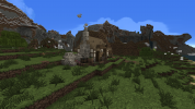
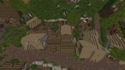
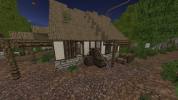
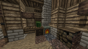
I think you did a good job with the apphouse, nice work. Only thing I would note regards the thatch roof that you made with more holes than the original one. It's nice to try adding some details, but too many of these holes actually compromises the stability of the roof and as such you should avoid making too many of them.

That being said, for the next challenges you have to make houses inspired by the design of other locations that I'll point out to you. Try looking on how the style of the project works, the blocks used and how they are used and other commonalities between houses. Your first challenge is to make a low-class house in the style of Hammerhall (/warp hammertown has good examples).

If you have any questions feel free to ask.
Good luck!
 
  • Like
Reactions: JJLyric

Horsthausen

Bard
Hello Ric,

First of all thanks for the quick reply. When building the app house, I thought the thatch roof would need to be a bit more roughed up because a perfectly clean thatch roof felt a little odd, but I guess I've gone a bit too far with that approach. I've been looking at the houses in the Hammerhal area and after noticing that they used pretty much the same style as the app house, I tried to come up with something of my own. It's an edge of the village type residential house that I tried to keep lower- class although it might have come out a little more as a middle-class building, hope that's not too much of a problem. I hope you like it and I'm looking forward to your feedback and the next challenge!


2021-07-09_16.04.05.png2021-07-09_16.00.25.png2021-07-09_16.00.53.png2021-07-09_16.01.29.png2021-07-09_16.02.04.png2021-07-09_16.02.51.png2021-07-09_16.03.11.png2021-07-09_16.03.35.png2021-07-09_16.19.39.png
 

Ric

Ser
Staff member
Hey Horsthausen!

I think you did a good job overall, though I have some feedback. Starting with the exteriors:

First thing is the little covered area you made with firewood bellow; I think it would make more sense to have it bellow the roof, rather than mixing both together. Regarding the yard, it's usually best to make them in a more linear way rather than as a circle around the house. Since it's a house in a very rural location, the yard should be bigger as it's the place where people living there would work and grow their food. Here's an example from Hammertown, with the yards of three houses:
2021-07-11_02.32.32.png
Still on exteriors, when making the daub walls remember to keep in mind that the timber pattern should be done in a way that provides structural stability to the house. With small houses like yours, it's okay too for it to be something very simple, like this one:
2021-07-11_03.13.16.png

On the interiors now: The "Chili Ristras" block should be used only on high-class houses when outside Dorne, so it's kind out of place on your house. Same thing for the "Table" block, as it has a more fancy design it's usually saved for middle-class or higher (for other table designs you can have a look at /warp ikea). Final detail is the furnace, which is too big for a small poor house. Something simpler like the one on the apphouse or in the example bellow would fit it better.
2021-07-11_02.05.23.png

For your next challenge, I think we should still aim for something rural, so please make a house in the style of /warp gaunt. Remember to make a reasonably large yard (you'll find examples at the warp).
Good luck!
 
  • Like
Reactions: JJLyric

Horsthausen

Bard
Hey Ric,

thanks for your feedback to the first challenge. I've tried to implement it to my next one. It's a rural lower class house in the style of Gaunt with a bigger yard where they are growing their own vegetables and a small chicken coop that reaches from the inside to the outside. Also, I went for a diagonal house this time and I tried to keep the thatch roof as clean as possible. Hope you like it and I'm looking forward to your feedback!

Moritz

2021-07-12_15.58.26.png2021-07-12_16.01.02.png2021-07-12_16.01.41.png2021-07-12_16.02.13.png2021-07-12_16.02.38.png2021-07-12_16.03.07.png
1626100345316.png
 
Last edited:
  • Like
Reactions: Gealrüable

Ric

Ser
Staff member
Hey Horsthausen!

Good job with the house! Nice that you decided to try a diagonal plot, these are usually a bit more complicated, but from what I can see you managed well the shape.

For the exteriors the house itself is in general good, I don't see anything to note, apart from the chimney: I would have a full block on top of the chimney instead of a stair. Also, you could've made it just a straight line of blocks, as it's just a furnace on the inside (like the "Example 3" image from my last post) - no need to make it so big. And don't forget to add the smoke block above it, as the furnace is on fire.

The yard is kind hard to see, next time please take more screenshots of it and preferably one looking at it from above too. From I can see though, I think you managed it well, I would just make the crops bigger, use the wattle block as a division rather than wood fences, and it's better to use a hopper block instead of a full block for the top of the post supporting the clothes-line. Finally, I think you would be able to find a better chicken coop design at /warp ikea.

On the interiors, a quick list of things I noticed:
  • The rafters: you made the stair>slab>stair design, which is good, but you made the blocks above the slabs be thatch stairs, which doesn't really make sense, as it appears that half the thatch is not being sustained by anything. There are also some spots without wooden slabs at all, and another with a wooden slab not holding anything. Be careful to not miss those.
  • The cooking area: making it closer to the furnace would make more sense. I noticed you have an herb on a fence block, I would suggest having it on a vertical rope instead. Also for the table, I would add a half door block in the tip as extra support for it (just two piston tops gives it an unstable look) and remove lantern, as those would be very expensive for an avarage farmer to have.
  • The chicken coop: I don't see much sense in having it inside the house, as there's already one outside. You could use the space for something else, like storage, eating, etc.
For your next challenge please make a middle-class house in the style of Duskendale, including a yard again. There are nice examples inside the town near /warp ddnorth.
Good luck! :)
 

Horsthausen

Bard
Hey Ric,

thanks again for your feedback, I've tried to implement it in my new build which is a residential house in the style of those in Duskendale North with the long straight yards behind. Also it's supposed to be directly inbetween two other houses which is why there are no windows on the sides. I really enjoyed building in this style and I'm looking forward to your new feedback on this.

Moritz


  • Like
Reactions: Batelgause

Ric

Ser
Staff member
Hey Horsthausen!

Nice work! I do have feedback on it, but I can see the improvement you made so far :) So now to the feedback, first on exteriors:

  • The yard looks nice and fuctional. Only thing I would say is to have a bit less baskets.
  • The gradient could improve a little. I think for this house a gradient like the example bellow would work better, with a transition from the dirtiest (darker) blocks to the clearer ones:
2021-07-22_12.47.34.png
  • Your daub pattern looks very good! Only thing I would discourage is using close studding the way you did. A more common way would be to use them in a continous horizontal "line", like these:
2021-07-22_12.52.39.png
  • Last thing is a small detail you missed on the roof overhang. Beneath the stairs that support the overhang, you should add halfdoors, again like in the example:
1626993060596.png

Now on the interiors:
  • First thing I notice was that near the fireplace (here) you left the stone blocks from the upper floor unsupported. You should avoid leaving blocks showing up like that, you should change the fireplace on the second floor or remove the stone blocks in a way that allows the rafters to sustain the ceiling/floor.
  • Kind of conected to the issue of the last topic, the furnace on the second floor could be one block up, so it wouldn't touch the ground. And the chimney block on the wall can be just one or two vertical lines instead of three, no need to keep them like that just because of the first floor being this way. They can also be part of the wall, not necessarily in front of it - in this case it would give more space to the rooms.
  • The first floor looks a little odd to me. Try to not place too many things just to fill up space, you have to find a balance of empty and used areas.
  • In here I can notice that the with the rafters you also didn't use the halfdoors, they should be used the same way as I pointed out for the overhang.
  • Finally, in the last pic using 1x1 windows instead of 2x1 would work better, as they wouldn't be in the level of the floor.
I can see you are progressing really well specially on the exteriors, though on the interiors I think you need some more polishing up. For the next challenge try to focus on how to organize things on the interiors. One thing I try to do is imagine how the people living there would walk around the house, which places they would go more often, etc., and with those things in mind place the blocks accordingly. Also, please take some more screenshots of the interiors the next time, it seems like some parts of it were not included.

So with that being said, for your next challenge please make a middle-class house in the style of White Harbor. Remember to give a fitting profession for the house (bakery, cobler, carpenter are some examples) and that the working area should be on the ground floor. There are nice examples to the south of /warp sealgate, inside the city.
Good luck!
 

Horsthausen

Bard
Hey Ric!

First of all thanks again for your extensive feedback. I really appreciate someone taking his time for such in-depth feedback of my builds. Also sorry for the delay, I was kinda busy these last days in real life. This time I went for a bakery in the style of White Harbor. I found a bakery to be one of the easier professions to remodel in minecraft. I hope you likeit and as always am looking forword to your new feedback on this.

Moritz


Ric

Ser
Staff member
Hey Horsthausen!

I apologise for the wait. Continuing with the application, you again did a good work overall, the feedback is mostly on minor things. So, starting with exteriors again:
  • Although White Harbor has some houses with fence windows, this is a technique we don't really use anymore so I would remove the fence blocks from there.
  • The chimney could be simpler, the one you did is kind clumsy and a little too tall. Here there are some examples of how it could be:
2021-08-04_20.20.45.png
  • For the yard, I would just add some grass blocks on areas of it where people wouldn't walk very often.; this makes the yard look more natural. Also, I think the clothes line is too high, in a place hard to reach.
Now, in the interiors:
  • In the first floor I think the room is too crowded. What gives me this impression is the size of the fireplace and the placement of the baskets and crates. To avoid this happening you can try using a specific room or corner/part of the room for the storage, preferably away from the main path people would take. Having some empty space is okay, following the "less is more" saying. For the fireplace, I took a couple screenshots of a more compact design you could try:
2021-08-05_00.36.47.png
2021-08-05_00.34.43.png
  • The rafters in the first floor seem to be wrong, as they should follow the shortest way across the room.
  • In this part of the second floor the shelf looks strange. It's too big and the flour could also be storaged with the rest downstairs. It also appears that the roof has no rafters in this part.
  • This bedroom could look better if it was more similar to this one, as the second one uses the space a little better, with the furniture fitting better. The wardrobe needs too much space for a room that small. And the drawers block (in the firts bedroom) showing one of it's sides above the bed shouldn't happen too.
  • For the attic, I suggest having more crates and baskets closed. Having one or two open to demonstrate what they store is okay, but too much doesn't work very well. The hay bale block looks out of place, I would remove it and save it for barns and stables. Also, the rafters for the roof are missing slabs between the stairs, it should be like this:
2021-08-04_20.21.45.png

Just as last time, I still think your exteriors have really developed well but the interiors still need some work. One thing you missed in this house is a "living" space, where they would have a kitchen and dining room (perhaps in the same room), try to keep in mind to have a space like that in your future city/town houses.

When making the interiors of a room remember to have in mind how people living in the house would use the space and walk around, this happens when trying to find the best way to place the furniture. But also keep in mind not placing too many things, keeping things simple, functional and organized is what you should aim for, making a balance between too much and too few empty space.

That being said, for your next challenge I think we can try something different. Please make a middle-class house in the style of /warp tortown. The houses along the road directly in front of the gate, inside the town, should be good examples - but feel free to look at others around the town, of course. If you want you can check the guide at /warp torhamlet4 for a quick guide on how to make the plaster gradient (but keep in mind that most of the rest of that guide is for the rural part of the project).

Good luck!
 

Horsthausen

Bard
Hey Ric,

Thanks for your feedback again. Also don't apologise for the delay, I may be a little impatient in this regard. This time I went for a cartwright, which I found fun to experiment with. I also have to admit that I definitely prefer working on the exterior of a build to doing the interiors which you have probably noticed. I took my time for this interior though and did my best. Hope you like it!

Moritz

 
  • Like
Reactions: Batelgause

Ric

Ser
Staff member
Hey Horsthausen!

You did a great job on this one! I have only a few notes and suggestions on it:
  • For the stall cover in the front, a simpler design like the one in the example bellow would look better
1628807308371.png
  • The cover on the back of house where the firewood is at (here) would work better using the "oak carpet" instead of the oak wood slab I believe. You could even use the oak half doors instead of the fences as well.
  • On the same image I noticed that you have an apple basket despite not having an apple tree or other reason to use it so I would remove it.
  • For the little balcony in the front of the house I would make a design similar to the ones already in use there (example bellow). Also, using the stairs as cover makes it look clunky and I believe it works best for the roof to remain straight, so removing it would be better.
1628807768887.png
  • Finally, in this image I don't really understand the use of the frying pan, it seems out of place in there. And the ornate table with the wheel in front of it isn't really covering the bench blocks around it, making their side appear, something you should avoid.
That being said, I can see the improvement I was looking for on this house, you did it really well. At this point I think you'll learn more by working in the server, so I approve your application! :) Next time you are online ask a mod to promote you.

Now that you are approved you should first read our New Builders' Guide and then make your probation thread. A probation leader should answer the thread and took over your probation within a week, but feel free to send me a message if that doesn't happen. You can find plots to build using the Dynmap (there's an option called "Open Plot" that shows available plots), having a look at /warp build (that may be outdated sometimes) and by asking other builders. If you wish to you can ask a mod to give you a plot in the Test world where you can practice building.

Congrats and welcome to the team! :D