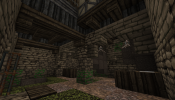
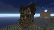
Approved Update Application: Flea Bottom, KL14
- Thread starter RavishMeRed
- Start date
-
The Spring 2023 edition of The Rookery is now out! Take a look to see the latest builds, guides, progress and development updates on the upcoming 1.18.2 switch. You can read it here:
https://indd.adobe.com/view/f943da18-ed77-4d55-845d-fee9bfa14247
You are using an out of date browser. It may not display this or other websites correctly.
You should upgrade or use an alternative browser.
You should upgrade or use an alternative browser.
Make Fleabottom great again.
I approve of this application
I approve of this application
Hey Rav,
I like your plans overall! I gave some feedback on the style test here:
 forum.westeroscraft.com
Provided you adjust your style accordingly, I'm happy to approve this. Please keep me in the loop about both the plotting and the undercity updates though, before opening anything.
I like your plans overall! I gave some feedback on the style test here:
Flea Bottom Planning and General Style Discussion
Hello Everyone! Putting together a list of canon areas and notable locations for the Flea Bottom Area. This said area is only subjected to the East side of Rhaenys's Hill between the Street of Flour and the great road from Iron Gate to Dragonsquare (This would not include Pigsrun Alley and the...
Provided you adjust your style accordingly, I'm happy to approve this. Please keep me in the loop about both the plotting and the undercity updates though, before opening anything.
Yay 
If there's anything you need out of the transition zone between KL14A and KL14B, just message Nuggs or myself.
If there's anything you need out of the transition zone between KL14A and KL14B, just message Nuggs or myself.
First few plots have been opened starting in the North East section.
F
FD001__
Hey, I've made a test for Karl Tanner's house.
My thoughts were that his house should have several entry points for quick escapes to evade the Goldcloaks, gang members, or anyone else after Karl Tanner. He has a small kitchen, with a large room for him and other criminals to hide out and get together.
The first two floors (lower ground floor and the ground floor) have been furnished, but the floors above haven't. You can find it at /warp finn01
I have a test for Karl Tanner's as well. Bottom floor is sweatshop, first floor is peasant accommodations and Karl's room, the second floor is the multitenant owner's and the attic is storage and dirt poor beds.
Got a chance to go over your tests in game a little more in depth and I'd like to say I'm happy with both tests. I feel they each provide their own uniqueness and personality to the area. That being said I have some final feedback that I think will allow them to feel very polished before I make a decision.
Jake:
I really like the overall silhouette and shape of the build. It creates a rather imposing and hostile look from below in Gin Alley.
That being said I feel there could be more. Right now there are a lot of muted tones and color suppression because of the daub. Preferably on the side with the balcony facing the alley facing the Street of Flour. Currently only thing breaking up that side of the facade is a balcony.
Finn:
I would like to start off that I'm really impressed with your ambition and confidence in building despite your limitations as a probation builder. To start off, though this house is home to Karl Tanner, he is not the sole owner of the house. I would prefer to see a multitenant layout where he is one of the people living there. As per your facade, there is a lot of messiness going on. 1. Your daub pattern needs to be more uniform and balanced throughout. You can have patterns but be sure they are distributed in an equal manor. 2. There is a lot of competing systems at play that create too much visual noise. I.e vertical planks. If you're going to use certain elements make sure they are balanced out by their counterpart.
On a side note, I love the idea of having escape routes for Karl Tanner to use to evade people or to sneak out/in through. I think that is a lovely personal touch that really brings a build to life.
NOTE: If anyone else is planning to test for this plot I would advise doing so promptly.
I've worked on some of the muted tones you brought up, and I've added some escape routes to and from the house.
Thanks for the feedback Rabitha
Thanks for the feedback Rabitha
Jake and Finn:
After going over your updated tests, and close consideration I've decided to choose Jake's test. I feel it is the best interpretation of a house home to an infamous assassin. The overall facade has a lot of character without being too busy and complex.
Finn:
I want you to take this as a huge win. Though your test was not the one picked I want you to know that I am very impressed with your building skill at such an early stage in your probation period and am looking forward to any future builds you make.
If there was any further advice I would give it would be to keep in mind that certain blocks can be visually too much and when building in dense areas can read as messy.
Thanks, Ravish
Went over with Scub in game with his test for the inn facing the great way. I feel this is the most characteristically unique of the tests for this plot.
Jmc: I still really like your test. Please do not delete your current test for this house. I would still like to implement this into the district.
Jmc: I still really like your test. Please do not delete your current test for this house. I would still like to implement this into the district.
Newly opened section of Flea Bottom featuring Charnel Lane: a depraved and corrupt area of flea bottom home to lots of crime as well as disease.
Plots are marked with a gold block as well as the [plot] function on the dynamic map.
Please read all signs before building and be sure to have fun
Plots are marked with a gold block as well as the [plot] function on the dynamic map.
Please read all signs before building and be sure to have fun
Charnel Lane, where the people of Flea Bottom get their cheap knock-off clutches
Thinking about opening up an interesting opportunity for building preferences: plots for those who prefer doing facade/exterior work and those who prefer doing interior only work.
All plots are of course marked with a Gold Block and as always please refer to the style guide.
For those interested in doing exteriors:
Please feel free to build at current plots but note or reach out to me saying you wish to only do exteriors
For those interested in doing interiors:
I currently have 1 plot open for interior work, but future plots will be dependent on me building exteriors or the latter option
Thanks, Ravish
Now Open For Applications:
Motherhouse/Halfway house built by the crown to reach out to the poor and help rehabilitate women. Targaryen style. Dark, heavy contrast pallet.
Building is surrounded by overgrown slums. Very dense area. Copy the surroundings for easier cohesion building.
Please submit applications on here.
- - -
Not interested in the Motherhouse??? Still PLENTY of plots open and available. /warp Kl14
Last edited:
I wanted to do a test for the Motherhouse, but the Winterfell Granite gradient felt weird and wrong for the place, so I went to try a more traditional targaryen-style gradient with an extremely dirty bottom half.

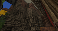


My test includes entrances from all of the wooden walkways around the building.
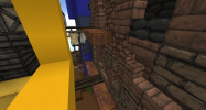
I am considering having one of the dormers be collapsed and repaired with wood on the inside.


My test includes entrances from all of the wooden walkways around the building.

I am considering having one of the dormers be collapsed and repaired with wood on the inside.
Last edited:
Share:


