Thamus' Texture Treasure Trove

Thamus_Knoward

Shadowbinder
The coins are nice, but the bags may be an issue since we not so recently changed then from all gold coins to a mix for the purpose of making sure they can be used from lower class at markets to upper class treasuries.

Adding these really large bags of money may negate that affect since I doubt a vegetable vendor in a rural area would lug around a sack of coins for their vegetables.
Yeah I get that, I was trying to go for a small leather purse, but yeah now that I've implemented it I realize they're Scrooge McDuck-sized money bags. Although the content could still be anything.. Apparently you need about 23520 half-pennies to make a single dragon... sooooo the small vendors are bound to have a lot of coins. And the bag doesn't give away what coins they are.

I'll try something smaller though to see if it works at the scale.
dc5880ea06.jpg
 

Thamus_Knoward

Shadowbinder
Yeah, I made the pouch much smaller (both left and right) and I think I'll try to stick to the native resolution (right side). The 64x64 one (left) feels odd against the material it's on:

p.png
 

AerioOndos

Donkey Lord
Staff member
Pronouns
they/them
I'd love the bag design without the coins maybe. We could easily just spread the block over 2 things. have the bag and have coins IF you want it to be a huge as purse. Have just the bag on a shelf. Have a leather merchant with one on their counter etc.
 
  • Like
Reactions: Margaery_Tyrell

Elduwin

Skinchanger
Just a warning: Coins are/were still used as crumbs/grain for chicken pens and that kind of stuff, which is already an issue because of the texture change to a mix of bronze/silver/gold coins. So might need to consider a way of removing/replacing all coin blocks used like that before adding something that might make it even less understandable.
 

Emoticone11

The Dark Lord Sauron
Staff member
We made an effort to kill off that use of the block ages before the texture was changed, and I'm not personally familiar with any uses of it since then. So I think it would only be present in very old builds.
 
  • Like
Reactions: thecoddfish

Elduwin

Skinchanger
We made an effort to kill off that use of the block ages before the texture was changed, and I'm not personally familiar with any uses of it since then. So I think it would only be present in very old builds.
Alright, thought i had still seen it a few times, but ignore me if it's no longer an issue ;)
 

Thamus_Knoward

Shadowbinder
I've been giving the pink stone a go. I've had permission to revamp our basic doku stone textures for it so here's what I have:

24ddec6cfb.jpg


It's a heavy work in progress but essentially the plan is thus:


So in the reference pics I see roughly three sizes of stone blocks/ “bricks: small, mid, and large. I have a feeling that the mid and small sized ones will be most common with the large blocks only working well as the foundation stones for larger structures. The small one would also be used to stuff holes in walls of the mid and large sized blocks. All three will get random tiles so they could be used without needing to be mixed with other blocks. And on-top of that I’d like to try making the textures account for erosion discoloration by adding a larger repeating overlay. I’ll try to make these blend with dun and reach using overlay CTM.

What you see here is the result of a sweaty make'n'break sess. Heavily WIP, stuff is broken, textures aren't pixel perfect and there's a few CTM bugs, but one thing I'm adamant about: I'm not retouching old doku textures, so the style will roughly stay as-is.
 

Attachments

  • Pink.zip
    176.3 KB · Views: 4

AerioOndos

Donkey Lord
Staff member
Pronouns
they/them
I am absolutely loving the smaller bricks and the foundation bricks that look like they pop out in the centre. Brilliant work Tham, especially with the edges getting darker. Very nice touch
 

Jakethesnake8_8

Firemage
Pronouns
he/him
i like the block in terms of colour, but I don't know how well it fits the rest of the server blocks. the overall texture looks like a city texture pack as opposed to the style of the other blocks. I'm not really sure how to describe it properly sorry, but I think the bricks at the bottom look too clean in terms of shape. perhaps by rounding off the corners that might undercut the modern-ness?
 
  • Like
Reactions: ContraBlonde

EStoop

Knight of Fairmarket
Masons in the middle ages were actually quite capable of making square stones that might appear modern because we're not used to see them in buildings that are over 500 years old.

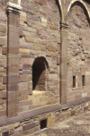
Some types of stones are a lot softer than others, and thus wear and tear more over the years. To give an indication of how much stone can be worn down, check out this facade where they elected to replace stones in their original state:
1614358866546.png

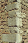
And this corner in which the lowest stone has been replaced:
1614359000673.png

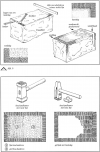
Check out the picture below to see how a relatively rough block gets worked into a neatly finished stone. This only portrays a handful of possible finishes.
1614358648188.png

However, I do get where you're coming from. Rather than rounding the corners maybe try making the mortar between the stones lighter like you did with the small stones.