Approved Project Application: House Melcolm of Old Anchor
- Thread starter Enah
- Start date
-
- Tags
- emoticone11 in progress
-
The Spring 2023 edition of The Rookery is now out! Take a look to see the latest builds, guides, progress and development updates on the upcoming 1.18.2 switch. You can read it here:
https://indd.adobe.com/view/f943da18-ed77-4d55-845d-fee9bfa14247
You are using an out of date browser. It may not display this or other websites correctly.
You should upgrade or use an alternative browser.
You should upgrade or use an alternative browser.
You already know this, but close-studding has not been sanctioned for the Vale. I think we need to try out best to keep it special or it's just going to be everywhere. Definitely make use of that green and blue D&W though! It's one of the few areas we've earmarked to use those colours.
I would also say that stone/brick infilled timber frames are historically all or nothing and the mix-and-match styles of infill you have in some of your tests tend to clash. In general there are a lot of mixing of palettes which I like, but I can't figure out exactly what the through-line of all the tests are. What defines the Old Anchor, or eastern Vale style? As a trading hub I would expect the occasional style-outlier, but to have no general coherence, especially outside the main town, might be a little confusing.
I'd like to see just a little more of the Ironoaks palette in your castle test. Or are we saying the stone/render blocks are passé? And if so what are the implications of that for our server?
Could you possibly upload a larger version of your map? Can't quite get a read on all the details. Could you also add some labels or a list for the kinds of minis you might include?
Could you give us some more information about the town? Number of houses etc, again hard to see the layout on the map. Same goes for the castle layout.
The close studding I would argue shouldn't be treated as special special, as it is found in examples from across all of Europe.
I used more neutral colours, which is typically found on German and Swiss houses, don't like the green or blue was done, they just seem... too THERE to me, the yellows are fine and Stoop and I have made decent yellow facades (had forgotten to include those) but the others I can't get to work right. I have updated the app with the missing images of the current palette and facade tests.
I don't understand what you mean about infill, since there are examples of houses in Europe using bricks to patch up in later centuries but retain the wattle and daub when it wasn't damaged. If that's too modern then I would suggest we have to take into account the neogothic look of the stormlands as well. If you mean the brick base, that's just a base and is no different than we have used elsewhere on the server until this point, excepting it uses one new block for decoration. I will however use wattle fencing as is done at Maidenpool to represent exposed wattle
I will not be using the Ironoaks palette as everyone wanted me to retain the castle of Old Anchor by Emileld or use it's palette. So I chose to use it's palette. Stone and render is the stone and whitewash right? It is what I was trying to achieve based on how salt corrodes and what was already in place with OA Castle. I was trying to give it a realistic approach via crumbling bits and like we do with more recent palettes for whitewashing. If perhaps we had better blocks for such, then I would more willingly use the Ironoaks palette instead. However, we are rather short of blocks to give the vale something nice unless we want it blue/green or stark white.
The town is has approximately 49 houses, which is I believe 8-10 less than is at Bandallontown aka Blackwell. There's to be mostly signs of former glory while less sparse in houses furnishing wise, more shabby appearances of roadways ands lanes, weeds and vines encroaching on the yards, thoroughfares and houses. Beginnings of a silted harbour. It's just an old port town, nothing too special about it.
I do not plan to have any minis, hence why I have not included them.
The castle is just a small hall/solar/sitting area and kitchen, a lord's tower for bed chambers and what have you, a great barn for storing food, supplies and a stable, a tower for the maester and the guards. It's a small castle, not much to it but it feels larger due to the bailey. Layout/mini is included in the app now.
Apologies about the image quality, I didn't realize GoogleDocs didn't enlarge them lol.
Thanks for the additional images Enah, and I really like your castle layout. I hadn't considered you wanted to keep the old OA palette, I like your reasoning that this is more weathered and therefore less "clean" than the Ironoaks palette.
Palette issues:
1. The question of colours, patterns is something we need to nip in the bud. If you don't want to use the green or blue blocks, that is totally fine, but you can't replace them with blocks unique to other areas. If you want to contest that, I would suggest making your arguments here before seeking approval to use them in this project.
2. I like the lower class tests provided the close-studding is removed.
3. The image you linked is of modern bricks. (if I saw that in my job irl I would cry, it's likely caused some damage to the historic timber).
4. I didn't explain myself well with regards to the brick/stone infill blocks being used in conjunction with daub infill. I have yet, in many years of research and experience, come across a medieval building which has half brick/stone and half daub/plaster infill.
The brick infill was, as you say correctly, always added later. Sometimes as a fireproofing measure, sometimes as a cheap replacement, sometimes just for aesthetics. When this brick infill occurs, it sometimes is in patches, but usually it happens to the whole building, and never just the bottom storey as indicated by some of your tests. If you can find an example of a building which has a timber framed ground floor with brick infill and and upper storey of daub/plaster, I will happily stand corrected.
To be clear, this is the kind of thing I am objecting to:


Here are a few more decisions I question, but don't totally object to, just pointing them out:

Why is there timber framing only just under the roofline?

How is this brick dormer supported structurally?

Same here.

Shouldn't this jetty be supported by timber instead of stone?
A few other points:
Will an update of /warp oaquarry be included?
Will you update or remove /warp whytehaven? (though tbh I'm not sure what project this is/was a part of).
Generally, what kinds of trees are you planning on using for the forested areas?
Your map seems to indicate the removal of /warp mooreseptry, is that the case? The map seems a little out of scale with the dynmap so maybe the plans don't actually extend that far?
Sorry for the rigmarole, just trying to get a better idea of what you are envisioning and understand how we as a community are stylistically defining this region. The Vale has always been slightly problematic in this regard. Anyway, you can ignore my feedback if you want, approvals aren't up to me.
Palette issues:
1. The question of colours, patterns is something we need to nip in the bud. If you don't want to use the green or blue blocks, that is totally fine, but you can't replace them with blocks unique to other areas. If you want to contest that, I would suggest making your arguments here before seeking approval to use them in this project.
2. I like the lower class tests provided the close-studding is removed.
3. The image you linked is of modern bricks. (if I saw that in my job irl I would cry, it's likely caused some damage to the historic timber).
4. I didn't explain myself well with regards to the brick/stone infill blocks being used in conjunction with daub infill. I have yet, in many years of research and experience, come across a medieval building which has half brick/stone and half daub/plaster infill.
The brick infill was, as you say correctly, always added later. Sometimes as a fireproofing measure, sometimes as a cheap replacement, sometimes just for aesthetics. When this brick infill occurs, it sometimes is in patches, but usually it happens to the whole building, and never just the bottom storey as indicated by some of your tests. If you can find an example of a building which has a timber framed ground floor with brick infill and and upper storey of daub/plaster, I will happily stand corrected.
To be clear, this is the kind of thing I am objecting to:

Here are a few more decisions I question, but don't totally object to, just pointing them out:

Why is there timber framing only just under the roofline?
How is this brick dormer supported structurally?

Same here.
Shouldn't this jetty be supported by timber instead of stone?
A few other points:
Will an update of /warp oaquarry be included?
Will you update or remove /warp whytehaven? (though tbh I'm not sure what project this is/was a part of).
Generally, what kinds of trees are you planning on using for the forested areas?
Your map seems to indicate the removal of /warp mooreseptry, is that the case? The map seems a little out of scale with the dynmap so maybe the plans don't actually extend that far?
Sorry for the rigmarole, just trying to get a better idea of what you are envisioning and understand how we as a community are stylistically defining this region. The Vale has always been slightly problematic in this regard. Anyway, you can ignore my feedback if you want, approvals aren't up to me.
I did not realize that was mooreseptry lol, but, my map is fully to scale. 1 block is 1 pixel. I also did not know it had a quarry D:
Regarding the large brick base with timber frame, I had it originally as brick solidly, but, it felt overbearing and I didn't like it as plaster or stone either. I'd be happy if someone can make the plaster/stone work better for me though!
Timber buildings throughout France, Germany and Switzerland have stone corbels in many places, not just timber. However, the questioned example of mine is just stylistic, as in plastered timber to look stone. Can always not include it,
Brick dormer can easily be red plaster or blue or whatever it can be. The white is Rendered plaster shaped like stone, a common element on timber buildings.
Timber under eaves this one in Basel is on a wall, this from a vidya game, based on architectural evidence from the time, Stein am Rhine
I like my lower class rural houses with the studding, as it'd be more realistic. As others know I try to keep things as realistic as possible, especially given the world is technically all thatch roof cottages with tiny houses and only pine trees and oaks and grey stone castles. Thanks GRRM
I am open to feedback, I might not like it, but I am open to it.
Thanks for addressing my points Enah. I'm not sure your map is to scale though. Compare for example your town and castle to those of nearby Runestone and Mooreton. In any case, I don't think anyone can be expected to draw perfectly to scale. It's a great map, and I'm sure the kinks will get worked out in game when you start plotting 1:1.
Just make sure you get approval to remove/update the Moore septry before starting work around there.
Just make sure you get approval to remove/update the Moore septry before starting work around there.
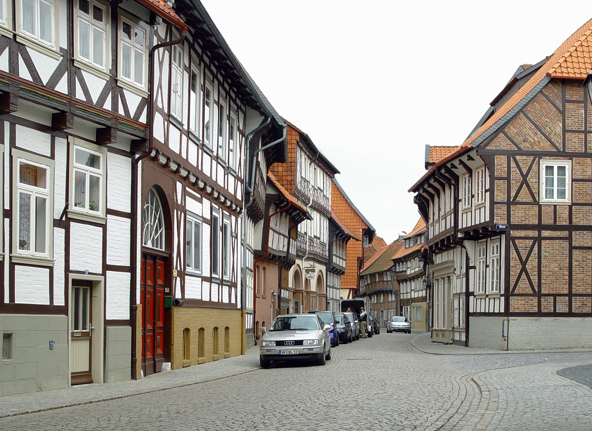
The building on the left on the picture below has (painted) brick infill on the ground floor and daub infill on the storey. Pic is of Hornburg.4. I didn't explain myself well with regards to the brick/stone infill blocks being used in conjunction with daub infill. I have yet, in many years of research and experience, come across a medieval building which has half brick/stone and half daub/plaster infill.
The brick infill was, as you say correctly, always added later. Sometimes as a fireproofing measure, sometimes as a cheap replacement, sometimes just for aesthetics. When this brick infill occurs, it sometimes is in patches, but usually it happens to the whole building, and never just the bottom storey as indicated by some of your tests. If you can find an example of a building which has a timber framed ground floor with brick infill and and upper storey of daub/plaster, I will happily stand corrected.
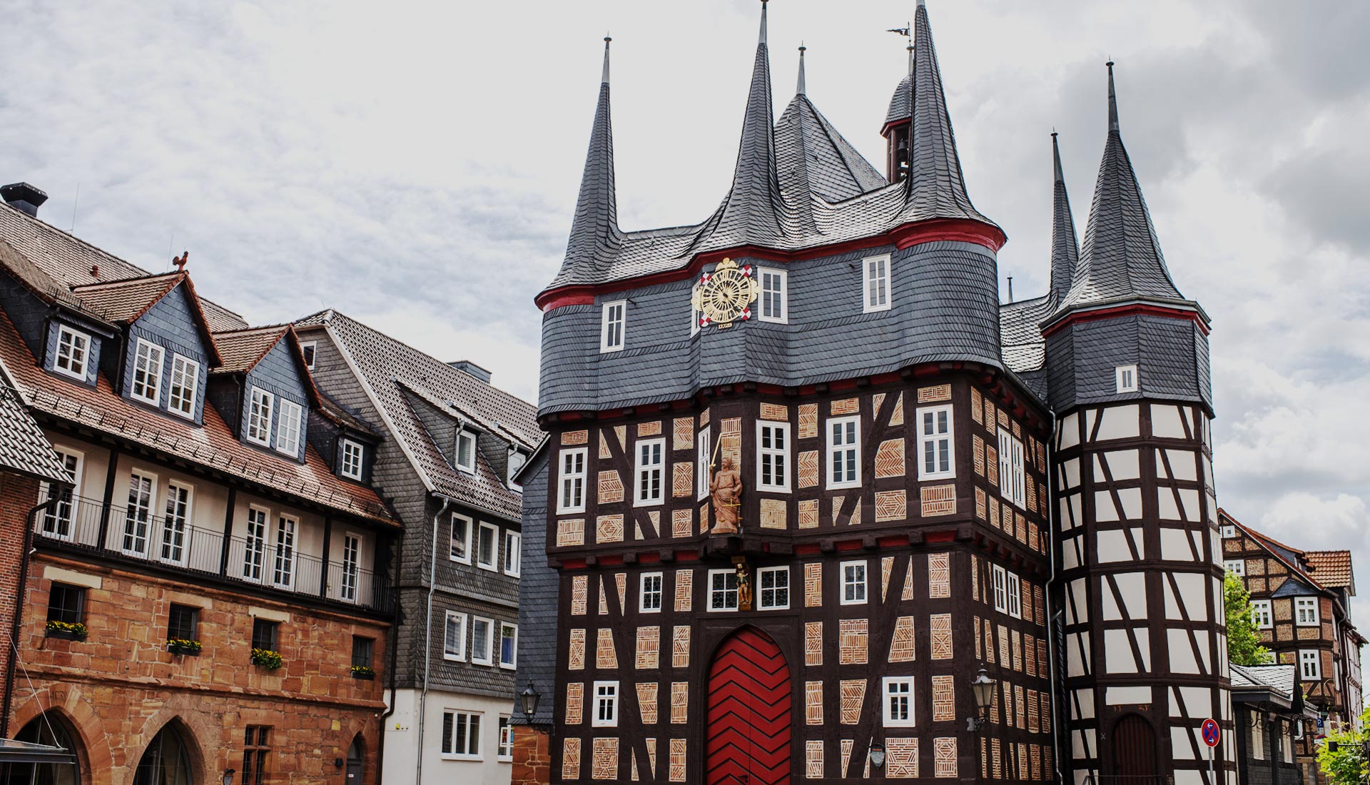
This town hall in Frankenberg has daub and wattle infill in one of its towers.
This building has bare stone between storeys as filler, though I can't tell wether it's just those areas or if all infill is made of stone and then plastered over. Judging the timber frame on the facade's top right I'd say only those areas are filled with stone, as the stone protrudes a little beyond the framing.

Then there is this:

Some reference from England as well, The Yeoman's House.
Hey Enah, great application! Like others said, amazing map. I'm glad to see you have ambitious plans for a region that's needed some love for a while.
Regarding the house style, I agree with what Dutch said above. I don't think that close-studding should be used at all in the Vale. It feels distinctly "English" to me, whereas for the Vale our style has tended to be heavily inspired by middle/high German and Swiss architecture. From all the images I've seen, it doesn't seem like close-studded timber is used much at all in those regions.
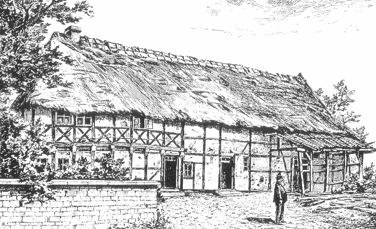
For instance, see the sketch in this Wiki article for a traditional Middle German farmhouse (BTW, these farmhouse Wiki pages with floorplan diagrams are a great resource for inspiration!):
 en.wikipedia.org
I've found this page, which is a gold-mine for our German-inspired regions:
Not a single one of them seems to have close-studded timber, though. (BTW, peep this house with blue infill).
Some more assorted examples of stuff I've found around google images:


(Another blue infill one!)

As for the colors used, due to the fact that Old Anchor is the largest town within a fairly big radius from Gulltown (I suppose there's also Runestone, but I'm not sure if that settlement should be as large due to its proximity to Gulltown), I had imagined Old Anchor as being sort of like a "mini-Gulltown" stylistically, in a similar way to how Duskendale is sort of like a "mini-KL" with minor stylistic variations to make it feel distinct. Now, Gulltown is also marked to use the northern yellow timber, but the blue/green are expected to be the predominant (colored) variant. Old Anchor is quite a bit smaller, and using too many colors would seem pretty eclectic, which is why I had envisioned it just using the blue/green here and there.
Overall, I'm just concerned that you're trying to mix too many different and eclectic styles and materials into a small town. For instance, the whitewashed timber house feels completely out of place (and is also out of place relative to the regional map as well), and I don't really understand why so many different stone types are being used for foundations. I think you need to focus a bit more on establishing a coherent style for the town, based on a limited palette and timber frame set. Unfortunately we don't really have a tentative style for Gulltown yet for you to draw from, but I think this is an opportunity for you to "set the scene" for development of the Gulltown style so to speak, based on the coarse ideas and inspiration that we've thrown around so far.
EDIT: BTW, I'd add that (as is always the case when just adding a new type of regional block), the colors of the Gulltown blue & green plasters are flexible to change in the future, if we need to. If you don't like them or are having trouble making them work in practice, I'd encourage you to make a post saying as much in the official resource pack thread, rather than just avoiding using the blocks.
Regarding the house style, I agree with what Dutch said above. I don't think that close-studding should be used at all in the Vale. It feels distinctly "English" to me, whereas for the Vale our style has tended to be heavily inspired by middle/high German and Swiss architecture. From all the images I've seen, it doesn't seem like close-studded timber is used much at all in those regions.
For instance, see the sketch in this Wiki article for a traditional Middle German farmhouse (BTW, these farmhouse Wiki pages with floorplan diagrams are a great resource for inspiration!):

Middle German house - Wikipedia
 en.wikipedia.org
I've found this page, which is a gold-mine for our German-inspired regions:
Houses and Barns, Germany, Exteriors
www.maggieblanck.com
Not a single one of them seems to have close-studded timber, though. (BTW, peep this house with blue infill).
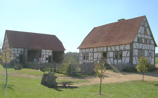
Some more assorted examples of stuff I've found around google images:


(Another blue infill one!)

As for the colors used, due to the fact that Old Anchor is the largest town within a fairly big radius from Gulltown (I suppose there's also Runestone, but I'm not sure if that settlement should be as large due to its proximity to Gulltown), I had imagined Old Anchor as being sort of like a "mini-Gulltown" stylistically, in a similar way to how Duskendale is sort of like a "mini-KL" with minor stylistic variations to make it feel distinct. Now, Gulltown is also marked to use the northern yellow timber, but the blue/green are expected to be the predominant (colored) variant. Old Anchor is quite a bit smaller, and using too many colors would seem pretty eclectic, which is why I had envisioned it just using the blue/green here and there.
Overall, I'm just concerned that you're trying to mix too many different and eclectic styles and materials into a small town. For instance, the whitewashed timber house feels completely out of place (and is also out of place relative to the regional map as well), and I don't really understand why so many different stone types are being used for foundations. I think you need to focus a bit more on establishing a coherent style for the town, based on a limited palette and timber frame set. Unfortunately we don't really have a tentative style for Gulltown yet for you to draw from, but I think this is an opportunity for you to "set the scene" for development of the Gulltown style so to speak, based on the coarse ideas and inspiration that we've thrown around so far.
EDIT: BTW, I'd add that (as is always the case when just adding a new type of regional block), the colors of the Gulltown blue & green plasters are flexible to change in the future, if we need to. If you don't like them or are having trouble making them work in practice, I'd encourage you to make a post saying as much in the official resource pack thread, rather than just avoiding using the blocks.
Last edited:
The building on the left on the picture below has (painted) brick infill on the ground floor and daub infill on the storey. Pic is of Hornburg.
Fascinating! Yes this is precisely the kind of thing I would not expect to see. The picture does a nice job of showing how rare this arrangement is, as all the other buildings seem to be completely brick infilled.
This town hall in Frankenberg has daub and wattle infill in one of its towers.
Oh yes, no problem with vertically arranged sections, only when one is atop the other.
This building has bare stone between storeys as filler, though I can't tell wether it's just those areas or if all infill is made of stone and then plastered over. Judging the timber frame on the facade's top right I'd say only those areas are filled with stone, as the stone protrudes a little beyond the framing.
Very interesting, looks to be a modern intervention to combat the rotting timber by filling into the hollowed-out areas of the timber lintel. I would agree the rest of it looks like ordinary plaster.
Then there is this:
Definitely another later intervention, likely to fill a window. Again, I have no problem with "patchy" infill.
Some reference from England as well, The Yeoman's House.
Another classic! Almost entirely rebuilt in the 1930's, so I'm a little sceptical about it's authenticity. I wonder if the white panels are hiding more flint or brick infill. My suspicion is that the stone (i think knapped flints) infills are "honest repairs" meant to identify where panels had been replaced. Another great example of a patchy and vertically arranged infill pattern.
Is there any way to use the close studding as purely accent then and only on a couple buildings? Like on eaves/windows. I’ll gladly scrap the white wood, and make the houses more plain colour wise, though I would fight for yellow simply because it is heavily used on buildings across Europe, whereas blue and green seems rather expensive and rare. And I hadnt thought of influencing the gulltown style in the least, I thought it was further away but it really is just a hop and skip and a jump away isn’t it.
To be honest, I've seen a few facade tests with the close studding used like that (i.e., mixed in as an accent) and I'm still super skeptical about it being used like that, just in terms of aesthetics. It looks gorgeous when used as a dominant material in a house, like in some houses at Maidenpool so far, but I feel like it really is an "all or nothing" block. I fear setting trends that won't age well when the hype wears off.
Regarding the yellow, I think it can be justifiable since it's a town so close to Gulltown, which will also most likely use it to some degree. I guess I'd just have to see another test with an attempt at a more refined palette using the yellow and/or blue and/or green plasters. Also, please do let me know if you think the blues and greens need any adjustments to be useable. If people agree, I can probably sneak in an update to them whenever we get the overlay CTMs.
Regarding the yellow, I think it can be justifiable since it's a town so close to Gulltown, which will also most likely use it to some degree. I guess I'd just have to see another test with an attempt at a more refined palette using the yellow and/or blue and/or green plasters. Also, please do let me know if you think the blues and greens need any adjustments to be useable. If people agree, I can probably sneak in an update to them whenever we get the overlay CTMs.
I will, i was gonna do it and search for the plasters after I got home
bump, i updated the images and map, simplifying a lot of facade tests and incorporating green plaster
Hey Enah, great update!
Since the OP I plotted the borders of the OA project, and am pleased that your plans more or less cover the allotted area. Especially pleased that the mountains to the north are getting some much needed TLC.
The only thing you are missing at the moment is the coastline to the south towards Whytehaven, which I believe was part of the old OA project.
Would you consider inheriting this area as well? Would be nice to have the coastline up to the bridge at Ironoaks (SE of ironoakshamlet1) spruced up a bit.
The new tests are great, especially fond of this view:
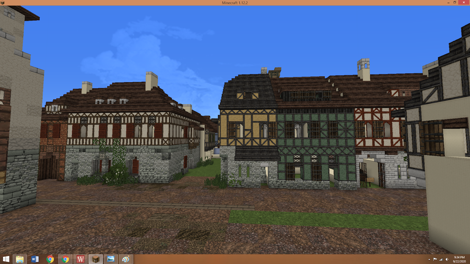
can totally do that, just didn’t really have a bunch of room in the map itself will post any plans for there in a follow up reply
Share:


