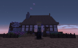
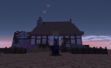
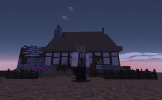
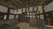
Dadsday105 Builder Application

Dadsday105

Mummer
Guest
What is your age?
13-16

In what country are you living?
Australia

Where did you first hear about WesterosCraft?
Searched online

What do you like the most about GoT/ASoIaF?
The world is what brought me in, that and having a friend rattle on about it for a year. At this point, the thing I enjoy most about GoT is arguing with my friend about what would happen if people hadn't died. Oh, and Oberyn Martell has to be my favourite.

What is your favorite build on our server?
There are a lot of places like the one I'm going to describe across the map, but x=7446 y=25 z=16975. Someone took the time to make a place off to the side, that just make the world feel more lively. I also stumbled across a planned out area for massive farmland. The sort of small scale builds that go a long way for the world, even if they aren't often the most marvelled at. Those ones.

Why do you want to join our server?
Game of Thrones is the sort of property where the world has so much detail that's just waiting to be explored. I have a serious interest in a version of this world that is complete. I imagine that's the reason this was made to begin with. The fact that it's minecraft, which I've been building in for nearly a decade now, is why I felt inclined to at least offer to help out. I will promise that I'm not going to be the best builder that you could ever possibly have. But I will promise that I have the patience to do the long and repetitive building. That's what Game of Thrones means to me. The small things.
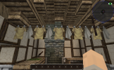
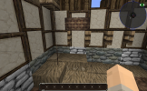
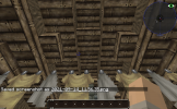
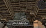
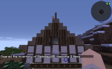
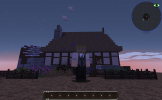
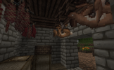
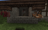
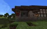
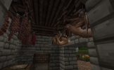
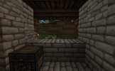
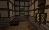
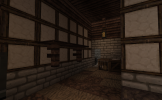
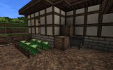
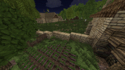
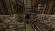
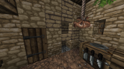
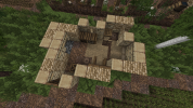
2021-09-14_11.56.22.png2021-09-14_11.56.35.png2021-09-14_11.56.43.png2021-09-14_11.56.46.png2021-09-14_11.58.55.png2021-09-14_11.59.24.png2021-09-14_11.59.26.png2021-09-14_11.59.28.png2021-09-14_11.59.30.png

Did you follow the application rules?
You know nothing, Jon Snow

Note on edit: I did include screenshots of the garden and back of the house originally, but the files are apparently too big for the server to handle
 

Ric

Ser
Staff member
Hey Dadsday!

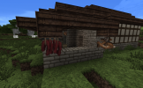
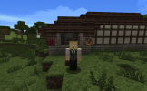
Thanks for applying and also sorry for the wait. Looks to me that you did a good job on the app house, but I notice a small issue: you're either not with the Resource Pack on or haven't installed Optifine, so some of our blocks are not being displayed corrently, like the wattle and the clothesline. Here's how they should appear:
1632230283567.png
I suggest you check if both our Resource Pack and/or Optifine are installed and working well. You can also make a post in out Support subforum or in the #techsupport channel in our discord server if you're having trouble with that.

Once that is fixed you can start working on your next challenge. For these next challenges you should make your own original houses in the style of the ones in the project locations I'll point out to you. Try looking on how the style of the project works, the blocks used and how they are used and other commonalities between houses, then build your own and share the screenshots here. If you haven't already please take a look at our Basic Building Guide, I'm sure you'll find it helpful.

So for the next challenge please build a house in the style of Hammerhall. You can find good examples at /warp hammertown. Please include a reasonably large yard as well, you can see examples of what I mean at the warp. If you have any questions feel free to ask them.
Good luck!
 

Dadsday105

Mummer
Guest
View attachment 10858

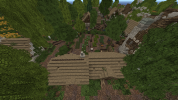
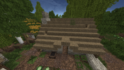
Here's the photos of the Hammerhall House. I put in a store selling meats and the wheat grown in the yard. I think I got Optifine to work, the Wattle Fences are loading in properly now. Please ignore the white stained clay around the garden, I only put that there as a barrier to prevent the dirt inside the yard from becoming grass.
 

Attachments

  • 2021-09-22_00.39.26.png
    2021-09-22_00.39.26.png
    936.7 KB · Views: 13
  • 2021-09-22_00.39.59.png
    2021-09-22_00.39.59.png
    949.4 KB · Views: 12
  • 2021-09-22_00.40.23.png
    2021-09-22_00.40.23.png
    1.3 MB · Views: 12
  • 2021-09-22_00.40.40.png
    2021-09-22_00.40.40.png
    853 KB · Views: 12
  • 2021-09-22_00.40.52.png
    2021-09-22_00.40.52.png
    1,014.2 KB · Views: 10
  • 2021-09-22_00.41.03.png
    2021-09-22_00.41.03.png
    938.2 KB · Views: 10
  • 2021-09-22_00.41.13.png
    2021-09-22_00.41.13.png
    1.1 MB · Views: 10
  • 2021-09-22_00.41.24.png
    2021-09-22_00.41.24.png
    1.5 MB · Views: 10
  • 2021-09-22_00.41.41.png
    2021-09-22_00.41.41.png
    1.7 MB · Views: 11
  • 2021-09-22_00.42.41.png
    2021-09-22_00.42.41.png
    1.5 MB · Views: 13
Last edited:
  • Like
Reactions: Gealrüable

Ric

Ser
Staff member
Hey Dadsday

Unfortunately I think that you missed some important details from the style in your house.

I think it would be better if you go again to the warp I suggested (/warp hammertown) and have another look at the houses. Take note in the commonalities between them: their shape, height, materials, furniture and other types of decorations. All of this can vary a little from one house to another, but when you look into the bigger picture you can see a sense of uniformity in the area. Don't worry about making the house quickly, take some time so you can learn the style and then give it a try; one of the purposes of these challenges is to teach you our style, so no pressure!

To continue your app, I would like that you do what I said: revisit Hammertown and again build a house of your own in the style of the area. Please also take more screenshots of the house, try to show it from all angles from outside, besides showing the whole yard and all of the rooms in the interior. About the stained clay, no worries; I know the grass spreading can be annoying.

If you have any questions about the feedback, feel free to ask.
Good luck!
 

Ric

Ser
Staff member
Hey Dadsday!

Sorry again for the wait, I was kind busier this week. But, about your house: unfortunatelly, again I think your submission is not up to date to our style, but I tried to better explain how so this time on a few points:
  • First thing I noticed was the roof. Not only in Hammerhal but also in many rural communities in the server we make houses with a roof style similar to the one you did for the apphouse. One of the reasons I asked you to make a house in this style is precisely because of how it closely resembles the apphouse. So for the roof in this case you want to use either the thatch stair block or a wood stair block, in a way similar to these:
2021-09-28_23.20.53.png
Notice how the roof goes along the longest side of the house too.
2021-09-28_23.21.12.png
You can also add some details to the roof, using grass or placing the stairs in a way that they leave small holes. Don't overuse those, though.
1633231280586.png
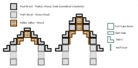
This image also shows how to make roofs. For small, rural houses you usually want to use the example to the left. Notice how you also have to use the rafters in the inside, to sustain the roof.
  • Your yard is mostly nice, but to make it more realistic and give it a feeling of being "lived-in" you could add some grass blocks in places where people wouldn't walk very often. Also, adding some gravel alongside the dirt blocks would make it look better too. Apart from that I think it could've been slightly bigger, as this house would be in a rural settlement where yards were the place to grow food and to work. You can see that in Hammerhal the yards usually stretch a few more blocks away from the houses. As a final note on this, I don't really understand the purpose of the vertical wood blocks you used, they look out of place.
  • In the interiors, the fireplace design you used looks a little odd. Using the furnace block or making a design similar to the one in the app house are good alternatives. While at that, I think making the kitchen utensils closer to the fireplace would make more sense, being more practical to cook that way.
  • For the thatch in ground, instead of making many small patches it's better if you use it as a single continuous carpet.
  • As a final point, the interior in general feels very empty. When making them try to keep in mind how someone living there would organize their things, what they would have and why. Some things you can try to add are baskets and sacks (good to store food), clotheslines and other types of furniture (you can see examples of them at /warp ikea). Adding some windows would also help making the place feel more lived-in.
I hope the feedback can be of help! I think it's worth giving Hammerhall another shot, so please again make a house in that style. No need to rush it, try to consider the feedback I gave you and feel free to have a look around /warp hammertown again for futher inspiration, both in exteriors and interiors. If you have any questions feel free to ask.
Good luck!
 

Ric

Ser
Staff member
Hey Dadsday,

Nice improvement with this house! The exteriors are looking mostly good, but there are a few points on house that still need some work:
  • In the house exteriors, I think that the chimney you made looks kind clunky at the base. That's because of how you made the fireplace in the interiors, with it being one block "inside" the wall. It's okay for it be aligned with the wall and in this case I think it would work better.
  • The yard feels empty. It can be a little tricky filling a yard without doing too much or too little, but try to keep in mind that this would be the space used to grow a good part of what they eat and, depending on their profession, also where they would work. Some things you can do to use more space (without filling it too much of course) is adding space for animals, like a chicken coop, a few more crops, small bushes, having carts, a space to cut firewood, etc. You can see examples of these and more throughout the whole server and some at /warp ikea. Also, try to mix the gravel along with the dirt, not leaving it only in the "borders".
  • The crop you made with the fences doesn't look very right. That fence block is meant to be used along with the leaves with grapes, not on it's own. It's very odd that it's placed on wood planks too. In general for that kind of crop I think a bigger yard or field dedicated to them works better than having a small place on a yard for them. You can see many good examples of alternative crops at /warp crops.
  • Last thing on the yards is that you left the grain sacks in the yard and open. This wouldn't usually happen, to avoid animals from eating the grains. Storing them in a closed or covered area, if possible above the ground, is preferable.
  • Be careful to not use the blocks with ropes on it (in this case the Hare Block) without having it hanged on something, like a rope for example.
  • Always cover all sides but one of the utilities block, like the drawers (you didn't do it in this area). Also in the same image seems like you used trapdoors as a shelf, something we don't really do anymore since anyone can just "open" the trapdoor and ruin the ilusion of a shelf. Instead you can use the "Oak Carpet", something usually done with an Oak Gate beneath it to represent the supports.
  • The interiors in general feel somewhat empty too. I suggest you try to create a story (within reason) for the family that lives in each house you make and from that arrange the house accordingly. Also try to imagine how someone living there would prefer to have things organized, usually trying to find a way that makes walking around the place feel more fluid.
That's it for now! I think now we can move to a different style, but do keep in mind all of the feedback so far. So for your next challenge please make a house in the style of /warp gaunt. Don't forget to make a reasonably large yard as well and please take a few more screenshots next time. If you have any questions feel free to ask.
Good luck!
 

Ric

Ser
Staff member
Hey Dadsday!

Good grasp on the Gaunt style, but I think there are some points where your house could still be improved:
  • In the yard I think the difference in height from one level to the other is too big. It would be better to either have the yard slope down more gently or to have a wooden or stony wall containing the dirt with a stair leading to the lower part.
  • Apart from that, I think the yard looks mostly good. I would just change the chicken area, instead of leaving grass it's better to change the ground to dirt and gravel too. The chicken coop itself could have a better design, you can find some examples at /warp ikea. But here's an example of a common design:
2021-10-16_18.09.53.png
  • Now in the house exteriors, first thing to notice is the use of double doors and having the stone blocks beneath them. I think making a 1x2 door would fit better the house, since it's just a small residential building for a family. About the stone, with the residents constantly walking over it even if there was stone foundations there it would be covered in dirt and gravel, so I would switch to those blocks. Also, you didn't use doors in the entrance to the yard.
  • I think the stone bricks you used in the base of the house here don't fit very well, I would replace them with cobblestone, making it like you did in the other sides of the house.
  • The timber pattern you used seems too busy to me. The main idea of them is to support the walls, which you seem to have followed and that's good, but to make them more aesthetically pleasing you could experiment with the horizontal and vertical patterns too and even some windows. I've left a couple examples bellow. Also, I would avoid using the horizontal pattern in more than 3 in a row, as it might look too long to be stable.
2021-10-16_18.20.38.png
2021-10-16_18.21.00.png
  • You usually want to avoid using the "Lantern" block in low-class houses, since the glass used in them would make it very expensive for peasants to buy. If you want a way to light the house having windows is usually a better way in these cases.
  • Here I think you used too much of the "kitchen utensils" block. Usually using just a couple of them is enough, having too many looks kind odd. In their place you could also use the "Cabinet" block (but be careful to not use the ones with glass, since they would be too expensive).
  • The house is also missing a fireplace that they would use for heating and, specially, for cooking. A table or storage area for them to use would also be a good way of using a little more of the space.
That's it! Hopefully the feedback can be of help, I see you're progressing. For your next challenge please make a low-class house in the style of Hamell (/warp hamell and /warp hamellham1 both have good examples), again including a yard. If you have any questions feel free to ask.
Good luck!
 
  • Like
Reactions: Dadsday105

Ric

Ser
Staff member
Hey Dadsday!

Sorry for the wait! You did a nice work with the house, I can see you're progressing and improving, but there're still some points for feedback:
  • I think the walls around the yard need some improvement. For this case would be better to have them following the terrain rather than going into it and keeping the same height only in relation to the ground, but not too tall (1 or 1.5 block high should be good). It's also better to mix another block with the vivid sandstone, like in the example:
2021-10-25_22.24.30.png
  • Still on the yard, when placing crops it's better to make sure the block beneath them is different from the dirt and gravel used in the paths. Farmland and/or mud are usually good choices for that.
  • You also have a lot of parnships stored, plus the ones already grown. I think you could have some more empty or closed crates and baskets in the place of the ones open as to not make it feel like you have too many of one crop.
  • The tip on top of the chimney looks somewhat out of place. I would stick to use either an arrow slit with a slab on top or just a wall block.
  • On interiors the first thing I noticed was the fireplace. I think it looks too big and fancy for a house of a low-class farmer. I would go for something simpler, maybe even just the furnace block.
  • For long tables, don't use trapdoors as part of them, as in the server someone else would be able to open it, ruining the table. It's better to use either slabs or carpets.
  • Having the shelves and cabinets on both sides of the house seems too much. One of them should sufice, remember that the people that would live there wouldn't have much to spend and having that duplicate wouldn't be necessary. I also don't understand the wood in the ground here. I think having just dirt and gravel would be better.
  • The interiors in general feel very empty. I would suggest you divide the house into imaginary areas, each area being dedicated to something (for example: one area for kitchen, another for bedroom, another for storage). This way it's easier to fill up space, but always keeping in mind to not make the house too crowded. As you have higher house you could even have a loft, that could be used for storage or bedroom.
That's it! For your next challenge I think it's worth trying again the Hamell style. Try to improve the same house you made using the feedback I gave and post it here again, please. I suggest you have a second look at Hamell for extra inspiration too, you might find some good ideas, specially for interiors! Feel free to also send me any questions you have.
Good luck!
 
  • Like
Reactions: Dadsday105

Ric

Ser
Staff member
Hey Dadsday!

Good job! I can see some good improvement, but some things still aren't quite there. Here's my feedback:
  • In the yard, I believe the walls are better and I notice that you changed the ground beneath the crops! But just removing the crates and baskets made the area feel too empty. In their place you could add other things, like a tree, bushes, a place for animals and/or even another crop. Also, you can mix some gravel along with the dirt, like how you did in the house interiors.
  • The new chimney looks too clunky, it has the same problem the one you made in the 3rd attempt of the Harrenhal style; that is, having the furnace one block "inside" the wall. It would work better to have the furnace aligned with the wall instead, with a simple line of blocks coming up from it. Like this one:
2021-11-01_23.40.43.png
You can also use a stair like that beneath the furnace and add firewood (like the example), embers or ashes beneath it.
2021-11-01_23.39.05.png
This is an alternative design that also doesn't occupy too much space.
  • About the way you organized the interiors, I think it's better but it could still have some more work put into it. For example the area for the kitchen could have a table for them to eat, maybe a thatch carpet on the ground to use a little more space without filling it too much. Here's an example of a house in Hamell, notice how the house is divided in subareas and how the builder decided to organize them:
2021-10-31_15.14.55.png
Despite being a very small house, you can see how there're small areas for different activities. The upper left corner is used for cooking, the lower central and left parts for a little storaging and with the table, for eating. And the right part of the house is used as a sleeping area.
  • The bed design is somewhat odd too, with just one bed beneath the cabinets. You could instead have the area for the beds be more apart from the rest of the house, instead of being right in the way into/from the kitchen. You can notice a good way of doing it in the "Example 2", with two beds together in their own area of the house.
  • In this image the stone blocks on the ground and the ones being supported by the rafters look odd, specially the ones in the rafters. I would replace them with dirt (for the ones in the ground) and the normal roof (for the ones in the rafters).
  • The storage area could be improved too. Instead of using just one table following the walls, you could have one or more shelves and even cabinets or drawers. Some of the baskets and crates could just be left in the ground too, just be carefull to not make the area too messy.
That should be it! For your next challenge please make a low-class house in the style of the Tor. You can check /warp torhamlet6 for a nice guide and some examples nearby, but also /warp torhamlet5 for more examples of finished houses. Feel free to ask if you have any questions.
Good luck!
 
  • Like
Reactions: Dadsday105