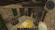
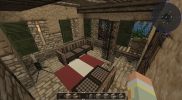
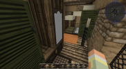
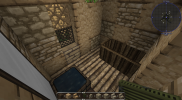
Constantinel Builder Application

Constantinel

Storyteller
Guest
What is your Minecraft username?
Constantinelia

What is your age?
21-24

In what country are you living?
Greece

Where did you first hear about WesterosCraft?
Youtube

What do you like the most about GoT/ASoIaF?
My favourite characters are Olenna Tyrell, Tyrion Lannister, Margaery Tyrell, Cersei Lannister and Loras Tyrell. My favourite region and castle are Highgarden and the Reach in general. I love the cinematic universe but recently I have started reading the books.

What is your favorite build on our server?
As mentioned above Highgarden seems incredible in the server. Its true glory shines way better than what we see in the show and it's trully magestic and huge. It's the build I would definetely choose to live in from the entire server.

Why do you want to join our server?
The whole server looks incredible and I would really enjoy building for you. It has been almost a year since I joined the server and I see that its progress has slowed, I'd really love to help! I am good at copying but although I don't have a lot of experience I could build improvising.
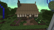
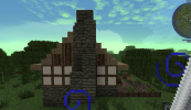
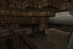
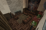
1.png2.png3.png4.png5.png6.png7.png8.png9.png10.png

Did you follow the application rules?
You know nothing, Jon Snow
 

Emoticone11

The Dark Lord Sauron
Staff member
Hey Constantinel,

Sorry about the wait! From now on, feel free to ping me if it's been several days with no response, I'll try to get back as soon as I can.

Nice work with the apphouse! Not really seeing any issues with it. Hope the exercise was helpful for learning our server's building style. For subsequent challenge builds, you'll be expected to build original houses of your own design, in the style of specific locations on our server. However, I recommend thinking of it similarly to the application house - except now, instead of simply replicating a house, you should try to replicate particular elements of multiple houses, and synthesize them into an original creation. After each one I'll give some feedback.

For the first challenge build, please make a medium-size house in the style of /warp whitegrove, with a yard. Let me know if you have any questions about anything. Good luck!
 

Batelgause

Royal Messenger
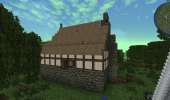
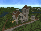
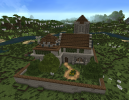
Medium-size house in the style of /warp whitegrove, with a yard
More photos:
hey! I wanted to point that out , although this looks lovely i wouldnt call this a medium-sized house but a holdfast or manse . in application , your main goal is to prove you know the server standarts and can adapt yourself to different regions/clasess . therefore , you should keep it relatively smaller but up to the standarts and add small details from yourself rather than building big luxorious buildings . i think checking out other applications may help as well .

good luck with the app!
 
  • Like
Reactions: Constantinel

Emoticone11

The Dark Lord Sauron
Staff member
Hey Constantinel,

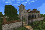
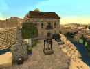
Like Batel said, this is more of an ambitious build than I had in mind (I was looking for an ordinary house, such as you might find in the Whitegrove town, rather than a manse). It looks like you got the Whitegrove style down overall, though, so I can still work with this.

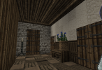
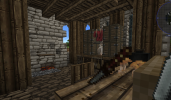
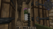
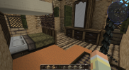
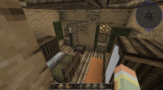
Overall you did a nice job with the layout of the manse, and I'd say that the interiors in particular are really solid! Here's some of the feedback I have:

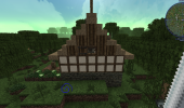
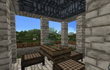
- The roof designs need a bit more work. Try to avoid rooves that are overly flat, or that lack structure (such as this one). Additionally, with this roof you want to have a clean overhang rather than the staggered stair blocks - but note that pyramid rooves are pretty uncommon in general.

- In general, I would recommend avoiding unnecessary detail for the sake of detail in the exteriors. An example of this is the ledges on the corners of the tower. It's usually better to build simple structures (but laid out in interesting ways), and add detail through subtle gradients (see /warp gradient on the server for a tutorial), foliage, and other realistic elements.

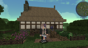
- In the yard, it would be nice to see some vegetable patches and herb gardens rather than decorative flower gardens and grass. A manse/manor would likely still have some level of food self-sufficiency, with peasant servants tending to the gardens and taking care of animals. Decorative gardens were not very common IRL until the Renaissance, so would not really be widespread in Westeros except perhaps the very wealthiest locations.

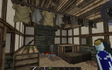
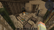
- When using heavy materials like slate for a roof, try to make sure the interior of the roof is supported with wooden rafters - here for example. You can take a look around houses with slate rooves on the server to get an idea of how to do this.

- I'd avoid using the "Baelors orb block" for vases due to the rope going through it. I usually use marble wall/fence blocks.

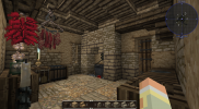
- When using cabinet/workbench blocks, try to make sure all sides except for one are covered by half door blocks or other furniture. Here for example, as well as the cabinets here.

- When you use vines, try to make sure they have a connected pathway to the ground, which they need in order to get nutrients and grow. For example, the vines on this wall should connect with the ground somehow.

Otherwise, you're off to a good start! Please let me know if you have any questions about the feedback above, or if anything was unclear. For the next challenge build, please make a medium-sized house in the style of /warp tortown. Be sure to study the style carefully. Good luck!
 
  • Like
Reactions: Constantinel

Constantinel

Storyteller
Guest

Attachments

  • 2022-03-23_22.34.18.png
    2022-03-23_22.34.18.png
    1.2 MB · Views: 11
  • 2022-03-23_22.34.30.png
    2022-03-23_22.34.30.png
    1.1 MB · Views: 2
  • 2022-03-23_22.34.42.png
    2022-03-23_22.34.42.png
    1.1 MB · Views: 2
  • 2022-03-23_22.34.57.png
    2022-03-23_22.34.57.png
    1.1 MB · Views: 2
  • 2022-03-23_22.35.29.png
    2022-03-23_22.35.29.png
    638.4 KB · Views: 2
  • 2022-03-23_22.35.52.png
    2022-03-23_22.35.52.png
    940.9 KB · Views: 3
  • 2022-03-23_22.36.09.png
    2022-03-23_22.36.09.png
    539.5 KB · Views: 4
  • 2022-03-23_22.36.41.png
    2022-03-23_22.36.41.png
    842 KB · Views: 4
  • 2022-03-23_22.37.04.png
    2022-03-23_22.37.04.png
    826.5 KB · Views: 11
  • 2.png
    2.png
    1.4 MB · Views: 12

Emoticone11

The Dark Lord Sauron
Staff member
Hey Constantinel,

Really nice work on this house, it's a huge improvement over your previous one in terms of style. The interiors again are a strong suit. I do have a little feedback, but most of it is minor:

- The plaster gradient is the main issue with the exterior. The stone brick blocks are mixed a bit too randomly with the plaster, which makes it look messy. Instead, you want the plaster to form larger continuous "blobs", with stone in areas where the plaster is fading or chipping (like around the base of the house and in corners). If you study the houses at the Tor a bit more you should see what I mean.

- Generally you want to avoid paintings except for in super wealthy households or castles, given that they would need to be commissioned and dyes were quite expensive. For a middle-class house (or even middle-upper) in a small town, they're probably out of reach.

- I'd also suggest toning down the chain candlestands a bit (perhaps trying alternatives with fence candlestands), as I usually associate those with wealthier households as well, but this is less important than the previous point.

- Very picky point, but the windows on the bottom floor for Tor houses should be 1x1 arrow slits rather than 1x2.

- I'd like to see a bit better utilization of the yard space still, as you have a lot of room for various vegetable and herb patches (there's some good examples at /warp crops on the server). Make sure they're appropriate for the region. In general, adding more 'immersive details' surrounding the house will help improve the exteriors.

For the next challenge build, please make a middle-class house in the style of /warp oatown, with a small yard. Let me know if you have any questions about the feedback above or the challenge style. Good luck!
 
  • Love
Reactions: Constantinel

Emoticone11

The Dark Lord Sauron
Staff member
Hey Constantinel,

Again pretty solid work on this challenge build, you're definitely coming along. I'll jump right into some feedback:

- Overall, the volume of the house seems a tad bit too large. While your interiors are still pretty good this time around, I notice there's a lot of empty space or filler material; these are all signs that the building is too big for the purpose it serves (large empty space can be good in particular cases if executed well, such as a castle hall, but should be avoided in residential houses). In general, I'd recommend giving yourself slightly smaller house footprints to work with for the challenge builds; the larger builds will come in time.

- I'd decrease the amount of windows on the second floor; the amount of blue shutters is a bit overwhelming. Also, I'd avoid using the extra shutters to cover up the sides of the windows on these overhangs. It's best to just avoid having timber frame windows on the very edges like that.

- The exterior gradient is a bit messy in some spots, notably the chimney. Avoid having the "river cobble" block touching the "faint light grey brick" block due to the harsh contrast between them.

- On the front facade, I think it might look better to "invert" the large stone brick pattern so it's used to accentuate the gable rather than in the middle of the facade. It just looks a bit nicer to have details like that accent architectural features, whereas having diagonal stone stripes in the middle feels a bit more awkward. Here's roughly how I'd modify that facade.

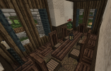
- The way that the rafters in this room end partway through, and then the ceiling is just flat, is pretty awkward. Also, with a room this large, it might look nice to have an extra layer of support for the ceiling (e.g. a couple rows of upside-down slabs right underneath the ceiling). Integrating vertical support beams (fence or wall blocks) with the rafters can also help make large rooms feel less empty. There's a ton of different ways to do rafters! I recommend just continuing to look around for different examples.

- Try to use a less bulky bed design than the one completely surrounded by half slabs.

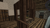
- I'd try a different hearth design here that doesn't require digging into the timber frame walls with half doors. Alternatively, it might look fine to cover those gaps in the walls with shutters and turn them into cabinets on either side of the hearth.

- Too many lanterns in the attic; they'd likely just have one that they carry around when necessary. They don't need a ton of lighting up there anyways.

- The garden is an improvement in terms of having useful food patches, but still feels pretty empty. I'd like to see a bit more effort into having immersive yards with lots of realistic details; you'll find plenty of examples of such details on the server to draw from. Also don't forget to gradient the ground mix with dirt, gravel, and possibly mud (with pine needles to transition) when applicable.

Other than those things, I'd say you did a good job with a fairly difficult town style! For the next challenge build, I'd like to see something more rural - please make a farmer house in the style of /warp gaunt, with a yard. As always, please let me know if you have any questions about the feedback or challenge build. Good luck!
 
  • Like
Reactions: Constantinel

Emoticone11

The Dark Lord Sauron
Staff member
Hey Constantinel,

Thanks for being patient; it's been a busy week for me.

Overall I think you got most of the elements of the Gaunt style, but there's a few significant issues with the execution that I need to point out:

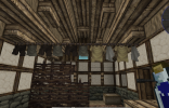
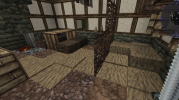
- It seems like you're still building the house in a style that's too large and wealthy for the intended style and profession (a farmer house). Your house is about the size of the largest building in Gaunt, which is a special build (tavern) rather than an ordinary farmer house. The interiors are also much too fancy for a farmers house; you're using the fancy table/cabinet blocks, paper blocks (peasants would not be literate), and rugs. Peasant houses should only have the "bare minimum" and represent poverty, which will be easier to do if you go with a smaller plot layout.

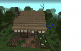
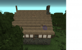
- The thatch roof is too messy; I recommend toning down the lumps a bit. You also want to avoid "pyramid" rooves for the most part. There's a single house in Gaunt that does the roof like this, but it's a much smaller house and on a diagonal, so it doesn't look as strange. Here's a really quick example of how you might instead do the roof for your house shape (the front side at least). Notice the more subtle partially hipped rooves, which are also used at Gaunt.

- Avoid having the long horizontal rows of plain timber frame (the one without the crossbeams), since it looks odd and isn't structurally sound.

- I'd like to see the garden polished off a bit more; it still feels very sterile and unfinished. You either want the unused space to have veggie patches or other immersive details, or to have foliage (bushes, tall grass, etc.) there - you never want just plain empty grass blocks.

Please let me know if anything is unclear; it's important that you're following the feedback. I'd be happy to provide more images showing examples of what I mean if it's helpful to you.

Before moving onto a different style, I'd like you to revisit the Gaunt challenge and build a smaller farmer house. I really recommend taking some time to explore each house in the main village, taking notes of the size and layouts of the houses, the sorts of furnishing they use in the interiors, etc. before doing this.