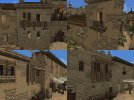
Berme Builder Application

Berme

Mummer
Guest
Pronouns
he/him
What is your Minecraft username?
Berme123

What is your age?
17-20

In what country are you living?
Spain

Where did you first hear about WesterosCraft?
Searched online

What do you like the most about GoT/ASoIaF?
What I like most about game of thrones is the architecture and the setting of the universe itself, which is why I am applying for this position.

What is your favorite build on our server?
There are many, of course, but I'll choose the great sept of baelor

Why do you want to join our server?
As I have already said I really like the constructions of this universe and added to the fact that I also like to build in minecraft I think this is the perfect opportunity to practice some skills, improve and contribute to this project.

Did you follow the application rules?
You know nothing, Jon Snow
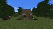

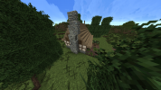
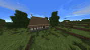
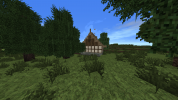
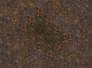
2022-08-05_21.01.53.png2022-08-05_21.02.06.png2022-08-05_21.02.19.png2022-08-05_21.02.29.png2022-08-05_21.02.34.png2022-08-05_21.03.05.png2022-08-05_21.03.19.png2022-08-05_21.03.27.png
 
  • Like
Reactions: Azulejo

Azulejo

Bloodmage
Staff member
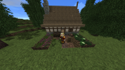
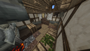
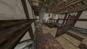
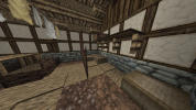
Hey Berme! Nice work with the app house! I see no major issues with it. With this build we hope you catched some of the techniques and ways we have of building here. Now your task will be to build other houses in the style of different locations in our server, but this time instead of copying you will have to come up with a design of your own based on the characteristics of the area we tell you.

Your next challenge will be to build a house in the style of /warp Hammerhal, with a yard. Once you are done you can upload some screenshots here and I will evaluate them as soon as I can. Have fun!
 
  • Like
Reactions: Berme

Azulejo

Bloodmage
Staff member
Nice job Berme! Even if I have some feedback to give you, your house is a good start!​
  • I appreciate you trying a diagonal house! Just a minor thing: I saw you went for an uneven number on the short side (not a bad thing at all though). When doing that it is prefered to distribute the "uneveness" on a different way as what you did. This is something a bit hard to explain via text, so I will just show you with an image. If you do this you won't need to add that piece of roof under a fence post on the left side of the house.​
2022-08-13_17.51.32.jpg
Can you tell the difference? What I did was highlighting the 3 block long bits of the short side of the house in red. Your build is the one to the left, while what I suggest you is the option on the right. Doing this will yield you a shape that matches a rectangle on a diagonal as close as we can do on the Minecraft grid.
  • I see you added mud on your uncovered dirt areas. That's nice! However you should try to blend it a bit more with the surrounding dirt, as those blocks contrast a bit too harshly with eachother. You can achieve this with a gradient like this one below. You can do the same thing with the chimney ashes inside, but with a different set of blocks.​
2022-08-13_18.12.13.png
  • Instead of using dark thatch for showing weathering in the roof you can use, as you also did, turned stairs that show a bit of the wood rafters below, or swapping some of the thatch stairs with wood, as if the cover of that area has fallen. Even then you should try to keep these details on the lower side, as thatch roofs, when in use, tend to be taken care of very meticulously. A small hole can quickly translate into a leak.​
  • When doing the stone bits of your house, just like what you I suggested with the dirt, you should strive for a gradient. That means that some blocks should not touch others. In this case, a classic Reach stone gradient, the orther should be Reach Light Brick > Reach Brick > Reach Cobblestone.​
  • In regards to your chimney and your yard stone wall you should reduce the ammount of missing blocks and uneveness. Some cracks are always good and add interest to the build, but too many can make it look at bit too much and not very realistic. In the case of the stone wall specifically, reducing the ammount of slabs and spacing them more would help a lot. Also instead of evenly spacing them try being a bit more "random", having some stretches with more slabs together and other with none. Right now what you did resembles a bit a castle wall top, instead of a simple farmer's recint.​
  • I like that you made your yard on a slope! Just remember to add dirt slabs when the height changes, so there's a proper walkable path.​
I hope this doesn't seem like a lot, despite what it may look like all are small details that with time you will not even think about when building. Keep up with the good work!

For your next challenge you will have to build a farmer's house in the style of /warp Gaunt, with a yard. It will be a bit of a similar build to what you just did, but I want to see you incorporate some of the feedback I gave you. Good luck and have fun!​
 

Berme

Mummer
Guest
Pronouns
he/him
Thanks for the feedback Azulejo! Don't worry about it seeming too much, after all the more you write the more I learn.

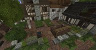
Here is my gaunt style farmer's house, I have tried to add all the details you mentioned in the previous message.
Berme
 
Last edited:
  • Like
Reactions: Azulejo

Azulejo

Bloodmage
Staff member
Cute house Berme, I see you incorporated what I said! This time I have much less to say:​
  • When doing timber frame houses you should avoid long strips of horizontal timber frame, it wouldn't be structurally stable. I would say 1x2 is the limit in most cases, tho there's always exceptions. That being said, Gaunt is an old-ish project that predates the addition of vertical timber framing to our block palette, so you did nothing wrong here. Quite the opposite, since you correctly followed the style and that's what I wanted, just know that now we do things differently.​
  • Instead of doing blob-like shapes for the veggie patches try going for more regular shapes, like rectangles (just like houses the can be diagonal), like this:​
2021-10-31_19.02.05.jpg
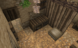
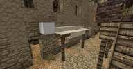
  • When using blocks like the tool benches that have all sides with tools you should cover up the rest of the sides with something, either other block, a basket or a half door if you want a clean look (like the picture below). Without it it can look weird.​
2021-08-13_00.52.35.png
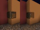
  • Kinda on the same real of things, when you have a window at the corner of a diagonal and it exposes several sides you should also try to cover some of them, specially when you use the wooden frame windows (stone windows are a bit more forgiving on that matter). Here you can see two "styles":​
collage (1) (1).jpg
  • More of a personal preference rather than a needed change, but I would add a bit more of decor inside. Maybe a chest for the family to store things, some hanging herbs or garlic in the kitchen area... I would also add another bed in the sleeping area, so there's more space for everyone.​
Overall as I said pretty good job given all! For your next challenge you will have to build a house in the style of /warp Tortown, with a profession. You can add a yard/shared courtyard if you want but is not a requirement this time since not all houses have them. Good luck and have fun!
 
  • Like
Reactions: Berme

Azulejo

Bloodmage
Staff member
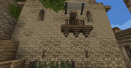
Hey Berme, nice house! I like that you chose to make it on a sligh slope and how you took advantage of it, I really like the side street entrance for the residencial area of the house. As always I will give you my feedback now.​
  • For the front awning I would use mostly dirty white wool instead of pure white. It looks a bit more worn down and realistic. Intensly white cloth is hard to keep, specially a piece that would be outside most of the time (below you can see the difference between dirty white and white).​
2022-08-24_22.05.11.png
  • The balcony you made at the side of the house looks a bit chunky. You could either go for a mashrabiya (wooden covered balcony) or some kind of "mirador". They are all over The Tor. You can keep the iron balcony, it also fits the style, but I would go for one of the simpler designs you can find around the town too. Here are some examples:​
collage (2) (1).jpg
  • The gradient can be improved a bit. Seems like you used a bit too much Arbor Cobblestone. The Tor is made by plastered houses with chips of it falling, having that in mind may help you get an idea of how the exterior is meant to look:​
2022-08-24_22.02.02.png
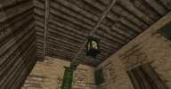
  • For representing the rafters at the interior of the house you can use only 1 set of stairs instead of 2, so they are a bit thinner:​
2022-08-24_22.03.05.png
  • I saw you added big wooden beams on the living area: Nice idea! Given the high ceilings its a good mesure. Your current configuration is good, an alternative would be to turn them and make them lean over the big dividing wall between the two rooms.​
  • On the sleeping area you added two beds that sit on an L shape. That's fine if they're made of straw, but for more sturdy beds you wouldn't place them "randomly". Either join them to get a double bed or keep them separated as two individual beds.​
  • The thin arrow slit windows you used at the back are best suited for castles rather than regular houses most of the time. You can use them but only 1x1 in size, or change to another type of window.​
For your next challenge you will have to build a house in the style of /warp OAtown, with a yard and a profession. Good luck!
 
  • Like
Reactions: Berme and Rexstop15