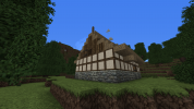
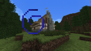
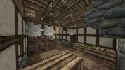
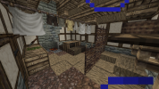
WeStanLoras Builder Application

AwbMan

Street Preacher
Guest
What is your Minecraft username?
awbman06

What is your age?
13-16

In what country are you living?
United States

Where did you first hear about WesterosCraft?
Searched online

What do you like the most about GoT/ASoIaF?
The lore. I think it's incredible how George R. R. Martin has created this entire world, especially one so rich and full of detail. George R. R. Martin has not only created Westeros and all of it's history and multiple cultures, but has also created an entire world, with countries outside of Westeros, and because of all of the work he's done, it's allowed us to put ourselves into his world, and make something like Westeroscraft. I also like Ser Loras. Loras is adorable.

What is your favorite build on our server?
I love Highgarden. I've always felt in touch with the Tyrell's; their way of life, their aesthetic and cleanliness, Olenna ( she's so funny), etc. I feel like the server's build of Highgarden is absolutely immaculate. I think that I should mention the amazing concepts, ideas, and drafts in the test world. I love the ability to see the builders' thinking process.

Why do you want to join our server?
I have been told since I was young that I had a unique perspective on things, and that I was extremely creative and imaginative. I myself love reading, and because of the my love of fiction and the hundreds of books I've read, I think I would be able to bring my imagination to the team. Another reason why I would like to join the team is because I am currently working on planning my life after high school. I plan on becoming an architect, and have been for a while now. I think that joining the Westeroscraft builders would help me more with my design, since Westeroscraft is not just a serer, but a giant piece of art. But lastly, I would like to join because I love to help other people. It makes me happy being able to assist others to make their work a little easier.
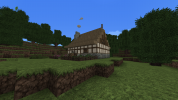
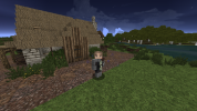
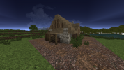
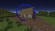
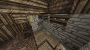
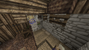
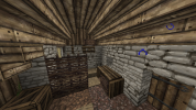
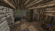
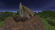
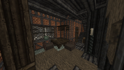
Minecraft 1.12.2 7_2_2021 11_20_00 AM.pngMinecraft 1.12.2 7_2_2021 11_20_16 AM.pngMinecraft 1.12.2 7_2_2021 11_21_16 AM.pngMinecraft 1.12.2 7_2_2021 11_21_39 AM.pngMinecraft 1.12.2 7_2_2021 11_22_47 AM.pngMinecraft 1.12.2 7_2_2021 11_23_02 AM.png

Did you follow the application rules?
You know nothing, Jon Snow
 

Ric

Ser
Staff member
Hey WeStanLoras!

Sorry for the wait, hopefully the next answers will be quicker. I think you did a good job on the apphouse, I have no comments on it! :)

For the next challenges you'll have to make houses inspired by the design of locations that I'll point out to you, rather than copies. Try looking on how the style of the area works, the blocks used and how they are used and other commonalities between the houses.

For your first challenge, make a low-class house in the style of Hammerhal (/warp hammertown is a good place to have a look). Please include a yard too.
Good luck!
 

AwbMan

Street Preacher
Guest
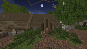
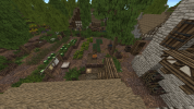
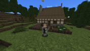
Below are screenshots of my first challenge. I wanted to create a low-class home in the style of Hammerhal, probably one that you may find on the outskirts of a town. I also included a yard, small as it may be. I apologize if there are any potion effects/particles that may be in the frame.
 

Attachments

  • Minecraft 1.12.2 7_11_2021 2_09_01 PM.png
    Minecraft 1.12.2 7_11_2021 2_09_01 PM.png
    1.5 MB · Views: 15
  • Minecraft 1.12.2 7_11_2021 2_09_42 PM.png
    Minecraft 1.12.2 7_11_2021 2_09_42 PM.png
    1.3 MB · Views: 15
  • Minecraft 1.12.2 7_11_2021 2_09_50 PM.png
    Minecraft 1.12.2 7_11_2021 2_09_50 PM.png
    1.2 MB · Views: 14
  • Minecraft 1.12.2 7_11_2021 2_10_53 PM.png
    Minecraft 1.12.2 7_11_2021 2_10_53 PM.png
    945.6 KB · Views: 14
  • Minecraft 1.12.2 7_11_2021 2_10_49 PM.png
    Minecraft 1.12.2 7_11_2021 2_10_49 PM.png
    944.6 KB · Views: 12
  • Minecraft 1.12.2 7_11_2021 2_10_45 PM.png
    Minecraft 1.12.2 7_11_2021 2_10_45 PM.png
    960.5 KB · Views: 12
  • Minecraft 1.12.2 7_11_2021 2_10_34 PM.png
    Minecraft 1.12.2 7_11_2021 2_10_34 PM.png
    1.1 MB · Views: 13
  • Minecraft 1.12.2 7_11_2021 2_10_01 PM.png
    Minecraft 1.12.2 7_11_2021 2_10_01 PM.png
    1.5 MB · Views: 14

Ric

Ser
Staff member
Hey AWB!

You made a really good job, though I do have to notice that the exteriors of your house are very similar to this house:
2021-07-11_18.51.25.png
I imagine you took inspiration from it, but I would suggest for the next challenges you try to look at more than one house in the area, see the common things on them and then make yours, so it can be more original.

That being said, on the feedback: first the gradient, it feels a bit too random. Although you can see the Reach Cobble and the Reach Light Brick touching sometimes in the Hammerhal gradient, I would advise you to mostly try to keep the Reach Stone between them (as in this order for example: Reach Cobble > Reach Stone > Reach Light Brick). Also what I meant when asking for a yard was a bigger one like this:
2021-07-11_19.05.17.png
Specially on a more rural place like Hammerhal, a yard is an important place where people would grow their food and work, so the space you made is far too small.

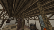
On the interiors, I think you made a very good job. You left one of the gate fences in the shelf closed, but that's just a small detail. The two other things that would have to be fixed are the plate you used - pewter plates are used only for higher classes, low-class houses should use the wooden plate instead - and the carpet (it should be a bit bigger and continuous, rather than just two carpet blocks). Making the carpet bigger or including a post made with fences supporting the roof could be a good way of occupying some space in the center part of the house without filling it too much (an example of it bellow, although with three beams instead of one).
2021-07-11_19.17.19.png

That being said we can proceed to your next challenge. Please make a middle-class house in the style of Duskendale and include a reasonably sized yard too. You can find some good examples inside the town, close to /warp ddnorth. When taking the screenshots please include one with a view of the yard from above, it makes it easier to see it :p

Feel free to ask if you have any questions.
Good luck!
 
  • Like
Reactions: ContraBlonde

AwbMan

Street Preacher
Guest
Sorry about the wait! Here is the link to the Imgur post:


I tried to create a middle class house in the style of Duskendale. The house is basically owned by this family who sells fruits/vegetables that their other family grows on their farm.

Edit: Btw the entire right side of the house is supposed to be conjoined to another house, like townhouses.
 
Last edited:

Ric

Ser
Staff member
Hey AWB!

Sorry for keeping you waiting, I'll try to be more swift the next times. You made a solid work, but there are some details that should change or improve. So, to the feedback, starting with exteriors:
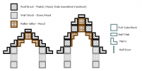
  • First thing I noticed is that you made the top of your roof in a slightly wrong way. You should follow the pattern of having a stair above a full block all the way to the top, where it would be a full block with a wall above in this style. The way you did in the back (here) using walls bellow it is also not okay. They should be similar to the example to the right here:
1628206003185.png
  • Also in the roof, you didn't add the support for the overhang. It should be like this, with a stair and a half door:
1628220531330.png
  • For the gradient, I think you could improve it by using more of the lighter brick, keeping the darker one closer to the ground.
  • The yard is good, but it's better if you replace the block beneath the crops for mud blocks or farmland; also the blueberry bush right next to the strawberries doesn't really make sense I think.
  • The windows, in special the bigger ones you made (here and here) don't work very well. One of them kind goes through the roof. Besides it, the rooms where they are inside the house are very tight. Having a room that is only 1 block large is not good either in general, but it's specially odd with such a big window in it. Here are some designs from the server that use windows like this, notice how they don't conflict with other parts of the house structure and how their rooms are in the interiors:
2021-08-05_21.53.48.png2021-08-05_21.54.00.png
I believe you used this house as one of your references. Notice how in the inside the room is larger and you're able actually walk inside it. Another example here:
2021-08-04_20.29.45.png2021-08-04_20.30.02.png
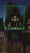
  • I noticed that you made the roof very low in the house. When making the house with multiple "layers", marked by the overhangs. To fix it you could make the top "layer" higher, like in this example:
1628213265516.png
Notice how the roof is on the green "layer" and doesn't reach the blue one.

Now on the interiors:
  • When you make the rafters for each floor ceiling, keep in mind that they should follow the shortest way across.
  • As I said before, you should avoid doing very narrow rooms like here and here. When making interiors try to imagine how people living in the house would walk around, whichs paths would be better for them and whichs ones they would take more often. This is a good exercise to notice how big (or small) rooms should be and where to place the furniture and other items.
  • I also noticed that you depicted many books in the house. Books should mostly be saved for high-class houses, specially in higher quantities, as they would be very expensive and not many people would know or need to know how to read. You also used the pewter plate block that in general works best for high-class buildings, so I would use the wooden plate in their place.
  • The bedroom looks mostly nice, but here having the drawers block so high looks a little odd. I would keep it in the floor level and not make this kind of shelf higher than 3 blocks tall.
  • For the last floor I suggest you leave more baskets closed, looks more natural this way. Also, they have many different fruits stored and in high quantity, I would have less variety for this case (as it's just a residential house).
  • In the second bedroom you should fully cover the side of the drawer block (here).
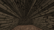
  • Finally, in the basement the ceiling you did doesn't really work. When having a stone ceiling, you should make a vaulted ceiling using stairs and/or slabs, so it can better support itself. Here's an example:
2021-08-06_00.15.46.png

I hope the feedback is useful, if something is unclear or you have any questions feel free to ask them! If you haven't already I suggest you check /warp ikea for some examples of furniture you can use in the houses and also /warp crops for yards.

Now for you next challenge please make a middle-class house in the style of Highgarden town (/warp hgtown). Please depict a profession as well, that you can choose yourself. Keep in mind that the working place usually is in the first floor, with the the upper ones being used as the living space.
Good luck!
 
  • Like
Reactions: Flip90

Ric

Ser
Staff member
Hey AWB!

No worries about the wait, take the time you need. On the house, there are some details that need to be addressed:
  • On the gradient, I think the front of the house could be more similar to how you did the back, that is, with more light stone. I also noticed that in some places (like here) you used the brownish white plaster right next to the reach light stone, that's something you should avoid as they contrast too much with each other. A better way would be having the plaster being touched only by the light stone block, as in a transition from darker to brighter.
  • I don't think the extension you made to the left of the house would really work, specially as you said the house would be between other two.
  • On the interiors, the way you organized some of the rooms doesn't work very well. Having the workspace in the basement is not a good idea for a tailor as light there would be very limited, only by lantern or candles. An alternative would be having the basement as storage and the area where the dining room is as the work area.
  • For the kitchen/dining room area, I would suggest you use the kitchen knives and/or the kitchen pans blocks along with the drawers. It gives some variety to the looks and improves the general look. I'm also not a fan of the two hoppers table, it looks kind unstable to me, I would suggest using another design (for example making it 2x2 instead of 2x1).
  • The way the walls are here is a little odd. I think the way you did the in master bedroom works better. The oak walls could've been made from the same material as the other wall too.
  • The drawer block in the master bedroom needs to have one of the sides covered in a way that only one of them appears. As there's the oak carpet covering the stone block bellow, you could use another block to cover it rather than a half door, like a basket for example. That way both the ground and the drawer side are covered.
  • Here you forgot to cover a part of the roof.
  • This bedroom has too many drawers. I believe you were trying to cover the roof behind it, but it doesn't really work well. It should be okay to cover the roof using a full oak block, making it like a wall instead of the rafters at that height (switching the stairs immediatly above it with a full block as well too).
  • Bedroom 3 has a similar problem, it feels too cramped. Covering the roof in another way, without using too many "utility" blocks would help that. A bedroom can be very simple, for example this room could be just a bed, some thatch around it with one or two baskets and maybe some hanging clothes - this is already functional and doesn't make the room too busy.
  • As a last note, when using a furniture block, try to imagine a reason that would lead people to leave it the place you chose. For example here you have a chest, a basket and a stool. But, as this is just a corridor, I don't really see a reason people would leave any of the three there. You might fear leaving space empty, but that's actually not always a bad thing. Having some empty space makes the house feel more natural, so you should try finding an equilibrium between used and unused space. Don't worry trying to fill everything, just imagine how the people living there would organize their things and try to apply it.
With that being said, it's worth noting that I can see your improvement from the previous challenges. Now for your next challenge please make a middle-class house in the style of White Habor, and remember to give it a profession as well. You can find good examples inside the city near /warp whiteharbor, particulary in the streets to the south of it.
Good luck!
 

Ric

Ser
Staff member
Hey AWB!

Good work with the house, you're making good progress! I've seen only a few things that need fixing this time, so to them:
  • First thing I noticed is that the roof overhang is unsupported. Despite the way some houses are in White Harbor, currently the way we do is just like in the Duskendale style, where you can make the support using wooden half doors and wooden stairs.
  • Gradient is mostly good, I would just suggest for you to use a little more of the Greyish White Plaster, specially in the area in the left in this picture.
  • The first floor of the house, specially the area around the furnace looks very unused for a work area. There's only the furnace for baking, but no tables to prepare stuff around the furnace, only the three small ones at the shop entrance. I suggest you have a look at some bakers around the server (Duskendale and Klupdate are two good places to look for it) to see how the bakeries there use their working space.
I think that's it, like I said not much feedback this time, which shows your improvement! But I would still like to see at least one more house from you, so for your next challenge please make a middle-class house in the style of the Tor town (/warp tortown), but this time I would like that you make it be a baker.

You should find good examples thoughout the town, as well as some bakers too. It's a more unique style, so try to look carefully into what are the commonalities between the houses both in the exteriors and interiors and then make your own house in the style. You might also find helpful a short guide on how to make plaster gradients that is currently at /warp torhamlet4, just keep in mind the other parts of the that guide are not meant for the town.

As always, if you have any questions feel free to ask.
Good luck!
 

Ric

Ser
Staff member
Hey AWB!

Good work! I see the improvement I was looking for, but just a few notes of feedback:
  • Here the iron bars gate should be in the double door too
  • In this part I don't see much sense in having coins and a piece of paper in the shelves where the bread goes. Remember too that many people in medieval times wouldn't know how to read, so keep this in mind when using the paper block.
  • For the rafters I would keep to just one type of wood, rather than using birch and oak.
  • The entrance for the storage room here is blocked by a flour sack. I think it's best to have the path clear, so it's easier to explore and more realistic too.
  • Remember to use rafters to hold the roof. Here there are some plaster and stone showing up.
That being said I think you're at a point where you'll learn more by working on the server under probation, so consider yourself approved :) Next time you're online remember to ask a mod to promote you.

Now that you are approved you should first read our New Builders' Guide and then make your probation thread. A probation leader should answer the thread and took over your probation within a week, but feel free to send me a message if that doesn't happen. You can find plots to build using the Dynmap (there's an option called "Open Plot" that shows available plots), having a look at /warp build (that may be outdated sometimes) and by asking other builders. If you wish to you can ask a mod to give you a plot in the Test world where you can practice building.

Congrats and welcome to the team! :D