Approved Update Application - District 25 "Kingsgate Quarter" - Ark

Arkilstorm

Dowager Countess of Grantham
Staff member
District Description:

In the shadow of Visenya’s Hill, between the Lion Gate and King’ Gate, the district is large but relatively modest. The buildings those of merchants, traders, craftsmen, and the like. The proximity to the city docks have given rise to several inns, taverns, and a few humble brothels, to play host to those whose visit to the city is to be relatively short. The industry of the district is more artisan than the smoky lanes of the nearby Street of Steel, playing host to a prominent Glassblowers, merchant tailors, woodworkers, and other trades.

The Sept of the Father is found within this district, with a small septry lining the main lane. At the King’s Gate is a small but well-supplied marketplace, corn exchange or market hall, and newly refurbished timbered Inn. The city’s Guild of Potters is just a stone throw’s away.


New Canon:

So far, we’ve yet to discover any new canon which would require substantial updates be made to the district. The updating of the canon stable block is necessary, and small changes made to the ‘state’ of the King’s Gate itself to reflect the condition later remarked upon by Jaime Lannister.


District’s Current State:

The district is large and has a broad mix of houses, industry, and interesting special builds. Some of the main alleys are very steep, diagonal and will need entirely replotting. This will probably equate to around 18-24 houses max. The district is one of the first built and there are a lot of buildings that could just do with a facelift and interior re-plotting. Otherwise it’s held up well. The Kingsgate square could be more interesting and the buildings more appropriate for the position. A few buildings will be merged to form more interesting row-houses and the square converted into a tradesman’s market.

District Plans:

Firstly, the plan is to give a sympathetic facelift to the principal buildings in the district, including the Sept of the Father and the Glass Blowers Complex. The Guild of Potters will be rebuilt, and the market square expanded to include more market / customs / trade related structures.

The height of many of the houses is a little inconsistent and needs to be addressed, as this has led to many very small buildings fitted into empty alley-space. At least two of the narrower passages will be widened slightly and the buildings re-plot. This shouldn’t account for a major replacement but will make parts of the city more accessible than they currently are. A few groups of houses will be combined to create new multi-tenant properties, and the existing abundance of inns will be re-developed to make them less repetitive and each has a unique element.


Alleyways marked in red are to be slightly widened and replot.

 
Last edited by a moderator:

ContraBlonde

Prophet
This is my application for the Sept of the Father, for my sept I tried to keep true to the same vision as the original made by Tsar, so it features the same layout with a Sept in the middle and 2 buildings to either side. It features a sept, hospital, refectory, living quarters, gardens and crypts (to be added later). Special thanks to everyone who has helped me with the interiors, feedback and planning. Test can be found at /warp CC and fly up
 
Last edited:

jmcmarq

Envoy
Hello!

This is mu proposal for Kl Corn Exchange, As being a representative building of the city, my main inspiration is the new Central Market of the Dragonsquare, however, as bein a building aimed mainly in rural trading I decided to build it into a barest architectural stylecorn exchange.jpg.

I hove you liked it

thanks
JMC
 

RavishMeRed

Printmaker
Staff member
Pronouns
he/him
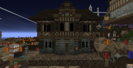
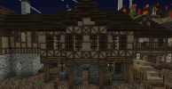
My façade tests for the Rowhouse complex. 3 houses separated by brick walls. Same pallet but details will be added (such as shutters, sills, etc) to differentiate the houses and allow them to stand out from one another.

-Ravish
 

Attachments

  • test.png
    test.png
    1,002.9 KB · Views: 46
  • test 2.png
    test 2.png
    1.1 MB · Views: 44

Imic

Street Preacher
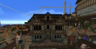
My facade test for the Father's Chandler across the street from the Sept, as well as the old version for completeness's sake. I added the stained glass window because I wanted to add some kind of Faith imagery to it somewhere, but whether or not it or something else like it stays is ultimately up to M&A to decide.
 

Attachments

  • 2021-06-04_15.01.02.png
    2021-06-04_15.01.02.png
    944.4 KB · Views: 46
  • 2021-06-04_15.03.45.png
    2021-06-04_15.03.45.png
    885.5 KB · Views: 45

Imic

Street Preacher
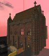
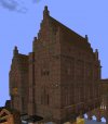
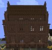
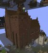
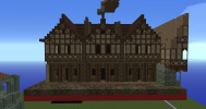
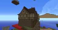
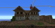
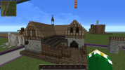
Despite my attempts to struggle against my ADHD my body forced me to do another special build test, this time the duel purpose stable/hayloft. No shutters yet, to make it clear where the windows are meant to be. Hopefully it's not too fancy.
 

Attachments

  • 2021-06-04_17.27.44.png
    2021-06-04_17.27.44.png
    610.5 KB · Views: 56

Imic

Street Preacher
I’m aware, I just wanted to include a picture of the old Father’s Chandler build because at the time it seemed like a good idea.
 
  • Like
Reactions: Sapper

SeapunkPeaches

Cersei's Left Bob
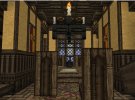
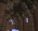
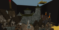
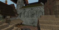
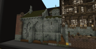
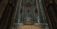
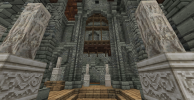
Antony, Endy and I are applying for the Sept of the Father in this district. We wanted to maintain some of Tsar's legacy (colour, heptagonal shape, garden...) while adding new and updated elements.

We always loved the sept and found it important that its unique character would be preserved. In order to retain its original look, we first stripped the sept of all detailing and gradients. After that we redecorated the old original structure trying to re-establish the old decoration, but with a modern up-to-date twist. We kept the square interior design of the sept, put back the bronze ceilings and dome, added the wooden balconies back in and tried to expand on the floor design that was already there. The shape of the exteriors is almost exactly the same. We added new buttresses, roofs and new ornamentation on the top part.

For the septry we wanted to take a more humble and pious approach, as would befit The Father, while also balancing the moderate ornateness of Tsar’s original adjoining septry complex. This is evident, for example, in the more closed façades (although not all the windows have been installed yet) and the more straightforward architecture and designs. As a sign of the increasing corruption and decadence within the Faith of the Seven in King's Landing, we have added a new wing that shows more grace and deviates from the more sombre, functional look of the rest of the septry. This side wing to the sept has a large door, more windows and a bit of ornamentation on the front facade. The septry now also features a private back alley for supplies to be brought in.

The side buildings were completely redone, but the content inside will stay the same - library, scriptorium, dining hall, kitchen, dormitory, etc. All of the rooms and other features are marked with yellow glass on the test. The exteriors of the complex are 95% done, while the interiors have been started and their level of completion varies. The test can be found at /warp endy.


Thank you for your consideration,

Dragons, Antony & Endy​
 

Attachments

  • 2021-06-20_22.35.02.png
    2021-06-20_22.35.02.png
    1.2 MB · Views: 88
  • 2021-06-20_22.35.37.png
    2021-06-20_22.35.37.png
    1.2 MB · Views: 85
  • 2021-06-20_22.40.16.png
    2021-06-20_22.40.16.png
    1.4 MB · Views: 82
  • 2021-06-20_22.38.09.png
    2021-06-20_22.38.09.png
    816.7 KB · Views: 84
  • 2021-06-20_22.38.41.png
    2021-06-20_22.38.41.png
    966.8 KB · Views: 87

ContraBlonde

Prophet
This is my application for the Sept of the Father, for my sept I tried to keep true to the same vision as the original made by Tsar, so it features the same layout with a Sept in the middle and 2 buildings to either side. It features a sept, hospital, refectory, living quarters, gardens and crypts (to be added later). Special thanks to everyone who has helped me with the interiors, feedback and planning. Test can be found at /warp CC and fly up
Bumping my app for those who missed it, it’s at /warp playground
 

Arkilstorm

Dowager Countess of Grantham
Staff member
Despite my attempts to struggle against my ADHD my body forced me to do another special build test, this time the duel purpose stable/hayloft. No shutters yet, to make it clear where the windows are meant to be. Hopefully it's not too fancy.
Hi Imic - I think for this plot, maybe don't think of it as a single structure with the same footprint on both floors. Haylofts were usually a separate structure from the main living area so that in the event of a fire, the hayloft didn't take the rest of the building with it. The stables should be a long structure with relatively comfortable but not wealthy dwellings above, but ultimately this is an industrial complex, not a residential one. Signs that bits of the structure were later additions should be obvious.

In regard to the Father's Chandler - I'd suggest changing the plot facade layout a little. Your facelift is great, but sticking to the restrictive symmetrical plot makes it appear very top-heavy and restrictive from the ground.

RavishMeRed- Great attempt at the rowhouses, but maybe each one is a bit too similar. Take a look at the 3 rowhouses opposite the Corn Exchange / Market Hall plot - 3 separate street-facing dwellings in one seemingly cohesive building. Also, check out the numerous rowhouses in Maidenpool.

jmcmarq - I haven't forgotten your test for the Corn Exchange, thanks for that! The plot technically isn't open yet for applications but I'll be opening it today.

ContraBlonde - Prior to Marge stepping down as co-lead of KL25, we both agreed to approve your Father's Sept. Please go ahead and add it, following the relevant melon updates proposed on your test.
 

Imic

Street Preacher
Hi Imic - I think for this plot, maybe don't think of it as a single structure with the same footprint on both floors. Haylofts were usually a separate structure from the main living area so that in the event of a fire, the hayloft didn't take the rest of the building with it. The stables should be a long structure with relatively comfortable but not wealthy dwellings above, but ultimately this is an industrial complex, not a residential one. Signs that bits of the structure were later additions should be obvious.

In regard to the Father's Chandler - I'd suggest changing the plot facade layout a little. Your facelift is great, but sticking to the restrictive symmetrical plot makes it appear very top-heavy and restrictive from the ground.
I should note, the whole upper floor is meant to be a super hayloft rather than a living space, with the entire lower floor dedicated to the Stables, unless I'm completely misinterpreting what you're saying, in which case sorry about that. Technicalities and my own nitpicking aside, I'll get to fixing both of them up.