Request for some pixel art

Status
Not open for further replies.

geeberry

Alchemist
Staff member
Admin
Hey everyone. As we move forward with the project I'm redesigning some stuff, and designing some future stuff. I've made this shield logo as seen here:

icon-512x512.png

Buutttt I think it would look a lot cooler if it was pixel art instead of a smooth icon. I could always try and modify something found on google but I figured I would reach out to the community and see if anyone wanted to help out the server by making something custom.

Let me know!
 

otty

Sorcerer
Pronouns
she/her
Always avoid taking any image from off the internet it’s really poor form. Plus that stuff is directly copyrighted, if we wanted to brag about our server and brand it more we should avoid using copyrighted material as part of branding more than we are (cause we are a GOT server)

So Graphic Designer here. I’m still a student and I’m still learning and am still seeing drastic improvements in my own designs. ( The Gods know I gag at my old Thumbnails now).

So are we redesigning our logo entirely? Or are we trying to come up with a secondary logo? I like the logo we have currently a lot but I get that it doesn’t match our current redesign.

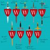
That being said, a pixelated W on a shield is asking for a look I don’t think accompanies our redesign. Particularly if this logo was pixelated as Pixelated design trends are largely associated with pure text (or large illustrations). Adding a shape to it starts to read as being less intentional and potentially as low quality.

I’m not saying I dislike your ideas but some in conjunction to one another do not achieve a good quality logo. With a logo you generally want to reduce the information down so that you can’t reduce it anymore without taking away the idea. This is why so many corporate redesigns use Helvetica or other popular sans serifs as their logo with a symbol/emblem to pair (Pepsi, Chipotle). Others emphasize the choice of font as a word mark. (Disney, Coca Cola) and opt not to use an image to prevent information overload. However that being said, good design is clever and just becuase it seems simple doesn’t mean it is. Rather it can be harder to find where you can reduce information than adding more. Heck It’s a flaw of mine since I come from an illustration background!

So all that being said there is a lack of cleverness with a Ringbearer W on a shield. Least the current iteration alludes to illuminated manuscripts, and wax seals something more thoughtful. I think the success of this logo is simply because the decorative elements do not demand attention and instead add texture. This texture is present, reads well but isn’t overwhelming the type(W). While we can reduce the information down more it’ll lose the texture that gives it the appropriate charm.

So essentially if you want to come up With a design rarely ever go with the first idea. (Maybe the current logo was a “first idea,” for whomever design it if so, that’s impressive! ) I have Never my first idea been the best idea nor have I met anyone whose first idea was the best. Oddly enough the ideas you come up with when you’re running out of them tend to be better because you’re racking your brain and have to be more smart with your solution. This is one reason why most designers create hundreds of logos before narrowing down and redoing version. I once had a project where I had to draw 450 graphical and unique dogs to teach me that lesson and that was a minimum for a C! It totaled to 800 dogs drawn after doing revisions to narrow down and perfect the final 10 that are refined and complete.

So essentially, I would keep working and coming up with more ideas and stray away from unoriginal (found online: images or text) material. I personally would encourage everyone have a go at creating a logo to generate more ideas! Maybe a logo contest? ;)

I know this seems like I’m speaking directly and only to you geeberry. I assume you know more than the general populace as you’re doing web design and development. I’m more over-elaborating for those less familiar with design and would word this differently if I wasn’t public :)

DISCLAIMER: I probably sound like I'm being arrogant in what I said, and I want to acknowledge I'm no expert nor am I an amazing designer who would do this perfectly. I'm just approaching this as I see it from my own understanding and experience of logo design. I feel created enough to be logos to speak on this subject with some confidence. I've been in design for 4 years however 2 of which were illustration and so I approach designs from a very different standpoint than someone with a pure Graphic and typographic skillset. I like designs to be a more illustrative solution myself. So most of what I'm saying is based of how my professors challenge me to balance my approach.

Lastly as my department head said every day in class, "every rule applies 95% of the time." Just because I say it here, doesn't mean there are aren't beautiful solutions that work breaking these guidelines, it's just that they just rarely work.
 
Last edited:

geeberry

Alchemist
Staff member
Admin
Sounds to me like you are volunteering to draw 450 logos for us :)

Thanks for all the input. I do have some design experience, a couple classes in college but mostly just self taught trial and error.

To your first point, I would never take someones graphical work unless it was open source or paid for, which all of our icons on the new website are. It was more of a reference to the overall look.

When you ask if we are redesigning the logo entirely, I assume you mean the round one (like here: https://cdn.westeroscraft.com/web/assets/images/wc-round-red-logo.png). I am looking that direction yeah. The logo is actually really good - the problem, as you mentioned, is its used in smaller sizes in quite a few places across and all the detail in the background as well as the words completely disappear or just look smudged or low quality in those instances. The new shield logo was an attempt to make something immediately recognizable against any background at both tiny and large sizes. Problem is at large sizes it just looks a little too plain.

I dunno - I welcome any ideas or steering in the right direction. I can design for the web, which is much different than illustration or graphic design which I don't think I really have the mind for, so when it comes to stuff like logos etc the best I can do is ask for help :)
 

otty

Sorcerer
Pronouns
she/her
Sounds to me like you are volunteering to draw 450 logos for us :)

Thanks for all the input. I do have some design experience, a couple classes in college but mostly just self taught trial and error.

To your first point, I would never take someones graphical work unless it was open source or paid for, which all of our icons on the new website are. It was more of a reference to the overall look.

When you ask if we are redesigning the logo entirely, I assume you mean the round one (like here: https://cdn.westeroscraft.com/web/assets/images/wc-round-red-logo.png). I am looking that direction yeah. The logo is actually really good - the problem, as you mentioned, is its used in smaller sizes in quite a few places across and all the detail in the background as well as the words completely disappear or just look smudged or low quality in those instances. The new shield logo was an attempt to make something immediately recognizable against any background at both tiny and large sizes. Problem is at large sizes it just looks a little too plain.

I dunno - I welcome any ideas or steering in the right direction. I can design for the web, which is much different than illustration or graphic design which I don't think I really have the mind for, so when it comes to stuff like logos etc the best I can do is ask for help :)

Dude once this semester is over, I'm totally down for something to keep me in a graphic design mindset otherwise I get bored on my own self-starters.

I totally agree, again sorry for like over elaborating, I always have a fear someone will come in and not understand what I'm aiming at.

Awesome! There is no issue in permitting the use of more than one logo too tho! Many companies have 2 acceptable logos for this exact purpose. My most recent project required we come up with a primary and secondary! The way we do so is by taking common elements but reapplying them to where we think they are needed. So we have a ragged edge circle and a ringbearer W and and some fun "squiggles" What elements can be pulled from that to make the new logo? I think there is plenty of room for <1in logo designs to allow us to keep the current logo iteration <3
 

ContraBlonde

Bookbinder
View attachment 2673View attachment 2674

Some ideas me and Pizza have been working on.

If anyone's interested in trying their hand at pixel art, I might do a guide in the Rookery for how I do it.
Pixel art is really accessible and easy to learn so it's worth a shot if you've ever been curious.
This is cool af! What if for an alternative logo you make the sword Valyrian steel and add the red and black swirls? Or, for a dark mode version of the logo, what if you make the sword Lightbringer and have it glow?
 
  • Like
Reactions: SseriousBusiness

AerioOndos

Donkey Lord
Staff member
Pronouns
they/them
the sword Cash has used is Longclaw, the Valyrian Steel sword of House Mormont but with the pommel that was made for Jon Snow. Idr which Valyrian steel sword was black with red swirls but Oathkeeper and Widow’s Wail are red with grey and black swirls iirc.
The dark mode idea is cool af, having a smouldering lightbringer would be awesome!

There is an artwork with Neon Lighting over the top of Beric’s sword (the prop used in S8) and that spells out ‘the night is dark and full of terrors. That might be something interesting to look at, another possible font to use other than Ringbearer too. I think HBO exibited it shortly after the end of the series. Could be cool to do something like that as well as book lightbringer. - the light producing flashy sword Stannis has.
 
Last edited:

ContraBlonde

Bookbinder
the sword Cash has used is Longclaw, the Valyrian Steel sword of House Mormont but with the pommel that was made for Jon Snow. Idr which Valyrian steel sword was black with red swirls but Oathkeeper and Widow’s Wail are red with grey and black swirls iirc.
The dark mode idea is cool af, having a smouldering lightbringer would be awesome!

There is an artwork with Neon Lighting over the top of Beric’s sword (the prop used in S8) and that spells out ‘the night is dark and full of terrors. That might be something interesting to look at, another possible font to use other than Ringbearer too. I think HBO exibited it shortly after the end of the series. Could be cool to do something like that as well as book lightbringer. - the light producing flashy sword Stannis has.
I did mean Widows Wail when I was talking abt the Valyrian steel

Another idea could be to have multiple swords and have the logo change every time you log in, similar to the launcher backgrounds

you could have Widows Wail, Ice, Blackfyre, Dark Sister, Heartsbane, Lightbringer, an ice sword of a white walker, Oathkeeper, a spear (for Dorne), a Dothraki weapon, a Trident for house Manderly (I could go on forever tbh)
 

AerioOndos

Donkey Lord
Staff member
Pronouns
they/them
I did mean Widows Wail when I was talking abt the Valyrian steel

Another idea could be to have multiple swords and have the logo change every time you log in, similar to the launcher backgrounds

you could have Widows Wail, Ice, Blackfyre, Dark Sister, Heartsbane, Lightbringer, an ice sword of a white walker, Oathkeeper, a spear (for Dorne), a Dothraki weapon, a Trident for house Manderly (I could go on forever tbh)

The multiple looks is a cool idea, but is it worthwhile for a logo that might appear on a google chrome tab/shortcut? For the launcher, website images and borders etc it would definitely work.

I’d avoid doing Dothraki Arakh’s as they are a bit point of difference between the books and tv series (in the books they are sabres more or less) and anything else that isn’t westerosi.
Instead we should focus on the most recognisable weapons first.
Longclaw is one if not the most recognisable sword in both the show and books and looks practically the same in both. All those other swords are vastly different.
Arguably Ice is the next, followed by Oathkeeper and the flaming swords/Stannis’ sword. A show watcher might think Stannis’ burned sword is Beric’s which would be completely fine imo.
Only issue with the two swords forged from Ice is that show oathkeeper and widowswail look like ordinary damascene steel rather than the red tinted versions Tywin wanted and so might be confused because of that.

Blackfyre and Darksister are well known within the book community but not really known at all by the show people. but a badass black and red sword would undoubtedly work well.

The idea of having weapons from different regions is cool but maybe we could try limiting to some v specific things.
For a dornish spear - Oberyn’s :,,(
For an ironborn weapon, A mock-up of Victarion’s and Euron’s Axe.
Hearts’ Bane for the Reach
Roberts Hammer for the Stormlands.
The silver sword used by Ser Vardis Egen in his fatal duel that was commissioned for Jon Arryn for the vale
North - Ice
Riverlands - Oathkeeper
Crownlands - Blackfyre+darksister
The wall/beyond - Longclaw/Other spear-sword/an interpretation of the blades that killed Ser Waymar Royce.
 
  • Like
Reactions: ContraBlonde

ContraBlonde

Bookbinder
The multiple looks is a cool idea, but is it worthwhile for a logo that might appear on a google chrome tab/shortcut? For the launcher, website images and borders etc it would definitely work.

I’d avoid doing Dothraki Arakh’s as they are a bit point of difference between the books and tv series (in the books they are sabres more or less) and anything else that isn’t westerosi.
Instead we should focus on the most recognisable weapons first.
Longclaw is one if not the most recognisable sword in both the show and books and looks practically the same in both. All those other swords are vastly different.
Arguably Ice is the next, followed by Oathkeeper and the flaming swords/Stannis’ sword. A show watcher might think Stannis’ burned sword is Beric’s which would be completely fine imo.
Only issue with the two swords forged from Ice is that show oathkeeper and widowswail look like ordinary damascene steel rather than the red tinted versions Tywin wanted and so might be confused because of that.

Blackfyre and Darksister are well known within the book community but not really known at all by the show people. but a badass black and red sword would undoubtedly work well.

The idea of having weapons from different regions is cool but maybe we could try limiting to some v specific things.
For a dornish spear - Oberyn’s :,,(
For an ironborn weapon, A mock-up of Victarion’s and Euron’s Axe.
Hearts’ Bane for the Reach
Roberts Hammer for the Stormlands.
The silver sword used by Ser Vardis Egen in his fatal duel that was commissioned for Jon Arryn for the vale
North - Ice
Riverlands - Oathkeeper
Crownlands - Blackfyre+darksister
The wall/beyond - Longclaw/Other spear-sword/an interpretation of the blades that killed Ser Waymar Royce.
I think Dawn of House Dayne would work well too
 
Last edited:
  • Love
Reactions: AerioOndos

ContraBlonde

Bookbinder
I’m bacc

I know there are errors and it’s not the best but I spent 3 hours on this so please be kind. This is meant to be a concept for which someone could change into pixel art


Attachments

  • 77CB9110-1A0D-4BA0-868D-854217ABE3CD.jpeg
    77CB9110-1A0D-4BA0-868D-854217ABE3CD.jpeg
    501.3 KB · Views: 23

ContraBlonde

Bookbinder
I’m bacc

I know there are errors and it’s not the best but I spent 3 hours on this so please be kind. This is meant to be a concept for which someone could change into pixel art

Please leave any feedback
 

Arkilstorm

Dowager Countess of Grantham
Staff member
Sounds to me like you are volunteering to draw 450 logos for us :)

Thanks for all the input. I do have some design experience, a couple classes in college but mostly just self taught trial and error.

To your first point, I would never take someones graphical work unless it was open source or paid for, which all of our icons on the new website are. It was more of a reference to the overall look.

When you ask if we are redesigning the logo entirely, I assume you mean the round one (like here: https://cdn.westeroscraft.com/web/assets/images/wc-round-red-logo.png). I am looking that direction yeah. The logo is actually really good - the problem, as you mentioned, is its used in smaller sizes in quite a few places across and all the detail in the background as well as the words completely disappear or just look smudged or low quality in those instances. The new shield logo was an attempt to make something immediately recognizable against any background at both tiny and large sizes. Problem is at large sizes it just looks a little too plain.

I dunno - I welcome any ideas or steering in the right direction. I can design for the web, which is much different than illustration or graphic design which I don't think I really have the mind for, so when it comes to stuff like logos etc the best I can do is ask for help :)

I think a refresh of that original illuminated manuscript style element may be in order rather than a complete rethink. I've worked as a graphic designer, art director, and marketing manager over the past 10 years and in my last role developed 6 new brands; I think this should be tackled in a utilitarian way, identifying the different opportunities and existences for the brand identity, and then the different iterations or 'treatments' of a standardised logo.

Our simple W is the main feature, but it is a wordmark variant and not in itself a logo. I think it'd be worth developing a proper brand guideline document outlying the different treatments and variations, so we know where and when to use the appropriate artwork; this will also help us to identify gaps in our set, opportunities to refresh, and where we could update consistently, across different platforms, including in-game as well as on social media, and on our website.

Happy to help with this, as it's a major part of what I do professionally, if it's something you think we could do with.
 

ContraBlonde

Bookbinder
I think a refresh of that original illuminated manuscript style element may be in order rather than a complete rethink. I've worked as a graphic designer, art director, and marketing manager over the past 10 years and in my last role developed 6 new brands; I think this should be tackled in a utilitarian way, identifying the different opportunities and existences for the brand identity, and then the different iterations or 'treatments' of a standardised logo.

Our simple W is the main feature, but it is a wordmark variant and not in itself a logo. I think it'd be worth developing a proper brand guideline document outlying the different treatments and variations, so we know where and when to use the appropriate artwork; this will also help us to identify gaps in our set, opportunities to refresh, and where we could update consistently, across different platforms, including in-game as well as on social media, and on our website.

Happy to help with this, as it's a major part of what I do professionally, if it's something you think we could do with.
Are suggesting a new, unique logo to replace the W? If so I think this has a lot of potential and am more than willing to contribute
 

AerioOndos

Donkey Lord
Staff member
Pronouns
they/them
They are really cool! The Warhammer and spear are my favourites!

They would work really well as a guide for pixel art. Some of the swords have weird blade-crossguard ratios though. Ice is meant to be weird in its dimensions cos its v wide and long though.
 
  • Like
Reactions: ContraBlonde

ContraBlonde

Bookbinder
They are really cool! The Warhammer and spear are my favourites!

They would work really well as a guide for pixel art. Some of the swords have weird blade-crossguard ratios though. Ice is meant to be weird in its dimensions cos its v wide and long though.
I agree and I will work on it! The spear and Oathkeeper are my favorites
 

AerioOndos

Donkey Lord
Staff member
Pronouns
they/them
I think a refresh of that original illuminated manuscript style element may be in order rather than a complete rethink. I've worked as a graphic designer, art director, and marketing manager over the past 10 years and in my last role developed 6 new brands; I think this should be tackled in a utilitarian way, identifying the different opportunities and existences for the brand identity, and then the different iterations or 'treatments' of a standardised logo.
Our simple W is the main feature, but it is a wordmark variant and not in itself a logo. I think it'd be worth developing a proper brand guideline document outlying the different treatments and variations, so we know where and when to use the appropriate artwork; this will also help us to identify gaps in our set, opportunities to refresh, and where we could update consistently, across different platforms, including in-game as well as on social media, and on our website.

Illuminated manuscript? That has a lot of potential to be incredibly awesome! It would also help make Westeroscraft a little bit more distinct from the show.
 
  • Like
Reactions: Arkilstorm

lemonbear

Nymeria
Staff member
Pronouns
she/her
I think a refresh of that original illuminated manuscript style element may be in order rather than a complete rethink. I've worked as a graphic designer, art director, and marketing manager over the past 10 years and in my last role developed 6 new brands; I think this should be tackled in a utilitarian way, identifying the different opportunities and existences for the brand identity, and then the different iterations or 'treatments' of a standardised logo.

Our simple W is the main feature, but it is a wordmark variant and not in itself a logo. I think it'd be worth developing a proper brand guideline document outlying the different treatments and variations, so we know where and when to use the appropriate artwork; this will also help us to identify gaps in our set, opportunities to refresh, and where we could update consistently, across different platforms, including in-game as well as on social media, and on our website.

Happy to help with this, as it's a major part of what I do professionally, if it's something you think we could do with.

I'd also love to help (since it's a major part of what I want to do professionally), and I've already done a truncated version of this for my current job. A Visual Identity Guide (which would be part of a larger brand guideline document) would also make it easier to have a consistent brand image across all our channels. We have a few different things going on right now that are remnants of different designers helping out at various points of time, and I don't think it'd be that hard to identity what elements we want to keep and build from there.
 
  • Like
Reactions: Arkilstorm
Status
Not open for further replies.