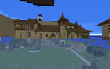
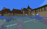
Reach-Westerland transition sub-style : proposition, discussions and inspirations

Guillaaard

Herald
hello everyone !


Right now there is no consistant nor real discussion about how the piemont of the westerland going into the reach and how the transition between those two very different region could look, and it's curently looking quite abrupt.
In regard to this, I propose the creation and creative research about a Westerland/Reach piemont sub-style.


This region could be extraordinaly interesting to work with, and to have it to look really original and interesting, but it's right now not develloped as much as stylistics research can be in the south for exemple with starpike and Darkdell.
it is also really difficult to do something there, as to not make it look like the southern reach red mountains border, which devellop really nicely and thoughly another piemont style.


Right now, especially in the northern reach where the palette is grey, it's very difficult to go from a grey northern reach style to a yellow westerland, and this difficulty (in coherence as in look) has not been adressed I think. it raise a lot of questions :
how should we manage a palette transition ? should there be one ? one from grey to reach to yellow ? what about the style, and what about the history of the relations between the Reach and the Westerlands ? and how should the climate transition and so the terra and landscaping look ?
thoses are a lot of questions which I think could benefit from being though as a community, not only for solo project leader, and maybe this thread could help centralize discussions about the borders.

-A starting proposition :
in regard to this, I propose this : ( this is really just a first try, and has been done really quicly, it's just a base to work with and maybe help anyone doing bordering projects)
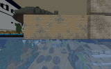
this could be a band of yellowy pink reach palette, with a particular style.
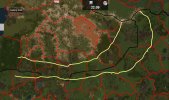
1640451032142.jpeg

Furthermore, the westerland are right now northern Italy, and Reach, France.
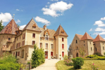
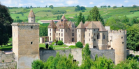
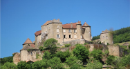
Considering this, I think a really interesting real region to look for inspiration could be the Bourgogne-Franche-Compté region, which is itself a transition between a more Loire France and the Alpine italy, exactly the kind of transition there is right now between the westerland and the Reach. this architecture seem to fit the style of the northern reach megabuild quite well too.
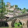
here are some example of castles ( houses should be thought too, i'll make another post for them), moreover, I think the Dordogne Valley could be a great inspiration to.
those two place also have a distinct yellowy stone, which could make for a good palette transition between the problematic grey/yellow transition.
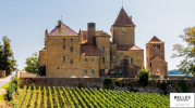
1640451628637.png
1640451655899.png

1640451708233.png
1640451806659.png

one Dordogne valley exemple :
1640452107754.png


I also tend to think that anyone doing a border project should think a lot about a proper transition with it's neighbour next region project, and that two neighbour project leader in border regions should keep close ties and talk a lot. I also think that a border project should not look like a core region style of it's region, but something more unique or blended.


thanks for reading, I hope this will start a fertile discussion and be a good start/continuity to the creative research around this region :)

(Merry Christmas everyone ! :D)
-Guillard
 

Jakethesnake8_8

Firemage
Pronouns
he/him
When I tired (and failed) to make a castle that would transition into the Westerlands, a lot of people suggested Switzerland to me. The trouble with this is that you have to avoid it looking too Vale-y.
 
  • Like
Reactions: Guillaaard

Renly_Baratheon_

Envoy
Pronouns
he/him
Of course this is not settled but since southern and south-western Switzerland is already being used for the Westerlands (Chateau Chillon for the Hornvale castle and I think Lemonbear cited southern Switzerland as a general source for her style) I don't think it's too bad to continue doing so. I'd say we should go for a more central/ eastern Switzerland and Austrian style in the vale anyway as to not repeat the same styles and use the same builds for inspiration.
So if it serves as a useful transition the lake geneva region, the wallis or the ticino (although that is definitely not transitionary) makes sense. But Guillaaard's examples seem much better suited anyway.
 

Gealrüable

Royal Messenger
medieval switzerland is a transition between germanic, italian and french architecture (depending on the region), that's why it suits so well for this area (and others too)
Swiss seems fitting for the Vale because of mountains, but I'd say that's a very superficial way of looking at things.
I'd argue as a major stylistic inspiration for the vale its actually not that great a fit, as its a small region largely transitional in style; also medieval Switzerland was rather poor and unimportant compared to the rich Vale.
So people shouldn't be afraid of having regions outside the Vale as "swiss inspired".
 
F

FD001__

What could be an option is to take the Vale blocks, then make them orangey/yellowish.
 
  • Like
Reactions: DjTorec

Jakethesnake8_8

Firemage
Pronouns
he/him
So there has been a lot of contention regarding this transition. Guillard and I are stuck in a bit of a cycle. We make something and it looks too much like Starpike and the surrounding areas. We edit it and it looks too Oldtown, we edit that and it looks nothing like Varner. I want to open up testing and concept gathering to anyone who has ideas, inspirations, thoughts, comments or concerns because this is something that will likely be addressed in other fringe Reach/Westerlands projects and needs to be straightened out before I can continue with my project.
 

AerioOndos

Donkey Lord
Staff member
Pronouns
they/them
I’m liking the dordogne and franche compte examples but tried looking around myself at some of the Swiss waadt buildings suggested by geal for a comparison.
only things I was able to find were the classic big German houses. Would you be able to link some, geal?
 
  • Like
Reactions: Jakethesnake8_8

Gealrüable

Royal Messenger
Romainmotier-envy still retains comparatively much of its medieval architecture, though the facades are obviously largely modern, as well as plenty other additions. As with all modern structures, one has to be careful to differentiate modern from medieval. Taking a look with Google Street view gives one a decent look at what a medieval Vaud would have looked like.

This is a look at some old farmhouses in Vaud, ranging in origin from the 17th century to the 19th century, the french and italian influence is quite clear.
 
  • Like
Reactions: AerioOndos

Jakethesnake8_8

Firemage
Pronouns
he/him
Romainmotier-envy still retains comparatively much of its medieval architecture, though the facades are obviously largely modern, as well as plenty other additions. As with all modern structures, one has to be careful to differentiate modern from medieval. Taking a look with Google Street view gives one a decent look at what a medieval Vaud would have looked like.

This is a look at some old farmhouses in Vaud, ranging in origin from the 17th century to the 19th century, the french and italian influence is quite clear.
Those houses don’t really look Westerlands or Reach to me. They look quite similar to some of the chalets from Vale day. I think really the way to attack this transition is to take pre-established house shapes and conventions and then alter the palettes to reflect the region they are closest to. For example, no white wood near the Westerlands, and instead more oak and brown daub. This works really well when marrying two styles as it brings out prominent qualities from both.
 
I think really the way to attack this transition is to take pre-established house shapes and conventions and then alter the palettes to reflect the region they are closest to. For example, no white wood near the Westerlands, and instead more oak and brown daub. This works really well when marrying two styles as it brings out prominent qualities from both.
Couldn't have said it better myself :)
 

lemonbear

Nymeria
Staff member
Pronouns
she/her
Those houses don’t really look Westerlands or Reach to me. They look quite similar to some of the chalets from Vale day. I think really the way to attack this transition is to take pre-established house shapes and conventions and then alter the palettes to reflect the region they are closest to. For example, no white wood near the Westerlands, and instead more oak and brown daub. This works really well when marrying two styles as it brings out prominent qualities from both.
I think this is more or less what I was trying to get at in my critiques of the original Hamell app. Rather than introducing new blocks to the area, it might be easier to create more "cottage-y"/Varner-inspired house shapes using blocks already in use in the Westerlands.

I'm not saying that Turnberry is actually a good reference (since it's so old), but that was kinda what I tried to do with Turnberry way back in the day.
 

AerioOndos

Donkey Lord
Staff member
Pronouns
they/them
Romainmotier-envy still retains comparatively much of its medieval architecture, though the facades are obviously largely modern, as well as plenty other additions. As with all modern structures, one has to be careful to differentiate modern from medieval. Taking a look with Google Street view gives one a decent look at what a medieval Vaud would have looked like.

This is a look at some old farmhouses in Vaud, ranging in origin from the 17th century to the 19th century, the french and italian influence is quite clear.

Just had a proper look at Romainmotier-envy and while there is a westerlands vibe to the place, the general house style and its features are more similar to and would fit better alongside Old Anchor and other places within the Vale (particularly eastern Vale where there is Andal-Essosi influence) rather than in the reach Northmarch or the southern Westerlands. Some of the farm houses could definitely work deeper into the westerlands hills as part of large wealthy cattle herding demesnes but otherwise the cottage-y vibe, like Lem said would be better for the northmarch-westerlands border


Gealrüable

Royal Messenger
Just had a proper look at Romainmotier-envy and while there is a westerlands vibe to the place, the general house style and its features are more similar to and would fit better alongside Old Anchor and other places within the Vale (particularly eastern Vale where there is Andal-Essosi influence) rather than in the reach Northmarch or the southern Westerlands. Some of the farm houses could definitely work deeper into the westerlands hills as part of large wealthy cattle herding demesnes but otherwise the cottage-y vibe, like Lem said would be better for the northmarch-westerlands border

I agree on it not really fitting the region, the solution Jake and Gui came up with is much better.
As concerning the Vale, we definitely should have an in depth discussion about the region :)
 

Jakethesnake8_8

Firemage
Pronouns
he/him
So do we all agree to having a Burgundy and Dordogne regional inspiration from Bushy to Durwell? As many of you know I've got plans to work in this area in the future and I think it would be a good idea to straighten out any kinks sooner rather than later.

I've come up with a palette for this region that essentially depicts houses that have been plastered and bricks are used to show wear and tear.

2022-03-06_10.29.52.png

This plaster-based palette also works well with Redlake and Conklyn's gradients. The only difference between the two is obviously colouration. I think it would be in the best interests of a cohesive transition style to ask the leads of those projects to implement them. The current palette in these projects is reflective of a core reach palette, and these projects are quite simply not reflective of that. This has resulted in a very harsh transition between palettes in the north Reach and south Westerlands.

Guillard and I have implemented this proposed palette on some house tests for the transition area that use common Westerlands materials and Reach form.

2022-03-06_10.39.46.png2022-03-06_10.39.41.png

It would be in the best interests of cohesion to use this in transition projects.

Thanks for reading!
 

AerioOndos

Donkey Lord
Staff member
Pronouns
they/them
I’d rather that the transition took place north of established grey projects like Redlake and instead followed roughly from southern crakehall and the peninsula south of it, through durwell (maybe conklyn) to cornfield, plum, turnbwrry, Falwell, rather than changing the existing redlake, which looks rather good as it is. Or better than the peeling plaster aesthetic of the gradient test above.

regardless of my opinions, awesome work collating the material and I love the amount of detail you’ve been putting into this
 

Jakethesnake8_8

Firemage
Pronouns
he/him
I'd like to clarify a few points that have been brought to my attention.

The transition area
As per my previous message, the idea is to have this transition happen on both sides of the border, as this will create a smooth blend between the two regions and their style. After speaking with some other server members, This transition is probably more realistic if it were to be implemented around the river area, and not extend so far to coastal Reach and Westerlands projects like Old Oak, Crakehall, Lowther etc. These areas would ideally have their own separate elements to create a varied regional style.

The palette
The palette is a plaster that has been put over the orange-toned bricks of the pink reach style. The plaster, as all things do, has been subjected to weathering and ageing, accounting for the yellow colour being used. The bricks, which have been somewhat protected from the elements by the plaster represent areas where the plaster has been so weathered that the brick is now exposed. Plaster used in these areas starts out as white but eventually fades. Plaster is used in Redlake, Conklyn, Goldengrove, Westbrook, Durwell, Ambrose, as well as the current Ivy Hall. Therefore, it makes sense to continue this trend, only with an updated and more realistic take.

The style
Currently, the Reach takes a very French inspiration in it's style. We have opted to choose Burgundy and Dordogne as inspirations, as both in form and material, there are similarities with both the Reach and the Westerlands. Currently, the use of faint light grey and light grey stone creates a harsh colour change from the yellow tones of the projects bordering it to the north, and the white of the reach.

Redlake as a project is good, and makes a solid effort to transition. I want to stress that I am not proposing a redo of Redlake or a wipe of the project, merely a palette update that Zoso could do so as not to have clashing colour tones so close to eachother.

Hopefully this clears up any concerns!