Ollena_Tyrell Builder Application

What is your Minecraft username?
JaimeLannister

What is your age?
13-16

In what country are you living?
Poland

Where did you first hear about WesterosCraft?
Youtube

What do you like the most about GoT/ASoIaF?
I like Tyrion Lannister the most out of all the characters.

What is your favorite build on our server?
Parren/Duskendale/Whitegrove/Gaunt

Why do you want to join our server?
I applied for builder because I don't want to be a freeloader. I hope to succeed this time.

Tell us about your build.
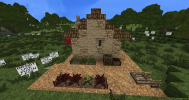
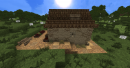
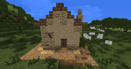
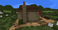
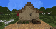
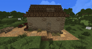
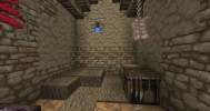
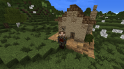
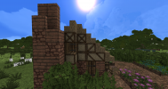
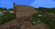
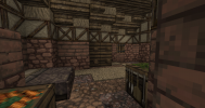
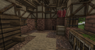
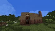
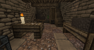
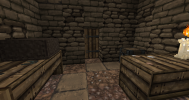
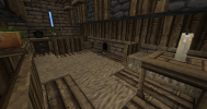
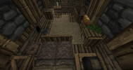
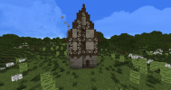
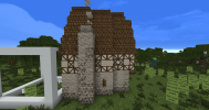
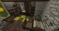
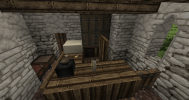
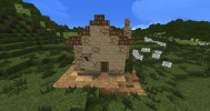
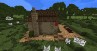
It's a house in the farmlands of The Tor. Two people live there - wife and husband. Husband works in the fields and the wife has a herb garden out in the back. They don't stand out much from the families in other houses. I chose to do the Arbor light stone palette and brown slate for the roof for no particular reason.
2021-02-23_21.46.12.png2021-02-23_21.46.20.png2021-02-23_21.46.25.png2021-02-23_21.46.32.png2021-02-23_21.47.12.png2021-02-23_21.47.21.png

Did you follow the application rules?
You know nothing, Jon Snow.
 
Hey Jaime/Ollena

Nice to see you're finally applying to become a builder. It's been a long time coming. ;)
Good to see how much effort you put into making and improving the gradient. It improved, but you're not entirely there yet. The most important thing about gradients is to respect the succession of the blocks in a palette. Palettes often consist of different blocks that need to be put in a specific order to make the transitions between colours and textures blend better. Certain blocks ought to never touch each other. In this case, for the 'The Tor' palette, the succession would be arbor cobblestone -> Lannisport -> arbor plaster. Other things I noticed on the exteriors are:
  • the chimney: I would aline it with the wall instead of placing it 1 outward. This is mostly a personal preference, so I wouldn't really worry about it.
  • You could use Lannisport arrowslit windows, instead of the old town ones. They are exactly the same textures, just different colours.
  • Place the door on the outside.
  • Not sure why you added birch to the roof. If you wanted to depict wear oak would be a more favourable option.
Ints:
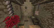
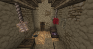
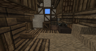
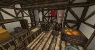
  • If I am correct you wanted to depict these people as being poor. Hence the little amount of furniture. If this is the goal, I would have added a little table and a chest instead of the workbenches that have kitchen tools on them. These tools would be quite costly. As a general rule with working benches, you should always add a half-door to cover up the sides.
  • It might be easier to just have one horizontal rope to hang things on, instead of 2 vertical ones.
It deserves to be said that you made a great first application house. It is clear you've spent a lot of time observing server building methods. Keep it up. For your next challenge please make a house in the Gaunt style and include a sizeable garden. You can choose whether you want to add a profession or not.
 
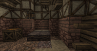
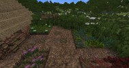
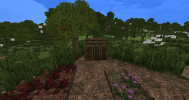
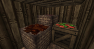
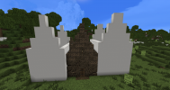
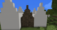
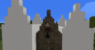
This is the Gaunt house.
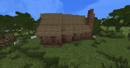
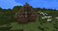
A farmer lives there with his wife. Their garden has a shed for storing fruit and vegetables.
I chose the KL dun brick and cobblestone for the base, brown daub & wattle and a thatch roof.
 

Attachments

  • 2021-02-25_21.58.19.png
    2021-02-25_21.58.19.png
    1.5 MB · Views: 9
  • 2021-02-25_21.58.26.png
    2021-02-25_21.58.26.png
    1.3 MB · Views: 9
  • 2021-02-25_21.58.44.png
    2021-02-25_21.58.44.png
    1.1 MB · Views: 10
  • 2021-02-25_21.58.53.png
    2021-02-25_21.58.53.png
    1.4 MB · Views: 11
  • 2021-02-25_21.59.09.png
    2021-02-25_21.59.09.png
    708.5 KB · Views: 10
  • 2021-02-25_21.59.12.png
    2021-02-25_21.59.12.png
    803.9 KB · Views: 9
  • 2021-02-25_21.59.16.png
    2021-02-25_21.59.16.png
    655.7 KB · Views: 9
  • 2021-02-25_21.59.24.png
    2021-02-25_21.59.24.png
    1.6 MB · Views: 9
  • 2021-02-25_21.59.28.png
    2021-02-25_21.59.28.png
    1.5 MB · Views: 5
  • 2021-02-25_21.59.33.png
    2021-02-25_21.59.33.png
    370.4 KB · Views: 9
Hey

Another great house. I'll jump straight into the nitty-gritty feedback, so you can continue building quickly.

The exteriors are almost completely fine.
  • I would have positioned the chimney differently. If you choose to put them on the taller side it's better to put them more in the middle. Right now it looks a bit like an afterthought.
  • For the D&W, I would have continued the diagonal beam all the way up to the top instead of changing direction every block you go up. Try to think about how the pattern would provide support to the house and roof.
  • Don't forget to tuck in the thatch at the top of your roof.
  • When making windows on a diagonal always place the half-door and shutter outward, instead of having an inward dent into the facade.
  • For gardens, it's important to try and maximise the vegetable patches space in your garden. There rarely should be more space covered in dirt/gravel than vegetable patches in gardens.
  • In the shed, you don't need to leave all the crates and baskets open. Some of the baskets can be closed as well. It's better to hint at what is there, rather than showing everything.
The interiors are a bit empty. Maybe try and include a drawer, chest, shelves, a standing table...
  • When you use workbenches, any kind, cover up the sides with a half door. Currently, you have kitchen utensils showing on 2 sides.
  • Make the thatch carpet always 1 continuous entity. No weird spots or branch-offs.
  • Don't display too much food inside a house. They would store it away.
For your next and final challenge, build me a middle-high class Duskendale house. You can choose the profession. ;)
 
  • Like
Reactions: JaimeLannister
This is my Duskendale house.

Backstory: The house was built by a poor family many years ago. That's why it's small and rough-looking. As time went on rich townpeople started building houses nearby and the family was evicted. A more well off cobbler moved in with his wife and son. The son helps in the workshop.

Materials: The gradient is composed of stormlands stone and monochrome sandstone. The roof is bedrock.
 

Attachments

  • 2021-02-28_20.22.05.png
    2021-02-28_20.22.05.png
    1.7 MB · Views: 14
  • 2021-02-28_20.22.21.png
    2021-02-28_20.22.21.png
    867.1 KB · Views: 14
  • 2021-02-28_20.23.19.png
    2021-02-28_20.23.19.png
    593.8 KB · Views: 15
  • 2021-02-28_20.16.25.png
    2021-02-28_20.16.25.png
    613.7 KB · Views: 15
  • 2021-02-28_20.16.33.png
    2021-02-28_20.16.33.png
    471.6 KB · Views: 15
  • 2021-02-28_20.16.43.png
    2021-02-28_20.16.43.png
    712.5 KB · Views: 16
  • 2021-02-28_20.16.55.png
    2021-02-28_20.16.55.png
    636.5 KB · Views: 16
  • Like
Reactions: Sapper
Hey

I gave you the feedback in-game so I could also show examples. The main points were:
  • Try to look at the houses around you to see the building style, materials, interiors etc. This is very important since imitation will be the primary source of learning once a probie.
  • Try to make more filled out interiors. Professions often have designated spaces for selling, working and storage.
  • The gradient could be further improved.
For your next challenge build a middle-class Highgarden townhouse. The emphasis here is on the ints. Good luck!
 
  • Like
Reactions: JaimeLannister
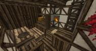
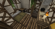
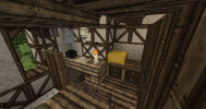
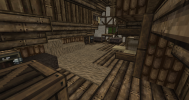
This is my upper middle class Highgarden townhouse. 4 people live here, husband who is a scribe, his wife and their two sons who help in the shop. I tried to make the ints more filled out with various objects. The roof is brown slate and the gradient is standard reach.
 

Attachments

  • 2021-03-06_15.42.31.png
    2021-03-06_15.42.31.png
    1.9 MB · Views: 12
  • 2021-03-06_15.42.46.png
    2021-03-06_15.42.46.png
    1.9 MB · Views: 12
  • 2021-03-06_15.43.01.png
    2021-03-06_15.43.01.png
    1.1 MB · Views: 10
  • 2021-03-06_15.43.20.png
    2021-03-06_15.43.20.png
    1.1 MB · Views: 8
  • 2021-03-06_15.43.44.png
    2021-03-06_15.43.44.png
    1.2 MB · Views: 7
  • 2021-03-06_15.43.52.png
    2021-03-06_15.43.52.png
    1.2 MB · Views: 6
  • 2021-03-06_15.44.05.png
    2021-03-06_15.44.05.png
    1.3 MB · Views: 5
  • 2021-03-06_15.44.12.png
    2021-03-06_15.44.12.png
    1.1 MB · Views: 5
  • 2021-03-06_15.44.22.png
    2021-03-06_15.44.22.png
    990.6 KB · Views: 6
  • 2021-03-06_15.44.27.png
    2021-03-06_15.44.27.png
    881.6 KB · Views: 11
Hey

Nice house. The biggest issues here are the D&W patterns and the gradient. As I showed ingame there is a logic to the D&W patterns. For gradients always try to respect the sequence of blocks. They make the transitions in the gradient smoother. For interiors try to bare in mind the books and glass is very expensive in medieval times, so the glass in cabinets etc would be a nono for most.

I'm satisfied with your building skills and will send you straight to probation ;). Ask a mod to promote you in-game. If you want more information about how probation works we have an article about it on the wiki.

Good luck and welcome to the team