KuhlDK Builder Application

KuhlDK

Messenger
Pronouns
he/him
What is your Minecraft username?
KuhlDK

What is your age?
25+

In what country are you living?
Denmark

Where did you first hear about WesterosCraft?
Youtube

What do you like the most about GoT/ASoIaF?
I use to do LARP, and have always been a big fan of fantasy and the medieval stuff. GoT, having both, easily caught my interest. I really enjoy how well written the story is, with all the twists and turns.

What is your favorite build on our server?
Oh boy - thats a good question. Probably The Wall. Or The Eyrie.. Or ..
I just love when builds look very "incorporated" into the surroundings.

Why do you want to join our server?
Cliché answer maybe - I enjoy GoT, and I enjoy Minecraft - specifically building in Minecraft.
When I visit the server, it seems like people have a good time with eachother, which is also very important to me. Would love to contribute to the positive vibe :)
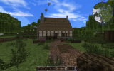
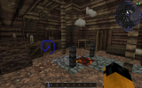
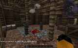
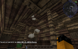
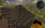
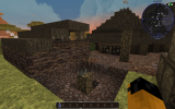
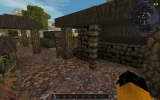
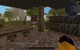
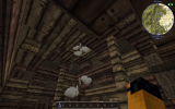
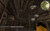
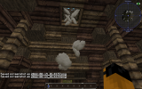
2022-08-14_02.41.06.png2022-08-14_02.41.13.png2022-08-14_02.41.37.png2022-08-14_02.41.43.png2022-08-14_02.41.53.png2022-08-14_02.42.11.png2022-08-14_02.42.17.png2022-08-14_02.42.22.png2022-08-14_02.42.27.png2022-08-14_02.42.40.png

Did you follow the application rules?
You know nothing, Jon Snow
 
  • Like
Reactions: DaenerysTargaryenI

AerioOndos

Donkey Lord
Staff member
Pronouns
they/them
Hey KuhlDK,

We've chatted in game and nice work so far! Looking forward to having you on the team and finding out what kind of builds you like doing :p!

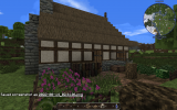
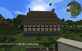
So I've been a bit interesting with your challenge build and are giving you a chance to explore one of the north west most projects on the server. Could you build for me a carpenter in the style of Amber! A simple covered workspace outside of the house could be used for the workshop but I'm most interested in how you go with the roof shape and stone gradient.

Take lots of screenshots while on the production server so you don't have to go back and forth between singleplayer and the server. Its a life saver. Good luck, happy building and I hope to see you around (maybe well rested too)!
 
  • Like
Reactions: FD001__ and KuhlDK

KuhlDK

Messenger
Pronouns
he/him
Hey KuhlDK,

We've chatted in game and nice work so far! Looking forward to having you on the team and finding out what kind of builds you like doing :p!

So I've been a bit interesting with your challenge build and are giving you a chance to explore one of the north west most projects on the server. Could you build for me a carpenter in the style of Amber! A simple covered workspace outside of the house could be used for the workshop but I'm most interested in how you go with the roof shape and stone gradient.

Take lots of screenshots while on the production server so you don't have to go back and forth between singleplayer and the server. Its a life saver. Good luck, happy building and I hope to see you around (maybe well rested too)!
Aaalright - It was quite a challenge for me with the roof - so please bear with me! I had fun though.
Looking forward to hear your feedback :)
 

Attachments

  • 2022-08-15_00.56.23.png
    2022-08-15_00.56.23.png
    1.6 MB · Views: 32
  • 2022-08-15_00.56.37.png
    2022-08-15_00.56.37.png
    1.1 MB · Views: 32
  • 2022-08-15_00.56.48.png
    2022-08-15_00.56.48.png
    671.1 KB · Views: 27
  • 2022-08-15_00.56.55.png
    2022-08-15_00.56.55.png
    742.3 KB · Views: 28
  • 2022-08-15_00.57.01.png
    2022-08-15_00.57.01.png
    592.6 KB · Views: 25
  • 2022-08-15_00.57.10.png
    2022-08-15_00.57.10.png
    1.7 MB · Views: 25
  • 2022-08-15_00.57.17.png
    2022-08-15_00.57.17.png
    804.6 KB · Views: 25
  • 2022-08-15_00.57.32.png
    2022-08-15_00.57.32.png
    804.1 KB · Views: 22
  • 2022-08-15_00.57.43.png
    2022-08-15_00.57.43.png
    692.6 KB · Views: 20
  • 2022-08-15_00.57.52.png
    2022-08-15_00.57.52.png
    848.9 KB · Views: 32

KuhlDK

Messenger
Pronouns
he/him
Aaalright - It was quite a challenge for me with the roof - so please bear with me! I had fun though.
Looking forward to hear your feedback :)
I redid the the inside of the roof. :)
 

Attachments

  • 2022-08-15_01.43.57.png
    2022-08-15_01.43.57.png
    582.8 KB · Views: 11
  • 2022-08-15_01.43.59.png
    2022-08-15_01.43.59.png
    550.1 KB · Views: 11
  • 2022-08-15_01.44.04.png
    2022-08-15_01.44.04.png
    425.7 KB · Views: 11
  • Like
Reactions: FD001__

AerioOndos

Donkey Lord
Staff member
Pronouns
they/them
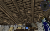
Hi Kuhl, I love how well you've mimicked the style of Amber! Its a tricky northern style to do the roof for and you've done a brilliant job. Nice ceilings too! Only thing with the ceilings I would recommend is to make the jungle and oak wood into larger blobs so it seems less random. You've done well doing that already but a little bit more wouldn't be bad.
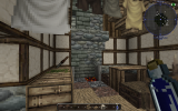
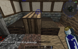
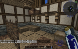
The interiors are a good example of the spartan living of the north. My main recommendation would be to either change the table into two halfdoors with wooden carpet on top (maybe jungle) like a flipped |_ _ | or to make a 2x2 piston table that doubles as the food preparation space (cleaver or knife with a plate or some duckweed on the table). Otherwise, good stuff!

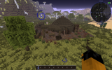
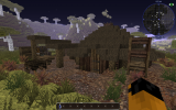
My main feedback is for the workspace outside. You've got access to a block called oak bark fence. using that for the poles will make the tarped areas seem larger and give more space to move around. Also, you could mix up the dark thatch rooves by making one of the tarps out of leather slabs.
I'm not sure why the chopping log is in a pit. it looks to me like it'd hurt the back of the person swinging the axe to use it like that. Having it on flat ground might help.
Good work with the carpentry workspace. There are a few good examples of how to make 'sawhorse' on the server, which are a very good tool for making it obvious that they're a wood worker.

Great stuff and I'm really impressed with how you've handled this one. I'd like you to give a shot at building a middle class baker from Fairmarket for the next challenge build. Good luck and have fun building!
 
  • Like
Reactions: FD001__

KuhlDK

Messenger
Pronouns
he/him
Hi Kuhl, I love how well you've mimicked the style of Amber! Its a tricky northern style to do the roof for and you've done a brilliant job. Nice ceilings too! Only thing with the ceilings I would recommend is to make the jungle and oak wood into larger blobs so it seems less random. You've done well doing that already but a little bit more wouldn't be bad.
The interiors are a good example of the spartan living of the north. My main recommendation would be to either change the table into two halfdoors with wooden carpet on top (maybe jungle) like a flipped |_ _ | or to make a 2x2 piston table that doubles as the food preparation space (cleaver or knife with a plate or some duckweed on the table). Otherwise, good stuff!

My main feedback is for the workspace outside. You've got access to a block called oak bark fence. using that for the poles will make the tarped areas seem larger and give more space to move around. Also, you could mix up the dark thatch rooves by making one of the tarps out of leather slabs.
I'm not sure why the chopping log is in a pit. it looks to me like it'd hurt the back of the person swinging the axe to use it like that. Having it on flat ground might help.
Good work with the carpentry workspace. There are a few good examples of how to make 'sawhorse' on the server, which are a very good tool for making it obvious that they're a wood worker.

Great stuff and I'm really impressed with how you've handled this one. I'd like you to give a shot at building a middle class baker from Fairmarket for the next challenge build. Good luck and have fun building!

Hey! So I was almost done with the build- but friday evening my girlfriend gave birth to our beautiful daughter. ❤️
I hope you can be a bit patient with me.
 

AerioOndos

Donkey Lord
Staff member
Pronouns
they/them
Hey! So I was almost done with the build- but friday evening my girlfriend gave birth to our beautiful daughter. ❤️
I hope you can be a bit patient with me.

Congratulations!!! That's amazing and enjoy as much time as you can with your family! There's no time requirement on this so do challenges as you're available. Absolutely no stress and I wish you all the best!

Sorry for all the exclamation marks : P!
 

KuhlDK

Messenger
Pronouns
he/him
Congratulations!!! That's amazing and enjoy as much time as you can with your family! There's no time requirement on this so do challenges as you're available. Absolutely no stress and I wish you all the best!

Sorry for all the exclamation marks : P!
Thank you so much.
I finally had the time to finish the build. I tried to build two additional houses on each side - I didnt put that much time in them as the middle one which also was the assignment. Just liked the idea of having the house between two others :)

I hope you like it :)
 

AerioOndos

Donkey Lord
Staff member
Pronouns
they/them
Hi Kuhl,

Its looking good proportion wise but I've got a few notes

-For rafters, try and have the 'beams' of the stair block a bit further apart from each other. having a slab-stair-slab pattern works nicely, just keep it sensible and neat and it'll look good.
-Also I like the idea of the thicker central roof beam but it might look best if you switched the angle around. i.e. the Sturdy central beam going through the shortest point and then having the longer thinner beams go across that to the longest point. This way it adds an extra bit of realism as the long poles now help support the jetty.
-Speaking of jetties, you haven't really done them. They're the supports that allow a floor to jut 1 block or more out into the street. Sometimes they're also called overhangs. You've got the wooden stair supports for it but haven't expanded the walls onto them. This is a crucial part of many styles so I'll through in a few more challenges with the jetties in future.
-why the jetties are important is because you've got cranes on your rooves. (the wall block with the chain attached). Having the roofline come out a bit more would make it easier to load the crane at the bottom as you don't have to worry about hitting the first storey or get around the verandah as much.

-Generally we try not to put crates on shelves where it would be difficult to lift them to, especially if the only option is by ladder. Instead, baskets are a better option, or sacks. Considering its a baker, both of these are better options than crates. If you are worried about having too many baskets, try creating wicker baskets another way by using half wattle around wool or mances tent slabs. Another option is to put a pewter kettle up there that could hold oil, water, vinegar or salt which could be used on bread.
-The daub crosses shouldn't be a central vertical beam. Use vert daub for this. You can have the crosses along the bottom line though.
-Nice work with the oven itself. I've worked on some designs before of how to do large quantity ovens which I could show you at some point if interested.
-Try and make chests 2 blocks wide. Hinges are pretty annoying to make so having as few of them for as much material as possible works best. There's space for most of them to be 2 wide as well.

Now these are pretty much where I think there could be improvement. You've reproduced the style really well and did a great job with the facades. Also the ints are very cosy and homely. Nice work with those. Good stuff!

For your next challenge, build me a tailor in the style of HGtown with a stone gradient!
 
  • Like
Reactions: FD001__ and KuhlDK

AerioOndos

Donkey Lord
Staff member
Pronouns
they/them
Alrighty! Nice work and you've done well with the angled plot. They're a real challenge to do right, especially when they have jettied extensions like that. My main issue here is that you haven't quite got the gradient right.

-HGtown white stone gradients go from White cobble -> light stone -> reach small brick -> reach cobble, rather than white cobble-> small brick.
-Balancing the jetty a bit more would work better so that the thicker parts of the stairs are more evenly distributed.
-I haven't seen wooden side panels like that one on the ground floor around HG. you could have made this look nicer by making its vertical oak with horizontal oak on the third block from the ground.
-The ground floor interiors are alright, but the floor could use a few bits of dark monochrome sandstone and stormlands bricks might improve it somewhat. Some solidity and more even ground perhaps for someone to stand while a hem is fixed.
-I'm a bit confused by how thin the building gets in photos 10-11-13. Does that mean there are stone walls sitting on top of wooden rafters? Generally a no no
-Instead of using a hopper for a 1x1 table, try using the table block or considering making it a 2x1 table made using carpets and halfdoors. Singular hoppers look unsteady and like they'll fall over.
-Otherwise, I think you could have tried to organise the rooms so that furniture or carpets covered the exposed stone a bit more. For instance, moving the table away from the wall and instead having leather slabs there.


While this is the house I was looking at when I set you this challenge, it is far too similar in the plotting and exteriors. Our server does take great pride in making exteriors and interiors unique and interesting and while I know you made the ints different, the exterior is just to similar to the building included in the imgur pics.
Have a bit of a look around again at HGtown and chippingbarter across the river, there are many houses with stone facades. Try and make something entirely your own but in the same style and as a chandler/candle maker.
 
  • Like
Reactions: Rexstop15

AerioOndos

Donkey Lord
Staff member
Pronouns
they/them
Hey Kuhl, so sorry for the wait. I'll be speedier in responding to you from now on. Exteriors are looking good! Especially you're work with the gradienting. Just put a cap on top of the chimney. A slab would work, for instance reach brick or even stone brick would be fine. I've got a few notes for the ints too.

In pic 11 the island bench in the kitchen should probably be a at least 2x2 and this way it could function both as a preparation space as well as the dining table, or be made of carpets with halfdoors at each end rather than at the front. It'll clean up the kitchen a little and make it seem less modern.
Also I don't think they'd have bookshelves in their homes. Those should be reserved for the upper class people and professionals who use books or ledgers i.e. scribes, stewards, doctors/surgeons etc.
The dark wattle clashes heavily with the rest of the interiors. Try using the normal wattle instead.
For the ceiling, use halfdoors to panel the sides of the sides of tile blocks. That way it looks like you've got support for the whole roof. I'd also cover the whole ceiling in wood so no tiles are visible except around the dormer (the little extension to the roofline on the side) and that way its a bit neater too.
Not a big fan of the interiors for the attic. Maybe try and give it a small loft for general storage as well as a proper living space for some apprentices. This would include laundry, space for their possessions in either a chest or drawers and maybe a small space for meals.
The fancy table and high backed chairs aren't something you should really have in the attic either. Especially the high backed chairs using locked doors. Those are something I'd only use in very wealthy private buildings or prestigious public buildings (like a town hall council chamber or court). Maybe just do a simple bench with dark thatch or leather chairs and halfwattle at the ends.

For your next challenge, I'd like you to focus on ceilings and interiors, making them feel dynamic and 'lived in'. For the house style, please build me a middle class pie baker in the style of Antlers. Can't wait to see what you put together, good luck and have fun!
 
  • Like
Reactions: Jeffjunior77

KuhlDK

Messenger
Pronouns
he/him
Hey Kuhl, so sorry for the wait. I'll be speedier in responding to you from now on. Exteriors are looking good! Especially you're work with the gradienting. Just put a cap on top of the chimney. A slab would work, for instance reach brick or even stone brick would be fine. I've got a few notes for the ints too.

In pic 11 the island bench in the kitchen should probably be a at least 2x2 and this way it could function both as a preparation space as well as the dining table, or be made of carpets with halfdoors at each end rather than at the front. It'll clean up the kitchen a little and make it seem less modern.
Also I don't think they'd have bookshelves in their homes. Those should be reserved for the upper class people and professionals who use books or ledgers i.e. scribes, stewards, doctors/surgeons etc.
The dark wattle clashes heavily with the rest of the interiors. Try using the normal wattle instead.
For the ceiling, use halfdoors to panel the sides of the sides of tile blocks. That way it looks like you've got support for the whole roof. I'd also cover the whole ceiling in wood so no tiles are visible except around the dormer (the little extension to the roofline on the side) and that way its a bit neater too.
Not a big fan of the interiors for the attic. Maybe try and give it a small loft for general storage as well as a proper living space for some apprentices. This would include laundry, space for their possessions in either a chest or drawers and maybe a small space for meals.
The fancy table and high backed chairs aren't something you should really have in the attic either. Especially the high backed chairs using locked doors. Those are something I'd only use in very wealthy private buildings or prestigious public buildings (like a town hall council chamber or court). Maybe just do a simple bench with dark thatch or leather chairs and halfwattle at the ends.

For your next challenge, I'd like you to focus on ceilings and interiors, making them feel dynamic and 'lived in'. For the house style, please build me a middle class pie baker in the style of Antlers. Can't wait to see what you put together, good luck and have fun!
Here :)
 

AerioOndos

Donkey Lord
Staff member
Pronouns
they/them
Alrighty so overall this is quite nice. Just a few details here and there to fix which I'm sure can be improved upon during probation.

-Try to use something other than hoppers if a table or bench is 1 block wide. Stairs work fine.
-If you're doing a stair-slab-stair jetty/support pattern, continue it even if the angle of the building changes.
-try and keep crates to industrial and work areas. There aren't many areas where a crate can't be replaced by a sturdy basket in domestic settings.
-With the exteriors, try and keep the patterns logic together. currently the almost checkerboard pattern of close timber (see below) seems a bit too busy visually.

Now I think you're ready to begin your probation. Please ask a moderator in-game when you are online to be promoted to builder. The next step is to read over the New Builders Guide. Also create a probation thread on the Probation Forum.

You can start building at any open location found on the server - you can check /warp build (some of these may possibly be outdated as people forget to update it sometimes) as well as going to our dynmap and toggling the "Open Plot" filter. You can also search the forums for active projects or ask around to see which builds are open.

Also ask a mod to set you up with a plot in the Test world so you can practice building.

A probie leader should respond to your thread soon, Batel seems to be chomping at the bit :). There they will give you constructive feedback during your next month and assist in your entry into the server community as well. Once you have completed probation, you will be promoted to full builder.

Keep in mind that clutter =/= equal better and that sometimes simple is good! Also, you've came really far with the gradients and I can see you being v good with them in future. Welcome to the team, build well and have fun!