FD001__ Builder Application

F

FD001__

What is your Minecraft username?
FD0801_

What is your age?
17-20

In what country are you living?
United Kingdom

Where did you first hear about WesterosCraft?
Youtube

What do you like the most about GoT/ASoIaF?
Probably the gritty nature of the world - violent and harsh. I also like the complexity of the characters as noone is totally good/evil - people are grey, like real life.

What is your favorite build on our server?
Blackhaven. It's a very distinct fort within a part of the Stormlands that I have a lot of interest in. The Dornish marches are an interesting part of Westeros for me - because you have parallels with the Balkans, Spain and France in real life - all coming together.

Why do you want to join our server?
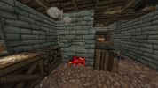
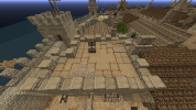
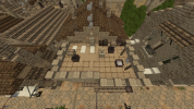
I want to join as I have a creative mind, and a passion for construction. I have a fairly good knowledge of architecture, and could provide good advice as to what you would see in the real world.
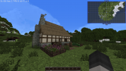
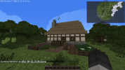
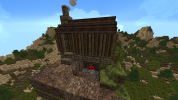
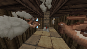
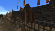
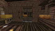
2021-08-22_23.30.12.png2021-08-22_23.30.18.png2021-08-22_23.30.23.png2021-08-22_23.30.33.png2021-08-22_23.30.51.png2021-08-22_23.30.57.png2021-08-22_23.31.04.png2021-08-22_23.31.42.png

Did you follow the application rules?
YOU KNOW NOTHING, JON SNOW
 

Ric

Ser
Staff member
Hey FD!

Thanks for applying! Good job with the apphouse, only one thing I noticed is the grass growing over the dirt in some parts - you can replace them before taking the screenshots or using the "dirt slab" block instead of just dirt. This isn't really a problem in the server, but it's something to be aware of during the application.

For the next challenges you should make your own original houses in the style of the ones in the project locations I'll point out to you. Try looking on how the style of the project works, the blocks used and how they are used and other commonalities between houses. If you haven't already please take a look at our Basic Building Guide, I'm sure you'll find it helpful.

With that said, for your first challenge please make a house in the style of Hammerhal (you can check good examples at /warp hammertown). Remember to include a reasonably sized yard, you'll see examples of them at the warp. If you have any questions feel free to ask.
Good luck!
 
F

FD001__

Hey FD!

Thanks for applying! Good job with the apphouse, only one thing I noticed is the grass growing over the dirt in some parts - you can replace them before taking the screenshots or using the "dirt slab" block instead of just dirt. This isn't really a problem in the server, but it's something to be aware of during the application.

For the next challenges you should make your own original houses in the style of the ones in the project locations I'll point out to you. Try looking on how the style of the project works, the blocks used and how they are used and other commonalities between houses. If you haven't already please take a look at our Basic Building Guide, I'm sure you'll find it helpful.

With that said, for your first challenge please make a house in the style of Hammerhal (you can check good examples at /warp hammertown). Remember to include a reasonably sized yard, you'll see examples of them at the warp. If you have any questions feel free to ask.
Good luck!
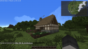
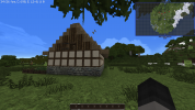
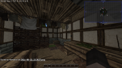
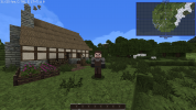
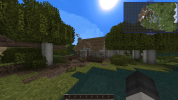
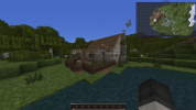
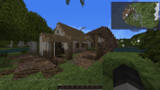
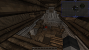
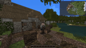
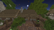
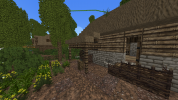
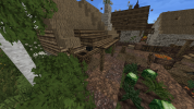
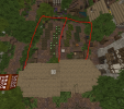
I finished the Hammertown/Hammerhal house. It's a lower class house for two people.
 

Attachments

  • 2021-08-23_17.16.19-min.png
    2021-08-23_17.16.19-min.png
    784.3 KB · Views: 18
  • 2021-08-23_17.16.44-min.png
    2021-08-23_17.16.44-min.png
    693.6 KB · Views: 18
  • 2021-08-23_17.16.53-min.png
    2021-08-23_17.16.53-min.png
    708.9 KB · Views: 19
  • 2021-08-23_17.17.20-min.png
    2021-08-23_17.17.20-min.png
    688.3 KB · Views: 17
  • 2021-08-23_17.17.31-min.png
    2021-08-23_17.17.31-min.png
    603.4 KB · Views: 17
  • 2021-08-23_17.17.47-min.png
    2021-08-23_17.17.47-min.png
    594.3 KB · Views: 17
  • 2021-08-23_17.18.00-min.png
    2021-08-23_17.18.00-min.png
    526 KB · Views: 17
  • 2021-08-23_17.20.29-min.png
    2021-08-23_17.20.29-min.png
    825.8 KB · Views: 17

Ric

Ser
Staff member
Hey FD!

As Geal said, please wait for a week before bumping. I'll try to not take to long to give you feedback, but I do need some time :p

Now, to the house. I think you had a good grasp of the Hammerhal style, I would ask though that for the next challenges you clear the vanilla trees around so I can have a better look at the house itself. Nonetheless I do have some points of feedback:
  • It's nice that you made a little path into and around the house, but I would suggest toning down or removing the mud block. If you do decide to use them I think it's better to make few larger patches with it rather than many small ones.
  • On the gradient, in general for small houses like this you want to keep the darker blocks (in this case the reach cobble) closer to the ground, as they represent the dirtiest and most eroded parts. You usually would also try to make a transition, where the the reach cobble would touch the reach brick and the reach brick touch the reach light stone.
  • The roof might have too many holes in it. It's okay to add a few as a small detail, but too many makes the roof too unstable and wouldn't make sense in real life. It also looks clunky in here because of how you made the thatch above the door; Here's an example of a better way to make it:
1630001459092.png
  • The chimney should be one block higher, so it's top is above the roofline. Also, I noticed you added a vine in there - for it to grow there it would have to come from the ground all the way up, so you should represent that as well.
  • The little shed you made in the yard is a bit clunky. An alternative way of making it would be with half doors instead of full vertical wood blocks or even making a covered area, like in these examples:
2021-08-25_23.39.10.png2021-08-25_23.39.36.png
  • On the yard, I noticed some holes in the ground but I'm not really sure what you were trying to represent. In general you should avoid having holes like that, unless you're trying to represent something being digged. Besides that, I think you just made the yard a little too small. For rural areas like this you'll usually have bigger yards, as they would use that area for working, growing food, keeping animals, etc. Here's an example of two yards from Hammerhal:
1629999769435.png
  • The fireplace has a small issue, you should use the half door and the stair in parallel to each other, like if they are facing the one in front of them. Like this:
2021-08-24_23.14.15.png
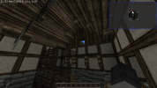
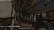
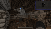
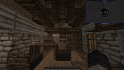
  • The shelf you made has only one "oak gate" as a support. The way you made it, that support wouldn't be enough to hold it as the plank is too long, you should make two supports so that it would viable. Same goes for the loft, it needs some kind of support. One way we usually do it is by haivng a couple "oak hoppers" blocks with fence blocks beneath it, working as posts that hold the loft in place. Like this:
1630000735899.png
  • As lanterns would be something expensive to have, most lower-class houses, specially in rural places, wouldn't be able to afford it, so it's an item you should avoid for cases like this.
That should be it for this challenge. For the next challenges please take a few more screenshots too, make sure to have all parts of the house covered in them. I would suggest that you also have a look at /warp ikea and /warp crops, they should give you some nice examples of furniture and crops that you can use.

For your next challenge please make a middle-class house in the style of Duskendale, also including a reasonably-sized yard. You can find some good examples inside the town near /warp ddnorth. I encourage you to have a look around, noticing the things in common between the houses both in structure and in materials before giving your try. If you have any questions feel free to ask them.
Good luck!
 

Ric

Ser
Staff member
Hey FD!

First of all, sorry for the wait, had some stuff along the week taking time from me. Nice that you made three houses! It's always good to see such dedication :) In general you've made them well, with some details that I've noticed that should be addressed, so here's the feedback:
  • I think you did really well with the daub patterns and the gradients. Only thing I would say is that it's okay for the KL Dun Brick to touch the Monochrome Dark Sandstone, no need to use the KL Dun Cobble for transition in this case.
  • The extension in the butchers house looks a little strange, I think because of how it connects to the roof in the back and for being too long. I think it would be better to remove it.
  • Yards are nice, but I think the smokehouse you made looks kind odd. Mostly because of the roof. An alternative design you could do is making it higher and more like a cabin, with a more conventional roof. For example, it could be like this:
2021-09-04_03.02.36.png2021-09-04_03.02.11.png
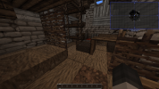
  • For the lower middle class house I think you might have made the house a little too small, with the interior being only 3 blocks wide. I would make the house 1 or 2 more blocks wide. This reflects in areas like this, with a very tight space. Further on that image and the next one, I imagine this kitchen area is too small and looks kind odd to have the storage and preparation areas in the corridor instead of in a more open space.
  • Here instead of a brick furnace, I think the furnace with the texture closer to the sandstone palette fits better with the KL Dun. This applies for the other similar uses of the brick furnace you made in the other houses too.
  • Interesting choice of making a lift here, nice idea. Instead of having a little balcony in front of it, we usually do it with just an opening in the wall, like in this example:
2021-09-05_00.36.53.png
  • For the bakers workingspace I think the snow in the ground looks kind odd. I get the idea you were going after, but I don't think it works very well. Also the kiln has too much space beneath it, you could do a simpler design and it would still be functional, like in these examples:
2021-09-05_00.28.38.png
2021-09-05_00.29.39.png
  • Still in the bakers house, the table in the center of the living room looks somewhat strange to me. I think a 2x2 or a 2x3 design could work better, filling the space but without occupying too much space.
  • On the bakers bedroom, I think the dark thatch wall is a better block to represent curtains than the leather. This applies for the other instances you used them too.
  • Moving on to the butchers kitchen, the hanging blocks (herbs, hare and garlic) should be closer together, it feels more organized and makes more sense as they would be easier to get to when cooking.
  • I think using a curtain as a division between the two rooms here is not the best. I would use a regular wall.
As I said, I like that you made more than one, but for the next challenges if you make multiple houses please only do the interiors in one, I think it might be better like this both for me to give feedback and for you to go through it. :p

For your next challenge please make a middle-class house in the style of the Tor town (/warp tortown). It's a very unique region, so I suggest you have a look around the town, try to understand the common things between the houses and then make your own. Please give it a profession too. If something is unclear or you have any questions feel free to ask.
Good luck!
 
F

FD001__

Hey FD!

First of all, sorry for the wait, had some stuff along the week taking time from me. Nice that you made three houses! It's always good to see such dedication :) In general you've made them well, with some details that I've noticed that should be addressed, so here's the feedback:
  • I think you did really well with the daub patterns and the gradients. Only thing I would say is that it's okay for the KL Dun Brick to touch the Monochrome Dark Sandstone, no need to use the KL Dun Cobble for transition in this case.
  • The extension in the butchers house looks a little strange, I think because of how it connects to the roof in the back and for being too long. I think it would be better to remove it.
  • Yards are nice, but I think the smokehouse you made looks kind odd. Mostly because of the roof. An alternative design you could do is making it higher and more like a cabin, with a more conventional roof. For example, it could be like this:
  • For the lower middle class house I think you might have made the house a little too small, with the interior being only 3 blocks wide. I would make the house 1 or 2 more blocks wide. This reflects in areas like this, with a very tight space. Further on that image and the next one, I imagine this kitchen area is too small and looks kind odd to have the storage and preparation areas in the corridor instead of in a more open space.
  • Here instead of a brick furnace, I think the furnace with the texture closer to the sandstone palette fits better with the KL Dun. This applies for the other similar uses of the brick furnace you made in the other houses too.
  • Interesting choice of making a lift here, nice idea. Instead of having a little balcony in front of it, we usually do it with just an opening in the wall, like in this example:
  • For the bakers workingspace I think the snow in the ground looks kind odd. I get the idea you were going after, but I don't think it works very well. Also the kiln has too much space beneath it, you could do a simpler design and it would still be functional, like in these examples:
  • Still in the bakers house, the table in the center of the living room looks somewhat strange to me. I think a 2x2 or a 2x3 design could work better, filling the space but without occupying too much space.
  • On the bakers bedroom, I think the dark thatch wall is a better block to represent curtains than the leather. This applies for the other instances you used them too.
  • Moving on to the butchers kitchen, the hanging blocks (herbs, hare and garlic) should be closer together, it feels more organized and makes more sense as they would be easier to get to when cooking.
  • I think using a curtain as a division between the two rooms here is not the best. I would use a regular wall.
As I said, I like that you made more than one, but for the next challenges if you make multiple houses please only do the interiors in one, I think it might be better like this both for me to give feedback and for you to go through it. :p

For your next challenge please make a middle-class house in the style of the Tor town (/warp tortown). It's a very unique region, so I suggest you have a look around the town, try to understand the common things between the houses and then make your own. Please give it a profession too. If something is unclear or you have any questions feel free to ask.
Good luck!
Hey Ric, thanks for the feedback.

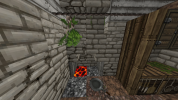
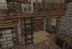
Here's my Tor town house. It's for a spicer and his wife.

 
  • Like
Reactions: DaenerysTargaryenI

Ric

Ser
Staff member
Hey FD!

Great job! The houses look great. I only have some very minor feedback on them:
  • You had a good grasp of some unique characteristics of the town, but one of them is that windows in the first floor should be kept as 1x1, so the window in the house to the left here should follow that.
  • In that same house, the top part looks too empty. Here's a couple examples of how to fill that space:
2021-09-07_02.49.58.png
2021-09-07_02.50.11.png
Notice how the floor pattern is used to make the area not look too "blank"
  • Beneath the stairs there should be some kind of support. You can use an open wooden gate or even an upside down stair for that.
And I think that's about it. Seeing your quick progress I think you'll learn better now by working in the server, so I approve you! Next time you're online remember to ask a mod to promote you :)

Now that you are approved you should first read our New Builders' Guide and then make your probation thread. A probation leader should answer the thread and took over your probation within a week, but feel free to send me a message if that doesn't happen. You can find plots to build using the Dynmap (there's an option called "Open Plot" that shows available plots), having a look at /warp build (that may be outdated sometimes) and by asking other builders. If you wish to you can ask a mod to give you a plot in the Test world where you can practice building.

Congrats and welcome to the team! :D
 
F

FD001__

Hey FD!

Great job! The houses look great. I only have some very minor feedback on them:
  • You had a good grasp of some unique characteristics of the town, but one of them is that windows in the first floor should be kept as 1x1, so the window in the house to the left here should follow that.
  • In that same house, the top part looks too empty. Here's a couple examples of how to fill that space:
View attachment 10668
View attachment 10669
Notice how the floor pattern is used to make the area not look too "blank"
  • Beneath the stairs there should be some kind of support. You can use an open wooden gate or even an upside down stair for that.
And I think that's about it. Seeing your quick progress I think you'll learn better now by working in the server, so I approve you! Next time you're online remember to ask a mod to promote you :)

Now that you are approved you should first read our New Builders' Guide and then make your probation thread. A probation leader should answer the thread and took over your probation within a week, but feel free to send me a message if that doesn't happen. You can find plots to build using the Dynmap (there's an option called "Open Plot" that shows available plots), having a look at /warp build (that may be outdated sometimes) and by asking other builders. If you wish to you can ask a mod to give you a plot in the Test world where you can practice building.

Congrats and welcome to the team! :D
Thank you!