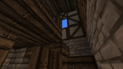
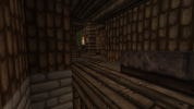
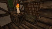
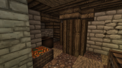
Visstick9 Builder Application

Visstick9

Storyteller
What is your Minecraft username?
Visstick9

What is your age?
17-20

In what country are you living?
Belgium

Where did you first hear about WesterosCraft?
Youtube

What do you like the most about GoT/ASoIaF?
I love Fantasy stories like A song of ice and fire or The Lord of the Rings, i'm also a fan of castles and epic battles like Blackwater Bay. My personal favorite character is Theon Greyjoy because he is very interesting, he goes trough a lot of character development : from being a cocky guy to the weak Reek after Ramsay tortured him. In the show his story line pays of quite well in comparison to other characters.

What is your favorite build on our server?
My favorite build is the Pyke castle because I like the Greyjoy house an i'm a huge fan of the way the islands on which the towers stand look.

Why do you want to join our server?
I'd love to join the server because I love A song of ice and Fire and Minecraft and it would be amazing if I could use my building skills to realize this world within the game.

Tell us about your build.
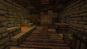
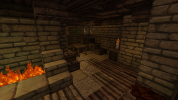
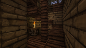
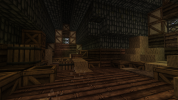
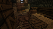
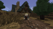
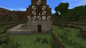
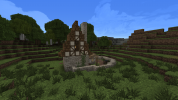
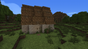
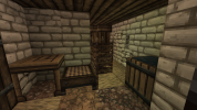
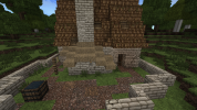
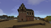
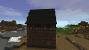
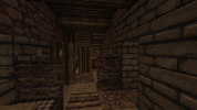
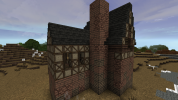
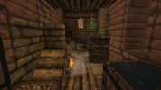
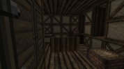
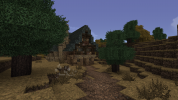
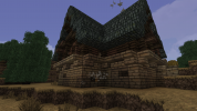
I built a simple peasant house, i'm not sure whether I made it too big, but the style is based of some of the buildings around the Ashemark castle with the black slate roof and the vivid dark sandstone walls.
2021-02-26_20.38.17.png2021-02-26_20.39.29.png2021-02-26_20.39.45.png2021-02-26_20.40.20.png2021-02-26_20.40.32.png2021-02-26_20.40.41.png2021-02-26_20.40.53.png

Did you follow the application rules?
You know nothing, Jon Snow
 

Emoticone11

The Dark Lord Sauron
Staff member
Hey WedgeRx,

Thanks for your patience!

This house is a rather nice start - the colors all go well together, and structurally it seems pretty realistic for the most part. The style and execution of the house is a bit below current server standards, but I think with some practice you'll catch up to server standards quickly. Here's some of the main feedback I have on this house:

- Overall, the exterior just feels a bit too overdetailed. Our current building standards can be summed up by "tasteful simplicity" - while you don't want buildings to look too plain, you also want to avoid adding messiness in the form of noise, harsh contrasts in textures/colors, or unnecessary detail for the sake of detail. Much of the feedback I can give right now would reduce to this point. For example, you should avoid the stair block overhangs in the stone foundation of the house, and instead just have the foundation be flush with the walls of the house. Likewise, you should get rid of the wood fence supports and the bulky wood arches above windows.

- Try to have rooves be linear in slope; either 45 degrees (stair-stair-stair-...) or 60 degrees (stair-block-stair-...). Avoid discontinuities in the roof shape, like the one you have about halfway down.

- Avoid 1x2 (horizontal) window shapes in general. It's far more common to have 1x1 windows or 2x1 (vertical) windows.

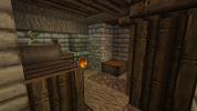
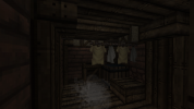
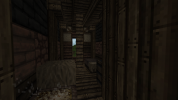
- Try to subdivide the interiors into smaller rooms for a larger house like this. Rely less on clutter blocks (crates/barrels/etc.) and try to think about what objects a medieval house would plausibly have, and how to represent those in minecraft.

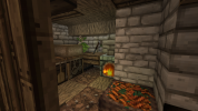
- I'd use a smaller and more compact hearth design for a normal house; the current one takes up a lot of space and has an awkward placement.

- Make sure to have wood rafters to support the slate ceiling here. Take a look at some houses in recent builds that have slate ceilings, and look at how they represent rafters. Similarly for the bottom floor, try to make the ceiling a bit less messy - take a look at some examples on the server.

- When using cabinet/bench blocks, like here, make sure to cover up all sides except for one with "half door" blocks or other furniture. This way, there won't be drawers exposed on multiple sides.

There are some other more minor points I could make, but at this point I think it's more useful to provide a list of recent builds that you can study and practice with. Before working on the challenge build (which I'll provide below), I suggest exploring these areas and trying your hand at a few of the styles.

The North
  • Beresford
  • White Harbor
The Riverlands
  • Duskendale
  • Maidenpool
  • Fairmarket
The Vale
  • Wickenden
  • Old Anchor (town at /warp oldanchortown)
The Crownlands
  • King's Landing update (open districts found at /warp KL1, KL8, KL21, KL31, KL32, KL35 and KL36)
  • Gaunt
  • Pyle
The Reach
  • Highgarden
  • Varner
  • Whitegrove
  • Holyhall
  • Woodwright
The Stormlands
  • Felwood
  • Mistwood
The Westerlands
  • Sarsfield
  • Stackspear
  • Silverhill
Dorne
  • The Tor
  • Wyl
Other useful resources
  • /warp gradient
  • /warp furnish

Once you feel comfortable proceeding, for the first challenge build, please make a medium-sized house in the style of /warp woodwright, along with a yard. Let me know if you have any questions about my feedback above or the challenge style. Good luck!
 

Visstick9

Storyteller
Thank you for the feedback and the response, it was very helpful. I do have a small question in terms of over-detailing though: in my previous build I added a lot of detail on the front of the house in order to hide the abrupt transition from sandstone into wood, if I removed this detailing the house looks very flat an uninteresting what could I do in order to solve this issue without over-detailing?

I also did the challenge build and tried my best not to add an overdose of detail and to pay attention to the angles of the roof, window sizes, half-doors and roof supports I hope this is an improvement over my previous house...
 

Attachments

  • 2021-03-08_20.51.38.png
    2021-03-08_20.51.38.png
    1.5 MB · Views: 15
  • 2021-03-08_20.51.50.png
    2021-03-08_20.51.50.png
    1.9 MB · Views: 14
  • 2021-03-08_20.54.53.png
    2021-03-08_20.54.53.png
    1.8 MB · Views: 15
  • 2021-03-08_20.55.00.png
    2021-03-08_20.55.00.png
    655.1 KB · Views: 13
  • 2021-03-08_20.55.06.png
    2021-03-08_20.55.06.png
    627.3 KB · Views: 11
  • 2021-03-08_20.55.11.png
    2021-03-08_20.55.11.png
    599.7 KB · Views: 12
  • 2021-03-08_20.55.17.png
    2021-03-08_20.55.17.png
    483.2 KB · Views: 12
  • 2021-03-08_20.55.20.png
    2021-03-08_20.55.20.png
    419.9 KB · Views: 12
  • 2021-03-08_20.55.25.png
    2021-03-08_20.55.25.png
    458.7 KB · Views: 11
  • 2021-03-08_20.55.34.png
    2021-03-08_20.55.34.png
    569.9 KB · Views: 14

Emoticone11

The Dark Lord Sauron
Staff member
Hey WedgeRx,

Very nice work on this house, it's a massive improvement! Regarding your question, it's not necessarily an issue to have an abrupt transition from one material to another, such as stone to daub and timber. It's basically showing timber framing built over a stone foundation, like this (consider the small extrusions of the wood beams too shallow to show up in minecraft). If you have a larger building and a facade is looking flat or uninteresting, I usually recommend starting out seeing what you can do with interesting stone gradients (using different stone blocks to represent corrosion in one part of the facade, for instance), or playing around with foliage when appropriate. If neither of those work, then you can consider adding additional architectural features to make it more interesting. Never just do detail for the sake of detail, though (things like stair indents or extrusions that don't serve a clear architectural purpose).

Some feedback on the new house:

- The stone foundation could still use a bit of work, mostly in the gradient. It's not a big issue here and your foundation still looks pretty good, but I just want to mention it because it's super important in general. You want to avoid mixing three different types of stone randomly, but instead have some 'primary' block, and then use secondary blocks purposefully, in smooth transition with the primary block, to represent corrosion (essentially like making "blobs" here and there). There's a nice tutorial for this at /warp gradient, and you can also check out stone castles which do a good job of this, like /warp gaunt or the WIP one at /warp maidenpool.

- Try to avoid having irregular plot shapes and/or roof shapes when doing diagonal plots, such as can be observed here (where some of the stair blocks form corners, others don't, etc.). Here's an example of how a diagonal plot with a 60-degree roof should look.

- Avoid doing rounded/lumpy shapes for thatch rooves, such as the shed building. Just do an angled flat shed roof going perpendicular to the main building. Here's a quick undetailed mock-up of what I mean.

- The interiors look good overall! My only feedback there is that I'd recommend having something like wood half doors covering the sides of the slate blocks on the second floor. The slate doesn't need to be completely covered, just convincing-looking rafters. I recommend doing something like this.

- Avoid making "bubble yards", where the walls follow a blobby or amorphous shape. It's better to use more linear/polygonal shapes for yards, conforming to nearby roads or other houses.

Other than that, nice work! For the next challenge build, let's try a more urban build - please make a middle-class house in the style of /warp duskendale. Let me know if you have any questions about the feedback or challenge style; good luck!
 
  • Like
Reactions: Visstick9

Visstick9

Storyteller
Thank you for the feedback again I'm glad that I made such an improvement and I hope this new build is on the right level too.
Due to many of the buildings in Duskendale being in rows I did not put any windows on the sides, I'm not entirely sure about the gradient though, I put monochrome sandstone on the bottom parts and when you go higher up I added some timber underneath the wooden top. I feel like the inside is a bit crowded but if I remove some things it looks very empty, is there anyway to fix that? [there are two beds behind the half-doors in the final image]
 

Attachments

  • 2021-03-13_21.17.30.png
    2021-03-13_21.17.30.png
    1.3 MB · Views: 10
  • 2021-03-13_21.17.43.png
    2021-03-13_21.17.43.png
    1.4 MB · Views: 10
  • 2021-03-13_21.18.01.png
    2021-03-13_21.18.01.png
    496.5 KB · Views: 8
  • 2021-03-13_21.17.50.png
    2021-03-13_21.17.50.png
    1.9 MB · Views: 11
  • 2021-03-13_21.18.04.png
    2021-03-13_21.18.04.png
    586.7 KB · Views: 8
  • 2021-03-13_21.18.12.png
    2021-03-13_21.18.12.png
    338.8 KB · Views: 8
  • 2021-03-13_21.18.34.png
    2021-03-13_21.18.34.png
    415.1 KB · Views: 9
  • 2021-03-13_21.18.14_2.png
    2021-03-13_21.18.14_2.png
    397.9 KB · Views: 7
Last edited:

Emoticone11

The Dark Lord Sauron
Staff member
Hey WedgeRx/Visstick,

This house looks pretty solid; the interiors especially are very nice. I actually think the level of crowded-ness in the interiors is appropriate this time; it's fine to have interiors which are on the tighter side as long as they're not messy or cluttered (i.e., the rooms have meaingful furniture rather than just crate spam). You did a good job with that balance. Here's some of the feedback I have:

- I think the stone gradient could still be a little less randomized (i.e., don't just have random single blocks of the dun cobble scattered around, but instead transition from the dun brick to "blobs" of the dun cobble to show spots where the stone is aging or eroding. All in all though, it's not bad.

- Don't mix wood planks with timber frame blocks like that; either have the facade be all daub+timber, or all wood planks. There is one exception, some daub+timber houses will use wood planks for the gable - the triangular section of the facade between the sides of the roof. This can look good in some cases.

- I'd suggest using the "timber frame window" blocks for the windows, rather than half doors.

- In "no overhang" styles, you still generally want to have the roof overhang on the eaves of the sides of the houses. Just not on the front/back of the house. That is, you should add an extra row of stairs on this side.

- Add some rafters here so the ceiling isn't flat; some rows of upside-down horizontal slabs should probably do. Also, I'd use the "wood carpet" blocks to cover up the stone there rather than the "wood cover" blocks.

For the next challenge we'll do a more rural crownlands style: please make a farmstead in the style of /warp gaunt. A farmstead should be a more or less self-sufficient complex, including a house, small barn, yard with veggies and an animal pen or two, etc. I recommend doing some googling for medieval farmstead inspiration as well. Let me know if you have any questions. Good luck!
 
  • Like
Reactions: Visstick9

Visstick9

Storyteller
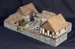
thank you for the feedback once again. In the next build I tried to put add more patches/blobs of different textures in the wall, but I'm not sure whether there is an overdose of cobble. I based my farmstead of of this image (but using the gaunt block palette of course) with a walled yard and connected buildings. I did feel like the yard in my build is a bit in-cohesive but is wasn't sure how to fix it. when I looked up images of medieval barns it didn't really show much stuff on the inside so I added a some thatch and hay. In the main building I made the bottom in to one big room, I hope that that isn't too unrealistic.

there were a lot of big images so I made an imgur album
 

Attachments

  • 42b96ef3e124f01c768d6aa8ff8fdfcb.jpg
    42b96ef3e124f01c768d6aa8ff8fdfcb.jpg
    101.2 KB · Views: 4
  • Like
Reactions: Vinnie

Emoticone11

The Dark Lord Sauron
Staff member
Hey Visstick,

Sorry for the wait. I agree with some of the points you made; it feels a bit too cobble-heavy. I wouldn't mind seeing some more use of timber/daub or wood. Making the main building one big room is good; that would actually be a pretty typical layout for a farmstead like this. Often the layouts of rural residences would be fairly simple, just having one large room with a central hearth where everyone sleeps, possibly even with their animals sharing the same room.

- Avoid making timber frame patterns which are random; you want them to be symmetrical most of the time across the center. Also, generally avoid having the horizontal rows of timber frame like on the left here. It's better and more realistic to use vertical-oriented patterns (since the beams would support weight vertically).

- If you're doing 60 degree angled rooves, make them fully peaked like this rather than doing bell-shaped rooves (where it flattens near the top).

- The layout with the yard is a little odd, with the area with the vegetables being a bubble jutting out from the main complex. I'd recommend perhaps expanding the overall borders of the yard a little to allow yourself for more space for the veggie patches. However, you generally want the farmstead as a whole to follow some sort of regular layout, using simple shapes - for example, see this farmstead at /warp waxbridgehamlet.

- Also in the yard, make sure to avoid having exposed dirt blocks showing under stone blocks. Make sure to use cobble slabs in the wall to smoothly transition the height.

- Make sure to include rafters here.

- Like I said, having the main building have one large room isn't necessarily an issue, but the proportions of the room in this pic feel a bit off. My recommendation would be to either have the main residence be a single room with a central hearth and high rafters, or otherwise to add some vertical support beams (using wood plank fence blocks or something) to help segment the space a bit better. Also, I'd avoid framing the corners of the room with the full block vertical plank blocks.

Otherwise this is looking pretty nice! I like the realism, and stylistically the interiors seem mostly up to standards apart from the issues I mentioned. I think the exteriors and yard plotting still need a bit more oomph, but you're definitely getting closer. For the next challenge, please make a medium-size house in the style of /warp tortown. Let me know if you have any questions on anything. Good luck!
 
  • Like
Reactions: Visstick9

Visstick9

Storyteller
Hey Emoticone,

Thank you for the feedback once again. When I went to Tortown I noticed a lot of the houses had 30 degree (?) roofs [slab-slab-slab] so I added that in my own build too, I hope that it isn't an issue. I wasn't really sure what to with the back of the house so I left is a wall. on the second floor I was a bit out of interior blocks to use so I may have overused some bookshelves.

here is an imgur album (sorry for the particles and the lava lake I the background)
 

Emoticone11

The Dark Lord Sauron
Staff member
Hey Visstick,

Very nice work with this house! Everything seems pretty up-to-standards to me; not seeing any major issues to point out. If I were to nitpick, I would say that the yard feels a little bare and could use a couple more immersive details - nothing too complicated, just a wheelbarrow, or shovel for tending to the veggies, or baskets, or something like that.

Also, regarding the bookshelves, I basically wouldn't have these at all unless the house belongs to aristocracy, or a special profession (scribes, bookbinders, etc.). Literacy during the setting of our server would be extremely low, and books themselves would be pretty expensive due to the labour intensivity of the process before the printing press.

For a tentative final challenge build, please make a middle-class house in the style of /warp Fairmarket, with a moderately sized yard. The style there's a bit complex, so make sure to study it carefully, but I'm sure you'll do fine. Good luck!
 
  • Like
Reactions: Visstick9

Emoticone11

The Dark Lord Sauron
Staff member
Hey Visstick,

Sorry for the hold-up - very nice work on this house, I'd say you nailed the Fairmarket style! My only feedback is that the timber frame pattern is a bit too messy in some spots, most notably on the turret on the side of the house.

I think you'll learn more as a probationary builder on the server at this point, so consider yourself approved! :)

To get promoted to builder, ask a moderator in-game next time you catch one online. The next step is to read over the New Builder guide, found here: https://westeroscraft.com/wiki/guides/new-builders-guide
And also make yourself a probation thread in the probation forum.

You can start building at any open locations on the server - you can find these at /warp build (possibly outdated as people forget to update it sometimes), and also by going to our dynmap and toggling "Open Plot", which is a new feature that we're testing, or otherwise just asking around to see which builds are open. Also, you can ask a mod to set you up with a plot in the Test world.

A probie leader should post on your thread within a week or so, give constructive feedback on your houses for the next month, and help be your entrypoint into the server community in general. As sometimes the probie leaders can be busy IRL, I also highly suggest seeking out feedback from project leaders and other online builders. At the end, you'll be made full builder.

Welcome to the team, I look forward to building with you! :D