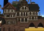
Abandoned Update Application - Street of Flour

Generalmcnugget and I would hereby like to apply for an update of the Street of Flour.

Description:
Street of Flour is located on the southern side of the Hill of Rhaenys. It overlooks the maze-like streets of Fleabottom. It is home to numerous bakeries. It is mentioned a few times in books one and two. In Game of Thrones, Arya visits the street, catches a pigeon and loves the scent of the bakeries.
In A Clash of Kings, Tyrion notices guards outside the doors of all the bakeries at the street, as the food shortage sets in.

Current State:
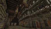
The street is home to bakeries, a few warehouses mainly for flour, some multi-tennant buildings and a lot of bakeries. The first row of houses towers over Fleabottom.

Update Plans:
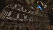
We would like to overhaul the entire street. Medieval bakers were wealthy and highly organized through guilds, and we want the street to show this.
Our vision of the street has tall buildings overhanging both fleabottom and the Street of Flour itself.
From fleabottom, the poor would look up onto imposing buildings reaching out over the side of the hill. From big windows, the inhabitants would have great views over fleabottom and up towards the Red Keep.
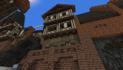
The street itself will have tall buildings on both sides, with the hillside ones being taller than the fleabottom side buildings. This is both because technically, they have their bottom 2-3 floors dug into the hillside but also so you will get a sense of the hill incline despite them being built upon.
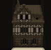
The architectual style will be clean with mostly Timber Oak, White Daub buildings with oak shutters interspersed with a few timber buildings. The hillside buildings will feature 2 bottom floors of stone to support the hillside.
The buildings will decline in size as one gets nearer to the end of the street.
The granaries will be moved from their current location centralised on the street towards the eastern entrance to the street. The granary will still be easily accessible to the bakers, but we want to move the granaries to give the prominent real estate to the bakers.
At the center of the street will be the guild hall with a big vaulted space at ground level for the sale of bread in any quantity and quality. Carts are to move in and out of this space going to/returning from deliveries.
Most of the bakeries will be "brown" bakeries. These produce huge amounts of bread of a poorer quality of flour. The brown bakeries will not sell bread locally, but will sell their bread in carts around the city, will deliver bread to their clients directly or sell their bread through the guild hall.
There will also be a few "white" bakeries. These will be high class and will focus on selling the highest quality bread to the nobility and the rich. The white bakeries will sell bread from their own premises as well as running deliveries.
The street will also host at least one butchery. The butcher will not sell any meat locally, but will instead sell engros to the bakeries for meat pies.
We will not make any changes to the streets of the district except minor ones. There will not be any new roads between the Street of Flour and fleabottom. Theres already access from both ends.


Gradients for the foundations:
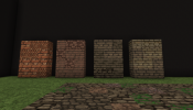
Gradient.png

Testhouses (you can visit these at /warp nuggs):
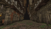
Testhouses street.png Testhouses1.png Testhouses2.png

A few houses pasted in at the edge of Fleabottom to showcase how the street would look from it's most prominent angle:
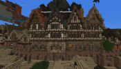
Testhouses overlooking fleabottom.png
 

RavishMeRed

Printmaker
Staff member
Pronouns
he/him
I love the plans for this district. I do feel there is a bit of stylistic suppression that needs to happen. For example brown slate and red slate are not relatively used in Targaryen Influenced areas seen here. The hipped roof designs also feels swiss inspired, something that should retain to the Cobblers Square area.

On another note, I feel the proportions of your tests dwarf everything around it. Yes, medieval bakers were wealthy but not insanely rich as per say a jewler or spicer. Bakers tend to be middle to high-middle class professions and your tests reflect a more high class vibe. I would lower the proportions of the houses, shooting for a 2 to 2 1/2 floors. Overall i think your current tests could use some refinement as to make the area stylistically unique without being a huge showcase and potentially blocking the skyline of the Dragonpit.

Also why I'm here I'd like to bring attention to the current border for this district. I believe it needs to be adjusted to follow the rim of the wall section around Flea Bottom. It currently contains Flea Bottom houses.
 
The proportions of the houses may look extreme of you only view at them from the fleabottom side. You need to also take into account the slope the street is situated on. The houses would never be able to block the dragonpit. If you go look at the in situ tests we have outside the city gates to the north, you will see that we have actually made some tests for even lager houses on the hillside side of the street, and these only barely crest the next street up the hill. If we go too low, the hillside houses will look like hovels dug into the hillside.
 

RavishMeRed

Printmaker
Staff member
Pronouns
he/him
The proportions of the houses may look extreme of you only view at them from the fleabottom side. You need to also take into account the slope the street is situated on. The houses would never be able to block the dragonpit. If you go look at the in situ tests we have outside the city gates to the north, you will see that we have actually made some tests for even lager houses on the hillside side of the street, and these only barely crest the next street up the hill. If we go too low, the hillside houses will look like hovels dug into the hillside.
Sorry I was not very specific in what I was referring to. What I meant by adjusting proportions were the houses facing the Flea Bottom side on the edge of the wall. I feel by decreasing the height on one side you could create a slope effect, allowing you to see the houses behind. I would still strongly urge you to lower the height of the buildings behind, mainly because the problem with building 4 or 5 floor houses like the ones in your test, you run into the issue of too many overhangs. One test specifically i saw was 5 floors tall and had 5 blocks overhanging.
 
Ah. Our tests shows that we have to build tall at the hillside of the street for the buildings not to look stupid against the hillside. If you look at the existing buildings, these are also tall and are even located on a retaining wall. We feel like this retaining wall restricts the access to the hillside buildings too much, so we would instead have the buildings go all the way down to street level and have these houses have a little taller foundation to match the hill slope.
The fleabottom side houses will be a little more restricted in height, so you get the sloping feeling of the hill.
Furthermore, the farther towards the ends of the street you get, the smaller and smaller the houses too will become, just like the current state of the street.

I have looked through the tests, and the most we have are 3 overhanging floors and an overhanging roof on top of that.
 
Last edited:
My idea would be to have the four central buildings on the fleabottom side be four storeys tall, then the next two on both sides be three storeys tall and the rest only be two storeys.
As I have also pointed out to Ravish on Discord, the current fleabottom houses against the wall are themselves three storeys.
We plan to change the retaining wall up a bit. Make the arches a bit wider and more arch-like. The row of houses against fleabottom will have foundations that are meant to blend with the wall.
 
Last edited:

Emoticone11

The Dark Lord Sauron
Staff member
Hey Spike/Nuggs,

Got a chance to look at this a bit more in-depth. Overall I like your plans a lot, though I have some feedback on some of the stylistic and plotting elements.

- I'm not really sold on the profile of the houses overlooking flea bottom at the moment; while the height and proportions of the houses are nice, it just feels a bit generic and I think the view of those houses from the streets below has a lot more potential. One thing that could help is throwing some sideways-facing rooves into the mix, in order to "glue" the facades together.

- I agree that the hipped rooves feel a bit out of place here; if these are to be used in KL, I think they should be restricted to the area around cobbler's square where we went with some Germanic stylistic influence (possibly the result of a diaspora from regions of Westeros based on that style).

- Regarding the hillside houses, I do feel that the new house proportions are a bit extreme. My proposed solution: replace the retaining wall in the current version with a raised walkway (example1, example2) about 1-2 blocks wide, spanning across most of the street. Moving the granaries will allow you to push the houses back slightly, giving a bit more space for this. I think this could look quite cool if done properly, and would then allow you to give those houses similar proportions to the ones on the flea bottom side, while still having a taller roofline than them.

- I'm having a hard time getting a good sense of how the new baker's guild design fits into the overall street. It feels a bit out of place currently, but it's too WIP to tell. What sort of inspiration or final image do you have in mind?

- Could you expound a bit on your plans to move the granaries to the east entrance of the street? Will you have them all within one complex, or spread out? What are you planning to do with the space that they previously occupied (specifically the one section above the dragon pit doorway)?
 
Hey Emot.
The test north of the copy in version of Kl is only to test dimensions and heights. The guild hall there is not anywhere final in either size, shape, form or anything. It's only to see how much space we could max use for a vaulted market.
The test also shows some extreme houses which were testhouses we stretched by two floors. This was to see how talæ we would have to go for access from the back street.
The sozes we wanted to use are the ones located on nuggs plot with the hillside houses having a few more blocks of stone grund floor to support the hillside.
We will address the rest of your post and make new tests when we get the chance to speak (Nuggs and I are different timezones).
 
  • Like
Reactions: Emoticone11
Hi Emot thanks for your reply.

I feel like you asked to change most if not all of the elements special to our vision of this unique district within KL.

I am wondering which elements do you feel most strong about so we can seek out a compromise because right now it feels like you are asking to change evreything that would make this district feel like an improved version of the old one.

I don't think it's fair to ask so many changes that are subjective to one's preference rather then trusting builders with their vision.

I'm afraid that if we implement all of the points it won't have the unique feel the old one had:(

So if it's possible it would be kind of you to let us know what are the most important aspects and try to distill it to where it dosen't change the whole vision and character of the area.
 
Last edited:
I dont mind throwing in some 45 degree rooves to change up the rooves a bit. However I feel with this unique area, that the people constructing the houses wouldnt have wanted to not have gables facing the street.

The houses facing fleabottom have a unique view of the city. Why would they not face their gables this way to enjoy the view from every single floor.
For the houses on the hillside, there is another challenge. If they had rooves sloping down towards the street and towards the hillside, either rainwater would all collect between the back side of the house and the hillside or they would need some piping to get the water to the street side. With roof lines perpindicular to the street, it would be easy to direct water to the street and down into the sewers.
 

Emoticone11

The Dark Lord Sauron
Staff member
Nuggs:

The elements that I feel the most strongly about:

* Having some sideways-facing rooves on the flea bottom side to help "glue" the houses together a bit more, and making the houses seem a bit less cookie-cutter.

* Changing some of the extreme proportions of the hillside houses (e.g. this one). I suggested using an elevated walkway as a unique way to do this while still maintaining the height difference between the rooflines on the flea bottom side and the hillside. However, I'm open to alternatives.

Regarding the issue of losing the "unique feel the old one had", are you talking about the one in old KL, or old old KL? I actually still really like the concept of the latter, even if the individual houses are very outdated. I've always felt that the former is slightly underwhelming in comparison. Note, however, that both of the old versions used a diversity of roof shapes and alignments to create a "wall of houses" effect. My point is that when you just use a bunch of similar-looking houses with forward-facing rooves, you lose that effect and the "unique feel" that the old versions had.

Regarding preferences and subjectivity, the point of the approval process and forum discussions is precisely to put a check on the effect that individual preferences can have on any particular district. If everyone leading a district just goes with their own subjective style and interpretation without any inter-district cooperation, it runs the risk of leading to a disjointed final product where the style can vary wildly from district to district. While some amount of district-level variance is desirable, we still need to make sure that basic things like material choices, roof shapes, etc. add up to form a cohesive picture of KL as a whole. The main thing this applies to here is the hipped rooves. Why do you feel that these make sense in this district? If they're used there, do you think they should be used in other nearby KL districts? I think these things need to be justified before using them in a particular area of KL which does not have precedent for using hipped rooves. I made this thread for discussing and refining the various substyles of KL and what unique features they have.

Spike:

I'm not really following the reasoning for having only forward-facing rooves. The "good view" argument doesn't seem that compelling; it's only the top level that would really be affected, which would likely either be an attic or sleeping area. In your current version of the tests, all of the houses have only a small window on the top level anyways, and one house doesn't have any window at all. Furthermore, if you add some sideways-facing rooves, you can still add dormers with windows if you wish.

Any sunken areas between the backside of the house and the hillside would need good water drainage anyways, regardless of which side the rooves are facing. I don't think the direction of the rooves would have much influence on the amount of water that collects in these areas, given that most of it would be direct rainfall into those areas, or runoff/groundwater from the hillside.
 
The hillside house with the extreme proportions wasnt really part of the application. It was me messing around seeing just how tall the house would have to be to actually have a small facade facing the back street. We have given up on having any facades face the back street because of how stupid tall the houses would have to be.
 

Emoticone11

The Dark Lord Sauron
Staff member
By "back street" you mean the one leading up to the dragonpit? I think the elevated walkway idea would still allow you to have a small facade on that side. The houses would be normal proportions, just elevated relative to the main road below. I'm fine with having something more similar to the current version as well, though (I think having the attics/storage areas be accessible from street level like in the current version is a neat idea).
 
So something like this
2021-08-15_20.36.17 test.png

This will just have the attic accessible from the backstreet. I have pushed the house in a bit compared to the previous houses to make the elevated path and house be more flush with the existing dragonpit gate.
I can work with that, and I will also get together with Nuggs to come up with a few tests for fleabottom-side houses that have their rooflines parallel to the street.
 
I am happy with keeping 4 bigger houses and implementing the changes Emot asked. I hovewever am against 45 degree roofs. Maybe some on the two opposite sides of the district.
Spikespiegel Nice test, but I am leaning towards it being masonry could inspire the guild master's house.
 

Emoticone11

The Dark Lord Sauron
Staff member
As long as you and Spike are on the same page about everything, I'm happy to approve. I'm fine with only 60-degree rooves, I just wanted to see a bit more diversity in the roof shapes/alignments of the houses facing flea bottom so it forms an impressive wall of overhanging houses.
 
We are in the process of adding some of the more complex buildings to the street and adding street pattern and some of the retaining walls.
Once we get a building or two more up and do some tweaks to the plotting, we will start opening up plots.

At the moment, we have some brownbakers and a warehouse (eastern entrance to the street) that needs ints. They are marked ingame. Feel free to test and apply for them.