District Description:
KL3 is a district cornered by the Street of Seeds to the west, Street of Silk to the east and Swepherds Way to the south. With nothing really important in it canon wise.
New canon:
I found no canon for the district since there I nothing canon worthy in it. (If someone still finds something, please tell me )
)
District's current state:
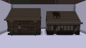
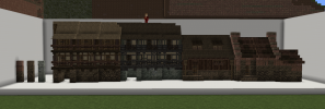
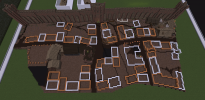
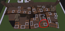
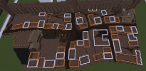
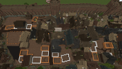
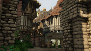
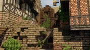
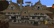
Right now the district is a mix of maybe 10 buildings that are almost copied 100%. It looks abit repetitive. Also the thatch roofed houses near the wall dont really have good plotting, and are very cramped up.
Update plans:
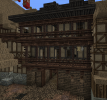
The whole district has to be replotted from the ground up id say. But still with the intent on having a more "flee bottomish" looking strip next to the wall but with a bit more greenery in the form of gardens. Also update the current style to the generall KL style we have rn.
And I thought because of the "trade streets" in the west and east the district would have some storages on these two borders.
But in general it could be a more "boring" district with less important occupations and more living space. I would also like to add another small market square.
Another idea I had was to have a sunken down area in the poor area, because of the big sewer entrance beneath it. (Could be cool to see a dent in the roof line of the district.)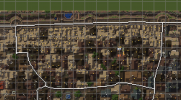
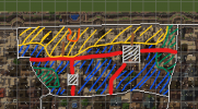
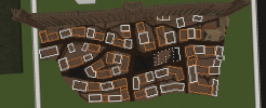
White = market sqares
Red = Main roades (stormlands cobble)
Dark Green = Strorages for Street of Seeds and Silk
Blue = mostly appartments and multitenants
Yellow = flee bottomish lookin area
Orange = sunken down area because of sewer entrance
Brown = Main entrances to the poor (mud/dirt with stormland cobble pathces
As always feedback is very welcome.
--Tobi--
KL3 is a district cornered by the Street of Seeds to the west, Street of Silk to the east and Swepherds Way to the south. With nothing really important in it canon wise.
New canon:
I found no canon for the district since there I nothing canon worthy in it. (If someone still finds something, please tell me
District's current state:
Right now the district is a mix of maybe 10 buildings that are almost copied 100%. It looks abit repetitive. Also the thatch roofed houses near the wall dont really have good plotting, and are very cramped up.
Update plans:
The whole district has to be replotted from the ground up id say. But still with the intent on having a more "flee bottomish" looking strip next to the wall but with a bit more greenery in the form of gardens. Also update the current style to the generall KL style we have rn.
And I thought because of the "trade streets" in the west and east the district would have some storages on these two borders.
But in general it could be a more "boring" district with less important occupations and more living space. I would also like to add another small market square.
Another idea I had was to have a sunken down area in the poor area, because of the big sewer entrance beneath it. (Could be cool to see a dent in the roof line of the district.)


White = market sqares
Red = Main roades (stormlands cobble)
Dark Green = Strorages for Street of Seeds and Silk
Blue = mostly appartments and multitenants
Yellow = flee bottomish lookin area
Orange = sunken down area because of sewer entrance
Brown = Main entrances to the poor (mud/dirt with stormland cobble pathces
As always feedback is very welcome.
--Tobi--


