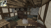
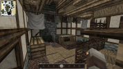
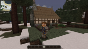
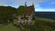
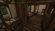
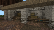
Tobi Builder Application

Tobi

Poet
What is your Minecraft username?
tobinator1606

What is your age?
13-16

In what country are you living?
Germany

Where did you first hear about WesterosCraft?
Youtube

What do you like the most about GoT/ASoIaF?
I really like Tyrion as a character because of his many character traits and his personality. I also really like his backstory.

What is your favorite build on our server?
I like Kingslanding because of the different buildstyles of the houses, depending on how much money or wealth the person has.

Why do you want to join our server?
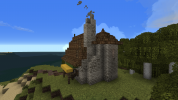
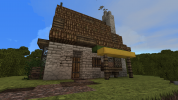
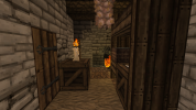
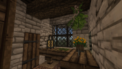
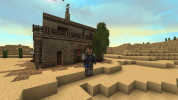
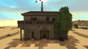
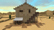
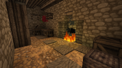
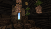
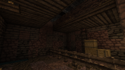
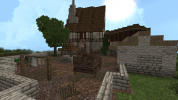
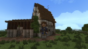
I would say i have acceptable building skills. And I wanna help to finish Westeros so we all can experience the finished world.

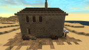
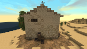
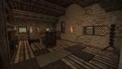
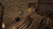
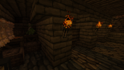
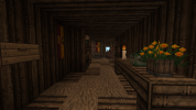
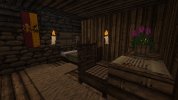
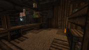
2021-06-29_12.03.21.png2021-06-29_12.04.46.png2021-06-29_12.05.13.png2021-06-29_12.05.45.png2021-06-29_12.05.54.png2021-06-29_12.07.10.png2021-06-29_12.07.29.png

Did you follow the application rules?
You know nothing, Jon Snow.
 

Attachments

  • 2021-06-29_13.47.18.png
    2021-06-29_13.47.18.png
    1.5 MB · Views: 3
Last edited:

Emoticone11

The Dark Lord Sauron
Staff member
Hey Tobi,

Thanks for your application! Glad to see your interest in helping out with the project.

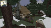
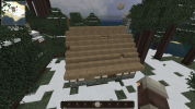
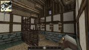
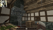
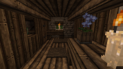
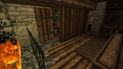
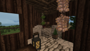
Nice work with the apphouse! Not really seeing any issues with it. Hope the exercise was helpful for learning our server's building style. For subsequent challenge builds, you'll be expected to build original houses of your own design, in the style of specific locations on our server. However, I recommend thinking of it similarly to the application house - except now, instead of simply replicating a house, you should try to replicate particular elements of multiple houses, and synthesize them into an original creation. After each one I'll give some feedback.

BTW, just a couple recommendations for future builds. Some biomes affect stone types, for instance many stone bricks are darker in Taiga/Extreme Hills biomes. I'd just try to make sure you generate a world with a 'neutral' biome appropriate for the style you're building (e.g. Plains). Also, while I know grass spreads automatically in Singleplayer, it'd be best if you quickly replace it with dirt/gravel before taking screenshots.

For the first challenge build, please make a middle-class house in the style of /warp woodwright. Let me know if you have any questions. Good luck!
 
  • Like
Reactions: JJLyric

Tobi

Poet
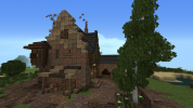
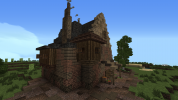
At first thanks for your quick response. Here is my Middle Class House.
 

Attachments

  • 2021-07-04_21.08.15.png
    2021-07-04_21.08.15.png
    1.4 MB · Views: 23
  • 2021-07-04_20.41.20.png
    2021-07-04_20.41.20.png
    1.8 MB · Views: 23
  • 2021-07-04_20.41.31.png
    2021-07-04_20.41.31.png
    1.5 MB · Views: 23
  • 2021-07-04_20.41.45.png
    2021-07-04_20.41.45.png
    1 MB · Views: 21
  • 2021-07-04_20.41.58.png
    2021-07-04_20.41.58.png
    497 KB · Views: 20
  • 2021-07-04_20.42.08.png
    2021-07-04_20.42.08.png
    542.7 KB · Views: 19
  • 2021-07-04_20.42.32.png
    2021-07-04_20.42.32.png
    1,007.6 KB · Views: 17
  • 2021-07-04_20.42.40.png
    2021-07-04_20.42.40.png
    1.2 MB · Views: 19
  • 2021-07-04_20.43.02.png
    2021-07-04_20.43.02.png
    460.7 KB · Views: 14
  • 2021-07-04_20.43.05.png
    2021-07-04_20.43.05.png
    294.2 KB · Views: 21

Emoticone11

The Dark Lord Sauron
Staff member
Hey Tobi,

Sorry, somehow I missed your update - feel free to ping me if it's been more than several days.

Overall nice work with this house, it seems like you got all the major elements of the Woodwright style down! The plot is a little bit on the smaller side, but the proportions are done well so I think it works in this case. I do have a bit of feedback to give:

- I don't think it would be very realistic to have a tower structure adjoined to a small ordinary house, unless it serves some sort of special purpose (e.g. a kiln or granary).

- The stone brick is a bit too messy. Instead of mixing different block types randomly, you want to have a clear gradient or transition from one color/texture to another. For instance, you might have reach cobble -> reach light brick -> light stone. Avoid having two blocks touching each other if they contrast too much, either in color or texture. I recommend checking out /warp gradient on the server for a tutorial.

- Avoid having what's called a "bubble yard", where the walls of the yard form an amorphous blob rather than having a well-defined shape. Instead, I recommend following straight (possibly diagonal) lines with the walls of your yard, creating a rectangle or polygon shape instead. Usually you want the walls to go parallel to roads, adjacent houses, or other features. If you look at the yards in Woodwright some more, you'll see what I mean. Finally, make sure to not expose dirt blocks directly under stone blocks (as in this picture).

- Avoid using log blocks in houses (both exteriors and interiors), since it's considered an outdated practice. Using thin log blocks is sometimes fine (e.g. for vertical supports).

- In the second floor, you should have some form of rafters supporting the slate roof from underneath. The best way to do this is with wood half door, stair, and slab blocks. You don't necessarily need to cover up every slate block, just most of them. There are some common rafter designs that people use, so I would recommend studying these in builds like Woodwright a bit more.

- I wouldn't use torch blocks in an ordinary house like this; those are more for castles and towns. For house interiors, you usually want to stick with candles and lanterns.

For the next challenge build, please make a medium-size house in the style of /warp tortown. Let me know if you have any questions about the feedback I gave, and I can try to illustrate what I mean with a picture when I get a chance. Good luck!
 

Tobi

Poet
Hi again,
in this build I tried to concentrate on the gradient. I think I did it better then last time. Also I wanted to ask if I´m allowed to just build some facades around the house so I create some kinds of streets?
But another thanks for you response and here is my build.
 

Attachments

  • 2021-07-15_19.45.13.png
    2021-07-15_19.45.13.png
    1.8 MB · Views: 15
  • 2021-07-15_19.45.22.png
    2021-07-15_19.45.22.png
    1.4 MB · Views: 16
  • 2021-07-15_19.45.27.png
    2021-07-15_19.45.27.png
    1.4 MB · Views: 16
  • 2021-07-15_19.45.36.png
    2021-07-15_19.45.36.png
    1.5 MB · Views: 16
  • 2021-07-15_19.45.43.png
    2021-07-15_19.45.43.png
    1.4 MB · Views: 14
  • 2021-07-15_19.45.57.png
    2021-07-15_19.45.57.png
    1.1 MB · Views: 12
  • 2021-07-15_19.46.26.png
    2021-07-15_19.46.26.png
    974.5 KB · Views: 9
  • 2021-07-15_19.46.53.png
    2021-07-15_19.46.53.png
    718.2 KB · Views: 9
  • 2021-07-15_19.47.18.png
    2021-07-15_19.47.18.png
    1 MB · Views: 18
  • Like
Reactions: Gealrüable

Emoticone11

The Dark Lord Sauron
Staff member
Hey Tobi,

Great work, very nicely done with the gradient this time. Overall a large improvement. To answer your question, you're certainly allowed to make multiple facades around the main house. In fact, I'd encourage it - an important part of building is learning how to properly situate a house in its surrounding context.

I think the main thing that needs work this time is the interiors, which seem to have a decent overall layout but some issues with the execution. I'd recommend taking some time studying interiors on the server before working on the next challenge build. Here's some of the specific feedback I have:

- Generally you should avoid 1x2 (horizontal) windows in houses, as they often look strange. It's better to stick with 1x1 windows and 2x1 (vertical) windows.

- Avoid random or sparse thatch carpet, where you just have singlular blocks of thatch carpet scattered around the house. Instead try to keep it in larger, continuous "blobs" where it would make sense. There's also a nice trick you can do sometimes (if it's the bottom floor, or you have 2-wide floors) where you use thatch blocks at the edges of the carpet to "blend" it with the rest of the floor.

- Similarly, avoid mixing dark thatch with light thatch, since they contrast badly. Just stick with one of them, probably light thatch in this case.

- Don't place candles horizontally on walls, since the texture doesn't have a holder block, so it seems like the candle would just fall off once the wax melts. Always place candles upright on some surface. Often I like to use fence/wall blocks as candle holders for poorer houses, and the metal stand that you used for wealthier houses.

- Painting blocks generally shouldn't be used at all in ordinary houses, only in wealthy manses or similar types of builds. Paintings would be very expensive in a medieval setting.

- Make sure to cover up the sides of the bench blocks here with half door blocks.

- Be careful not to have full block steps on the underside of ceilings, like you do on the top floor. As in my previous feedback, you should look into rafter designs to support the ceiling from underneath and make it look less flat/chunky.

- Minor detail, but a bit of the "ash" block (on vanilla mycelium) would look good around the hearth here.

For the next challenge build, please make a medium-sized house in the style of /warp duskendale, with a small yard. This is a larger town with a more complex style, so make sure to pay careful attention to everything. And please let me know if you have any questions about any of the feedback above. Good luck!
 

Tobi

Poet
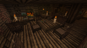
Here is my Duskendale House. I tried to do an Inn with some rooms and Stables. I think I did a good job but I have a bit of a problem with the ceiling but I will try to do it better in my following builds.
Thanks for your response.
 

Attachments

  • 2021-08-07_01.51.32.png
    2021-08-07_01.51.32.png
    1.5 MB · Views: 24
  • 2021-08-07_02.10.04.png
    2021-08-07_02.10.04.png
    1.7 MB · Views: 24
  • 2021-08-07_02.10.14.png
    2021-08-07_02.10.14.png
    1.7 MB · Views: 22
  • 2021-08-07_01.53.28.png
    2021-08-07_01.53.28.png
    1.1 MB · Views: 20
  • 2021-08-07_01.55.32.png
    2021-08-07_01.55.32.png
    585 KB · Views: 18
  • 2021-08-07_01.56.11.png
    2021-08-07_01.56.11.png
    621.5 KB · Views: 19
  • 2021-08-07_01.56.16.png
    2021-08-07_01.56.16.png
    610.7 KB · Views: 16
  • 2021-08-07_01.56.25.png
    2021-08-07_01.56.25.png
    711.3 KB · Views: 17
  • 2021-08-07_01.56.32.png
    2021-08-07_01.56.32.png
    548.1 KB · Views: 16
  • 2021-08-07_01.57.18.png
    2021-08-07_01.57.18.png
    904 KB · Views: 22

Emoticone11

The Dark Lord Sauron
Staff member
Hey Tobi,

First off, props for going for a more complex build & layout! I think the overall plotting and layout of this build is very good, and has a lot of potential. That said, there's a lot of issues with execution that I noticed:

- The stone brick gradient is still a bit too messy. You want to have smooth transitions between blocks of different colors, textures, or darkness. For instance, you shouldn't have the lighter "vivid sandstone" directly touching the darker "dun brick" or "dark monochrome sandstone", since they contrast too harshly. The mix between dun and stormlands brick/sandstone should also be less random. My advice is to make the walls out of a single material (e.g., dun brick), and then add secondary materials (e.g., stormlands cobble and dark sandstone) wherever the walls would get dirty or eroded. I recommend taking some more time studying gradients on the server before doing the next challenge build.

- Don't mix together light thatch and leather, which also contrast really harshly. Mixing dark thatch and leather is sometimes okay, but it's perfectly fine to just use one material (light thatch).

- You never want to have flat ceilings in houses; it's unrealistic and also doesn't look very good. Create rafters using wood plank upside-down stairs, slabs, and occasionally wall blocks or fence gates. These rafters should run in one direction, and support the floor above. If you look at the interiors of recent houses on the server you'll find some examples of these that you can study.

- Overall a lot of the interior rooms feel pretty empty, although the layout seems fine. Having a better ceiling design will help a lot with this, but you should also experiment with different furniture arrangements and room layouts - take a look at larger taverns on the server and see what they do.

- Avoid torches in ordinary buildings; these are more for castles or possibly along town/city streets. Stick with candles and lanterns. For candle blocks, you always want to place them vertically on some surface. Never place them on a wall, since the candle would just melt and fall off.

- Don't use sign blocks for stuff except for in rare cases. Remember that people in medieval times weren't really literate, so there wouldn't be signs in the tavern indicating the rooms. Generally things would be indicated symbolically (e.g. the profession signs), or people would just know what things are through verbal communication.

- The inside of the roof should also be covered up (e.g. here and here). The easiest way to do this is with upside-down wood stairs and half doors. However, you can also try more complex rafter designs. Again, I recommend looking around at Duskendale houses and seeing what they do.

- Whenever you use bench/cabinet blocks (e.g. here), try to cover up all sides except for one, using half door blocks for instance.

Sorry for the wall of text; if you want me to show any of the feedback visually, let me know and I can take some pictures when I get a chance. For the next challenge build, please make a medium-sized house in the style of /warp woodwright with a moderately sized yard. Let me know if you have any questions about anything. Good luck!
 

Tobi

Poet
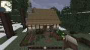
Here is my Woodwright style house. I tried to make sure that I respect all the issues and improve them. Also I tried a diagonal house for the first time. If you want more pictures I can add them later.
Thanks for your response.
 

Attachments

  • 2021-08-20_17.27.57.png
    2021-08-20_17.27.57.png
    1.4 MB · Views: 11
  • 2021-08-20_17.28.08.png
    2021-08-20_17.28.08.png
    1.2 MB · Views: 10
  • 2021-08-20_17.15.03.png
    2021-08-20_17.15.03.png
    1.4 MB · Views: 8
  • 2021-08-20_17.15.24.png
    2021-08-20_17.15.24.png
    487.7 KB · Views: 9
  • 2021-08-20_17.15.55.png
    2021-08-20_17.15.55.png
    613 KB · Views: 8
  • 2021-08-20_17.16.03.png
    2021-08-20_17.16.03.png
    365.4 KB · Views: 7
  • 2021-08-20_17.16.13.png
    2021-08-20_17.16.13.png
    583.7 KB · Views: 6
  • 2021-08-20_17.16.22.png
    2021-08-20_17.16.22.png
    887.5 KB · Views: 6
  • 2021-08-20_17.16.39.png
    2021-08-20_17.16.39.png
    304.7 KB · Views: 6
  • 2021-08-20_17.16.52.png
    2021-08-20_17.16.52.png
    886.3 KB · Views: 10
Last edited:
  • Like
Reactions: FD001__

Emoticone11

The Dark Lord Sauron
Staff member
Hey Tobi,

You're definitely improving! Good on you for trying a diagonal house as well - those are tricky, and you pulled the shape off pretty well. I still have a bit of feedback to give regarding execution, most of which comes down to things being a bit too messy. So try to work on that carefully for the next build.

- The stone gradient technique still needs a bit of work. The "light stone" block contrasts too harshly with the reach cobble and reach smooth brick blocks, in terms of texture and darkness. I'd recommend using the following gradient: reach smooth brick -> reach cobble -> reach light brick -> light stone. Only adjacent pairs in this sequence should be touching each other in the gradient.

- Similarly, simplify the timber frame pattern a bit. Avoid mixing chunks of plaster with the timber frame blocks in a messy way. Go for something like this instead. If you are going to do something like what you have now, use the "plain white daub" block instead of the white plaster. Make sure it's always framed by timber frame blocks.

- Although it's good that you're experimenting with diagonal houses, 45 degrees is pretty much the one angle you want to avoid in minecraft. With a few rare exceptions, it's just really difficult to make look good. In this case, the 45 degree outbuilding should be changed to a more subtle angle, like 60 degrees or so.

- Also, the arched tunnel through that building is rather strange, especially when they can just walk around it easily. It makes the whole building a bit pointless (it seems to be used for storage, but they could just use a simpler shed, cellar, or attic for that) and the interiors pretty awkward.

- Avoid having random or scattered thatch carpets, e.g. here. Try to use continuous "blob" shapes for the carpets instead. If you head towards the end of /warp furnish (the NONOS section), there's an example of this.

- Don't use bookshelves or paper blocks in anything except the wealthiest of houses, maesters, or specialized professions (scribes, bookbinders, etc.). Most people would not be literate, and would not be able to afford books.

- Use wood planks for the cover above the well, rather than slate. Slate tiles would be a pretty expensive and heavy material to use for a well.

Otherwise nice work; again the overall layout is pretty good and flows together well. BTW, I just realized I accidentally gave you a Woodwright challenge twice xD Sorry about that; the second time around is definitely an improvement on the first though.

For the next challenge build, please build a small farmstead in the style of /warp gaunt - at a minimum it should have a peasant house and barn (or possibly a combined house/barn), some vegetable and herb gardens, and animal pens. I encourage you to do some research into medieval farmsteads for inspiration as well. Make sure to pay close attention to detail and avoid excessive messiness in the style. Good luck!

 

Tobi

Poet
Hi again,
I really enjoyed this build. This time i again added diagonal houses. My plan with the peasant house was that the farmers are sleeping by the chimney because of the heat that it is producing. Also first time that I use an Imgur link, hope it works.
And again thanks for your response.


Emoticone11

The Dark Lord Sauron
Staff member
Hey Tobi,

Overall good job with this build, another solid improvement! Your interiors are looking pretty good this time; most of my feedback will be focused on the exteriors:

- The main issue is the messy thatch rooves, which are much too lumpy and random. If you go back to Gaunt, you'll notice that most of the rooves have pretty clean form, with only very minor lumps at most. Focus on getting a simple roof shape first. Only add additional details if necessary. Usually you won't need to do anything more to the roof, especially with diagonal houses where the roof shape is already fairly complex. You don't want to make the rooves overdetailed.

- Also, avoid having thatch rooves that are too flat, such as on the barn/stables. You want thatch rooves to be at least 45 degrees in slope.

- Don't mix different wood types together randomly (jungle and oak in this case), as it just looks messy. Make your houses using a single wood type (e.g. oak), and then if you want to represent rot or discoloration, use continuous "blobs" of jungle wood. This is similar to the advice with thatch carpets I gave earlier. Remember that you don't always need to add jungle wood at all. Only try this if some part of the house looks too plain with only oak wood.

- Some of the timber patterns need a bit of work still. For instance, here I would avoid having the long horizontal rows of "open" timber frames (without the cross beams), since it's not really structurally sound and looks a bit odd.

- Regarding the stone walls of the pasture, try to make these a bit less messy and less "blobby". You want the walls to follow some well-defined shape - a polygon for instance, where the sections of the wall are linear, following surrounding houses or roads - rather than a shapeless blob. Also, you don't need as much variation in the height of the wall, with the slabs. Try to make that aspect a bit less noisy as well.

- It's not really realistic for wheat or other grains to be grown in small quantities like here due to the way they're processed; these are typically only grown in large fields. In this case you should make it another vegetable patch (cabbage for example) instead.

Otherwise I think things are coming along nicely. Just really focus on avoiding excess messiness in your builds, and only add detail when aesthetically or realistically necessary. As always, please let me know if you want me to illustrate any of my feedback or show a good example of something. For the next challenge, please make a middle-class house in the style of /warp whiteharbor (the middle-class houses can generally be found in the southwest area of the city). Good luck!
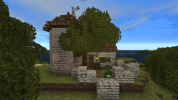
 

Tobi

Poet
Hi again,
in this build i again tried to consider all the advice and tips you gave me. For me the gradient turned out great. The left and right side of the building are conected to buildings (no detail).
If you need extra pictures just ask.


Thanks for your response.
 

Emoticone11

The Dark Lord Sauron
Staff member
Hey Tobi,

Great work with this challenge; it looks like a really solid WH style house! (although I'd place the style as more upper-class than middle-class, but that doesn't matter). I agree that the gradient is well done this time. Here's some of the feedback I have:

- Avoid using fence windows; these are considered outdated now (although they're present, pretty rarely, in WH).

- Fairly minor detail, but I'd avoid "curving" the rafters at the edges of the room (e.g. here); just pick a direction and use stairs to make a bunch of parallel beams. The exception is when you have a halfdoor wall or something, and you need to make rafters in that direction. See this image and this image for an example of what I mean (I had to adjust the spacing on the rafters to get the second one to work - there's a trick where you alternate corner stairs and straight stairs at the ends - but depending on the interior layout you might be able to make something else work).

- The slate here feels rather chunky; I'd probably cover more of it from underneath somehow using wood stairs and half doors. Here's an alternative design you could try. Also, I think having a full bed cover makes the room too cramped in this case.

For the next challenge build, please make a medium-sized house in the style of /warp fairmarket, with a small yard. The style here is a bit more complex, so make sure to take your time studying it - I'm sure you'll do fine with it though. Let me know if you have any questions. Good luck!
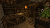
 

Emoticone11

The Dark Lord Sauron
Staff member
Hey Tobi,

Sorry for the hold-up. Overall you did a great job with this house! The timber frame pattern looks really nice. I just have a few minor points of feedback:
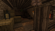
- It looks like you mistook the black slate with blue slate. The latter type isn't used in Fairmarket at all, IIRC.

- It's not really clear to me what the barrel + cabinet on the table here is supposed to represent, but I'd probably change it for something more subtle and less bulky. Also, remember to try to cover up the sides of cabinet + bench blocks if you're going to use them.

- Maybe it's just the angle, but it looks like the canopy above the bed here is unsupported.

Otherwise, I feel like you've nailed this house and will learn more as a probie builder at this stage, so consider yourself approved! :)

To get promoted to builder, ask a moderator in-game next time you catch one online. The next step is to read over the New Builder guide, found here: https://westeroscraft.com/wiki/guides/new-builders-guide
And also make yourself a probation thread in the probation forum.

You can start building at any open locations on the server - you can find these at /warp build (possibly outdated as people forget to update it sometimes), and also by going to our dynmap and toggling "Open Plot" (if a project lead marked their plots with open plot tags), or otherwise just checking the forums and asking around to see which builds are open. Also, you can ask a mod to set you up with a plot in the Test world where you can practice building.

A probie leader should post on your thread within a week or so, give constructive feedback on your houses for the next month, and help be your entrypoint into the server community in general. As sometimes the probie leaders can be busy IRL, I also highly suggest seeking out feedback from project leaders and other online builders. At the end, you'll be made full builder.

Welcome to the team, I look forward to building with you! :D