Hey all,
With a good deal of delay we’re finally here to react to the gate applications we have received. We have decided we won’t choose an application yet, as we’re excited with all three of the gate applications. Each application has its merits and flaws, and for this reason we’d like to give a round of feedback to give all the applicants a chance to make the applications even better.
First we’ll give some general feedback about the plot, after which we’ll go into further detail on the designs made by Gael, CC and Seri.
The plotting of Oldtown
The current plotting of Oldtown has been laid out in order to translate the plans made in the Oldtown document onto the map. As a result, the plotting is a very loose indication of what goes where, and is by no means intended to be definitive. For mini projects, both the shape and exact location are open to the creative view of the builder, as long as it does not interfere with already finished (or in progress) projects. When making changes to the surroundings of the mini, make sure to list them in your app. We trust builders to be considerate while making changes.
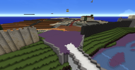
In the case of the Quail gate, the following aspects have a direct influence on the gate and how it is perceived:
- The bridge
- The end of the double wall to the east
- The square at the gate
- The wall
- The exact location of the gate
You can change aspects of these in order to make it fit in with your gate design, but it is not a requirement to do so. Applications without changes to these structures will not be judged differently than applications that change everything. However, we will judge how well an application fits into its surroundings, and changing them accordingly can help with this.
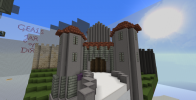
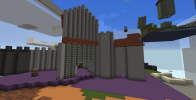
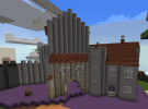
Gaelrüable
A lean tower gate with a chamber gate in front, a simple but effective design.
Plotting and layout
- The gate is somewhat underwhelming. This could be fixed by making the towergate slightly bigger.
- The floorplan of the gate would benefit from a more rectangular layout. Currently it follows the original plotting, feel free to step away from that.
- The width of the passage through the gate seems to shift between 3 and 4 blocks.
- While the gate is placed at a 45 degree angle, the bridge is not. Consider changing the bridge so it lines up with the gate.
Design
- The addition of statues and arches on the tower gate make it seem a bit cluttered. Consider a more bland facade.
- Make sure walls of defensive buildings are thick enough; preferably two blocks, three if you have the space to spare.
The setup of the gate reminds us of the Amsterdam Gate in Haarlem (Netherlands).
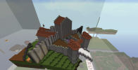
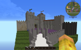
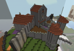
ContraBlonde
An imposing gate flanked by two heavy towers, a classic gate design.
Plotting and layout
- While the plotting works well, we’d like it to be incorporated into the defences more. Feel free to change the surroundings to make a better fit.
- The square in front of the gate is a bit redundant, consider removing it.
- The bridge doesn’t seem to have any relation to the defences. Consider including the bridge.
Design
- The detailing on the towers are a bit too much, but otherwise the design and detailing is good.
- Make sure walls of defensive buildings are thick enough; preferably two blocks, three if you have the space to spare.
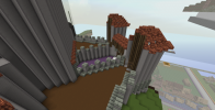
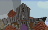
SseriousBusiness
An absolute unit of a gate. Massive and imposing, if the gate could talk it would scream “thou shall not fuck with me”.
Plotting and layout
- The shape is very interesting, the asymmetry of it adds to its charm.
- The bridge doesn’t line up nicely and the tower seems to switch to a 45 degree angle and reverts back to the angle of the bridge further into the gate. Feel free to change the bridge as needed.
Design
- The design is very late medieval, while our goal for the defences is for them to be a bit older than that. Consider changing the battlements into hoardings or a tiled roof, which might make it appear a bit older.
- Make sure walls of defensive buildings are thick enough; preferably two blocks, three if you have the space to spare.
Feel free to ask any questions if things remain unclear.
