Plutten4 Builder Application

Plutten4

Bard
Pronouns
he/him
What is your Minecraft username?
plutten4

What is your age?
17-20

In what country are you living?
Sweden

Where did you first hear about WesterosCraft?
Searched online

What do you like the most about GoT/ASoIaF?
Everything, the story and how is built. I like that it is realsitic and not like every other fantasy serie. The histroy behind ervything and how they have built up a fake world that seems so real.
i really like the history of house targaryen but also the kings of winter and all the houses of the north.

What is your favorite build on our server?
i really like white harbor. Because it really differs from the rest of the north. you can see features from the rech and i really like the white stone but also the old castle of house locke.

Why do you want to join our server?
Because i love AsoIaf and everything about it. I whould love to build up westeros and make it in to real world. i am very intrested in the diffrent styles around the seven kindoms and all the difrent ways to build. I am also very intrested in each house and whould like to develop cities and towns and make them in to the real places we can read about in the books and just be able to experince and walkt around all those awsome locations.
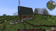
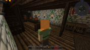
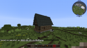
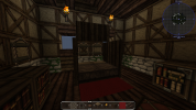
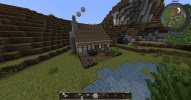
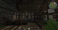
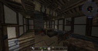
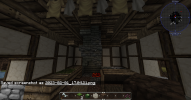
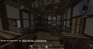
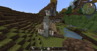
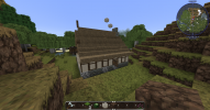
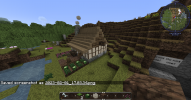
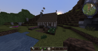
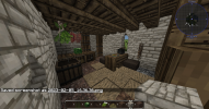
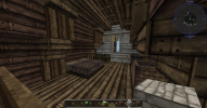
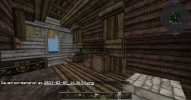
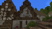
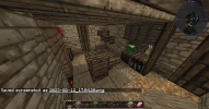
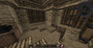
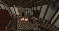
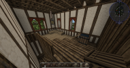
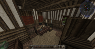
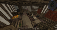
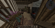
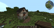
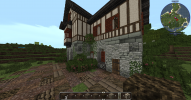
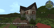
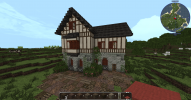
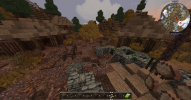
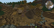
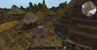
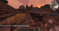
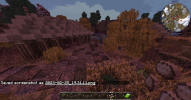
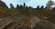
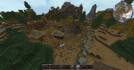
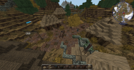
wes 1.pngwes 2.pngwes 4.pngwes 5.pngwes 6.pngwes 7.pngwes 9.pngwes3.pngwes.pngwes 11.png

Did you follow the application rules?
You know nothing, Jon Snow
 

Emoticone11

The Dark Lord Sauron
Staff member
Hey plutten,

Thanks for your application, and glad to see your interest in helping out with the project!

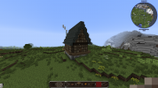
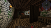
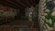
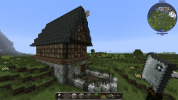
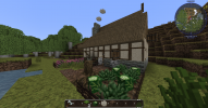
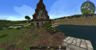
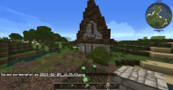
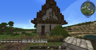
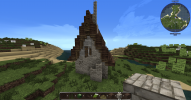
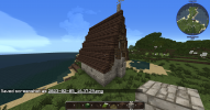
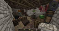
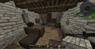
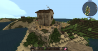
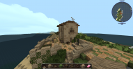
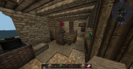
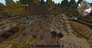
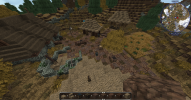
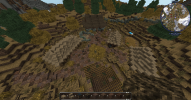
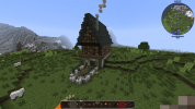
This house seems like a good foundation for tackling the medieval style, and the overall shape and proportions seem solid. However, there are a number of details in the exterior and interiors which need some work before matching the server standard. For example, the shape of the house should be a proper rectangle - avoid cutting out the corners of the house - and you should also remove the wood stairs encircling the house as they serve no purpose. Make sure the timber frame blocks create an aesthetic and structurally sound pattern, rather than placing them randomly.

There's some other things I could give feedback on, but I think the best way to quickly get a feel for the server's style would be to replicate the "tutorial" house at /warp apphouse. You're intended to replicate this house as the initial app submission anyways. Once you've done this, post the pictures in this thread and I'll start you off with some specific challenge styles if everything looks good. Let me know if you have any questions about anything.
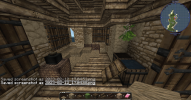
BTW, it seems that your Optifine is not working. Make sure to follow the instructions for installing it here, and post in techsupport on the discord if you still can't get it to work.
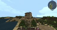
 
  • Like
Reactions: Jeffjunior77

Plutten4

Bard
Pronouns
he/him
Hello, thank you for the quick reply and the advices. Here are the pictures on the tutorial house!
got 1.png
 

Attachments

  • got 10.png
    got 10.png
    795.7 KB · Views: 6
  • got 9.png
    got 9.png
    855.7 KB · Views: 9
  • got 8.png
    got 8.png
    724.5 KB · Views: 9
  • got 7.png
    got 7.png
    742.6 KB · Views: 9
  • got 6.png
    got 6.png
    2.1 MB · Views: 8
  • got 5.png
    got 5.png
    1.3 MB · Views: 6
  • got 4.png
    got 4.png
    1.8 MB · Views: 5
  • got 3.png
    got 3.png
    1.4 MB · Views: 5
  • got 2.png
    got 2.png
    1.2 MB · Views: 5

Emoticone11

The Dark Lord Sauron
Staff member
Hey Plutten,

This looks pretty good, you got all of the details for the most part, although there are a couple very minor issues: the fireplace should use "grey wood half door" on either side, and also the birch half door under the table should be flush with the table (i.e., directly under it), rather than placed on the block next to it. Having an eye for detail is important when studying different styles.

More importantly, it seems that your Optifine is still not working. Please make sure to fix this before your next challenge build, or a number of things won't look right. You can tell if your Optifine is working by going to /warp spawn on the server and checking if the red clay block appears red.

Anyways, hope the tutorial house was helpful for learning some new building tricks. For subsequent challenge builds, you'll now be expected to build an original house, but putting together details from specific styles on the server. For the first challenge build, please make a medium-sized house in the style of /warp woodwright. Let me know if you have any questions. Good luck!
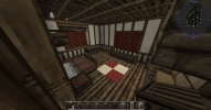
 

Plutten4

Bard
Pronouns
he/him
Hey, i think i fixed the Optifine and im done with the house in woodwright. Here are the photos!

re 1.png
 

Attachments

  • re 2.png
    re 2.png
    1.4 MB · Views: 12
  • re 3.png
    re 3.png
    1.1 MB · Views: 13
  • re 4.png
    re 4.png
    1.4 MB · Views: 13
  • re 5.png
    re 5.png
    1.5 MB · Views: 13
  • re 6.png
    re 6.png
    918.9 KB · Views: 13
  • re 7.png
    re 7.png
    831.8 KB · Views: 12
  • re 8.png
    re 8.png
    887.3 KB · Views: 13
  • re 9.png
    re 9.png
    675 KB · Views: 9
  • re 10.png
    re 10.png
    741 KB · Views: 10

Emoticone11

The Dark Lord Sauron
Staff member
Hey Plutten,

Sorry about the wait - no need to add the "you know nothing" line each time, I've just been pretty busy. But feel free to bump if it's been 5 days.

First, I noticed that the exteriors of this house are almost identical to the one in Woodwright here:

2023-02-11_16.13.56.png

I'll give you benefit of the doubt since it's the first challenge build and the interiors have a number of differences, but just a reminder: the only house that should have been copied was the "tutorial" house. All of the others should be original houses that are substantially different from the ones on the server, although you can borrow small aspects of several houses (like furniture ideas, exterior details, etc.).

Some other quick feedback:

- For the stone base, try to use a gradient: rather than mixing the different stone types uniformly, transition from darker stone (e.g., "reach cobblestone") on the bottom, towards lighter stone (e.g., "light stone") on the top. Look carefully at some of the Woodwright houses and you'll see that they use this technique.

- You have some floating wattle fence above the leather slab seat here. Place the wattle fence behind the leather slab instead, so you can place another below it and connect it to the ground.

For the next challenge build, please make a medium-sized house in the style of /warp tortown. Remember, the house should be sufficiently original. Let me know if you have any questions, good luck!
 

Plutten4

Bard
Pronouns
he/him
Hi, i did not know that. I will try to be better at it in the future. And here is the house in tortown (not copied). Hope you like it!
 

Attachments

  • dor 1.png
    dor 1.png
    2.2 MB · Views: 14
  • dor 2.png
    dor 2.png
    1.4 MB · Views: 13
  • dor 4.png
    dor 4.png
    1.6 MB · Views: 13
  • dor 6.png
    dor 6.png
    1.4 MB · Views: 13
  • dor 7.png
    dor 7.png
    834.5 KB · Views: 11
  • dor 9.png
    dor 9.png
    875.5 KB · Views: 9
  • dor 10.png
    dor 10.png
    968.5 KB · Views: 9
  • dor 11.png
    dor 11.png
    921.5 KB · Views: 10
  • dor 13.png
    dor 13.png
    1.4 MB · Views: 15

Emoticone11

The Dark Lord Sauron
Staff member
Hey Plutten,

Great work on this house! It looks like you hit all the major aspects of the Tor style. I just have a few minor points of feedback to give:

- The gradient could still use some improvement, as it's a bit too visually noisy. Instead of having small large patches of the "arbor light stone", try to use larger continuous patches to represent the part of the house that's plastered over, and then use the brick blocks to represent areas where the plaster would degrade over time (mainly the base of the house, corners, and around windows). There's a helpful resource on the server at /warp gradient, I recommend checking it out when you're in-game next.

- Avoid using the dead bush/scrub block everywhere in the road; in the Tor this is only used as a detail along the edges of roads to help blend the houses a bit better.

- While not part of the house itself, the vines around the raised platform are a bit too patchy. Like the gradients, you want to use the vines in larger "blobs" that grow up from the ground. Avoid having singular vine blocks that aren't attached to anything.

Let me know if you have any questions about the feedback or would like anything illustrated visually. Otherwise, for the next challenge, please make a middle-class house in the style of /warp oatown. Good luck!
 
  • Like
Reactions: Plutten4

Plutten4

Bard
Pronouns
he/him
Hi, here is the house in oatown. Im not really sure if it is middle class, is more like upper middle class. But here it is. Hope you like it!
 

Attachments

  • val 13.png
    val 13.png
    865.7 KB · Views: 17
  • val 12.png
    val 12.png
    1.1 MB · Views: 15
  • val 11.png
    val 11.png
    1.3 MB · Views: 17
  • val 8.png
    val 8.png
    990.5 KB · Views: 20
  • val 6.png
    val 6.png
    1.1 MB · Views: 16
  • val 7.png
    val 7.png
    816.7 KB · Views: 15
  • val 4.png
    val 4.png
    1.8 MB · Views: 14
  • val 14.png
    val 14.png
    1.7 MB · Views: 14
  • val 2.png
    val 2.png
    2 MB · Views: 14
  • val 1.png
    val 1.png
    1.8 MB · Views: 16

Emoticone11

The Dark Lord Sauron
Staff member
Hey Plutten,

Fantastic work on this house, you're catching on pretty quickly! You did a nice job with the stone gradient and detailing this time. Here's some of the feedback I have:

- Old Anchor uses a "no overhang" style on the rooves, so the roof should actually be cut off on the front-facing facades, like in the example here. Note that this can vary from location to location, so always pay attention to the local style guide. If you do have an overhang on the roof, make sure to add some blocks underneath so the stair blocks aren't only touching on the corners. For 45 degree rooves, people sometimes use fence gates like this.

- Generally try to avoid having horizontal rows of the open timber frame block (the one without any cross beams) that are more than 2 wide, since it is not structurally sound and looks somewhat awkward. Here for example.

- The windows with the red shutters look a bit odd from the inside here, mostly due to the uncovered timber and plaster blocks above them. I recommend replacing the oak half door blocks above them with upside-down oak stairs, and perhaps removing the stair blocks underneath the red shutters.

- When you have larger interiors such as this house, sometimes the basic all-stairs rafter design can look a bit bland. One trick is to space the beams apart a little bit by using alternating stairs and slabs, like in this example. Sometimes placing a vertical beam somewhere (using wall or fence blocks) can also help break up empty spaces and add additional support to the rafters, though it depends on the specific interior space.

Other than those things, I didn't notice any major issues! For the next challenge build, let's try something a bit more rural: please make a small farmstead in the style of /warp beresford. At a minimum it should have a peasant house and barn (or possibly a combined house/barn), some vegetable and herb gardens, and animal pens. You're also encouraged to add any other details you find in researching medieval farmsteads for inspiration, if you so choose. This is a tricky style, so make sure to pay close attention to details. Let me know if you have any questions!
 

Plutten4

Bard
Pronouns
he/him
Hi, here is the fram. Im not really satisfied with the roof on the main bulding and not quite sure if it looks good in that sort of style. If you want i can change i. But here it is.
 

Attachments

  • farm 8.png
    farm 8.png
    2.3 MB · Views: 16
  • farm 9.png
    farm 9.png
    794.2 KB · Views: 17
  • farm 10.png
    farm 10.png
    868.7 KB · Views: 14
  • farm 11.png
    farm 11.png
    920.8 KB · Views: 14
  • farm 7.png
    farm 7.png
    2.8 MB · Views: 16
  • farm 6.png
    farm 6.png
    1.9 MB · Views: 16
  • farm 5.png
    farm 5.png
    2.9 MB · Views: 13
  • farm 4.png
    farm 4.png
    2 MB · Views: 13
  • farm 3.png
    farm 3.png
    1.7 MB · Views: 12
  • farm 2.png
    farm 2.png
    1.7 MB · Views: 16

Plutten4

Bard
Pronouns
he/him
here is another variation on the roof. Maybe it looks better in the beresford style.
 

Attachments

  • farm roof 1.png
    farm roof 1.png
    2.6 MB · Views: 11
  • farm roof 2.png
    farm roof 2.png
    2.7 MB · Views: 12
  • Like
Reactions: Flip90

Emoticone11

The Dark Lord Sauron
Staff member
Hey Plutten,

Apologies for the delay - really nice work on this challenge! It's a difficult style and you pulled it off pretty well. And I'm glad you noticed and fixed the issue with the roof on your own; it definitely looks a lot better in the second version. I do have a bit of feedback to give:

- Overall, my main criticism is that many details are a bit too messy. Due to minecraft's shading system, it's easy to create noise when you have too many random block variants and shapes mixed together. One example of where this occurs is with the dirt/gravel path blocks mixed in the ground. You should avoid this and instead just use full dirt/gravel blocks (and mud/pebble gradients to help break up the monotony, if necessary). The path blocks should only be used in very specific circumstances (e.g., forest roads that you want to look "indented").

- On a similar note, don't use the path blocks in interiors either - both for the above reason, and because there's a gap between the ground and some of the furniture.

- Another thing that looks a bit messy is randomly mixing different block types and shapes in stone walls, such as how you have pebble blocks and various full blocks mixed in with wall blocks here. While sometimes you can add a bit of subtle variation, for the most part it's usually better to keep stone walls simple, and add weathering through gradients rather than variants.

- The roof on this house looks a bit blobby - I would recommend revising the shape, or even changing the plotting a bit to make the roof work better. 45 degrees is the most difficult angle to pull off in minecraft; I usually tend to avoid it except in very specific cases. Another angle might be easier to work with here.

Anyways, I don't think I need to see another challenge build before accepting your app, but I would like you to first revise the previous submission with these changes, and reduce the level of overall noise a bit. Post the changes here and I'll try to reply quickly.
 

Plutten4

Bard
Pronouns
he/him
Hi thank you for the feedback. Here is the changes in the farm. Hope you like it
 

Attachments

  • farm change 1.png
    farm change 1.png
    2.6 MB · Views: 11
  • farm change 2.png
    farm change 2.png
    2.6 MB · Views: 10
  • farm change 4.png
    farm change 4.png
    2.9 MB · Views: 9
  • farm change 5.png
    farm change 5.png
    3.4 MB · Views: 11
  • Like
Reactions: Die Wursttheke

Emoticone11

The Dark Lord Sauron
Staff member
This looks better, nice work! A minor piece of feedback - the mud and pebbles in the ground mix still looks a bit too messy; try to make "blobs" of mud instead of single blocks, and use gradients to transition them with normal dirt.

I think you'll learn more at this point as a probie builder, though, so consider yourself approved!

Ask a moderator in-game to promote you next time you catch one online. The next step is to read over the New Builder guide, found here: https://westeroscraft.com/wiki/guides/how-to/new-builders-guide
And also make yourself a probation thread in the probation forum.

You can start building at any open locations on the server - you can find these at /warp build (possibly outdated as people forget to update it sometimes), and also by going to our dynmap and toggling "Open Plot" (if a project lead marked their plots with open plot tags), or otherwise just checking the forums and asking around to see which builds are open (probably your best bet to be honest). Also, you can ask a mod to set you up with a plot in the Test world where you can practice building.

A probie leader should post on your thread within a week or so, give constructive feedback on your houses for the next month, and help be your entrypoint into the server community in general. As sometimes the probie leaders can be busy IRL, I also highly suggest seeking out feedback from project leaders and other online builders. At the end, you'll be made full builder.

Welcome to the team, I look forward to building with you! :)
 
  • Like
Reactions: Die Wursttheke