New Landing Page!

geeberry

Alchemist
Staff member
Admin
Hey everyone

We just launched a new landing page (https://westeroscraft.com/)! Its more modern, sleeker, sexier looking. My goal for it was to present what WesterosCraft was more simply and readily, with quick links to the important stuff (like the launcher, and applying to build).

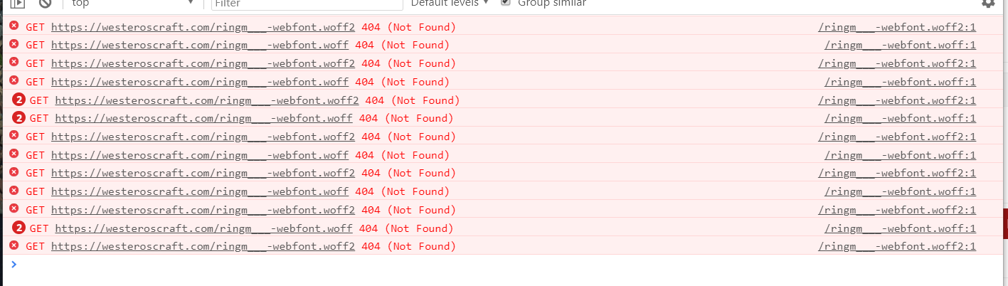
I'd be happy to hear any feedback y'all have. Let me know if the wording sounds good, or if theres another block of content I could add. Also let me know if you see any bugs!

Thanks and I hope yall like it
 

EStoop

Knight of Fairmarket
Looks good G,

A couple of things I noticed though:
  • The banner with News, Forums, Media, Wiki, Members, FAQ, Downloads and Map seems to be transparant, resulting in text and images showing through them and making it harder to read.
  • The gif of the house timelapse portrays a house in an outdated style, I'm not sure if we want to show that even though it looks absolutely amazing, since it might make potential new builders that that is how we build.
The rest is amazing though.
 

Thamus_Knoward

Shadowbinder
Love it man! Super sleek!

I wish the new launcher was ready and the whole launcher page a bit more accessible tho. I feel like everything on that landing page is guiding there and then users are hit with a wall of instructions.

A simple, functional download button at the end of that landing would be neater.
 

geeberry

Alchemist
Staff member
Admin
Looks good G,

A couple of things I noticed though:
  • The banner with News, Forums, Media, Wiki, Members, FAQ, Downloads and Map seems to be transparant, resulting in text and images showing through them and making it harder to read.
  • The gif of the house timelapse portrays a house in an outdated style, I'm not sure if we want to show that even though it looks absolutely amazing, since it might make potential new builders that that is how we build.
The rest is amazing though.

Yeah I understand its a bit hard to read at first. I might add some drop shadows to them. As you scrroll down a bar should appear behind it though to make it more readable.

Love it man! Super sleek!

I wish the new launcher was ready and the whole launcher page a bit more accessible tho. I feel like everything on that landing page is guiding there and then users are hit with a wall of instructions.

A simple, functional download button at the end of that landing would be neater.

I totally agree and redesigning the Launcher page is next on my list and I hope to have it ready around the same time the new launcher is out. It will make it a lot less wordy!
 

geeberry

Alchemist
Staff member
Admin
thanks lemon...I made some adjustments, including adding additional font files to load on different browsers. The Ringbearer font loads correctly on my PC, but when I tried it in Chrome on my Mac it doesn't load. The fixed version isnt live on the site yet though. Will have to do some testing

Edit: Okay I fixed it! Should have proper font stylign in next update
 
Last edited:
  • Like
Reactions: Adorkabley

Dan_Prime

Emissary
Guest
Yea I don't see it either. Make sure the source url is correct in the font-face definition. Getting this in the console:

a2a1270cea7fb084f0b458b043de8f2c.png