KL Road Mix and Style

CashBanks

A Knight at the Opera
Staff member
The KL Update is going great! Everyone seems be enjoying the abundance of plots and getting the chance to try out the refined building styles.

One thing we'll need to pin down sooner or later is how we're going to approach the road mix and if we want to make any changes.

Here's a shot of a current typical road.
1605188965924.png
It's not awful, but the block mix definitely gets a bit salt 'n' peppery in parts and I'm not sure if the green moss works great (maybe an overlay would help?).
Let us know if you have strong opinions about the road block mix and any alternative suggestions.

One thing I also haven't loved is how flat the roads can seem to be in parts, with no curbs or long gutters.

We've tested a few options in River Row to see if we can make any improvements, adding slabs to the edges, slabs to the middle, central gutters etc.
But the one that currently seems like the best contender is parallel lines of stairs, stepping down to the road which is lowered by one block.
1605188997067.png

This creates some noticeable variance to the street, breaking up the flatness.
1605189025038.png
And it means we can do more creative stuff with gutters.
1605189676730.png
Plus it's wagon compatible!

If there's a positive reception to this street style we can roll it out to the other main streets as they become available. Feel free to suggest some alternative options/real world inspiration too.
 

Thamus_Knoward

Shadowbinder
I think going down one full block is too much and even if the "sidewalk" was just a slab it would still look really steep. Instead I'd suggest to work with the textures more to imply depth (by going darker towards the center of the street) and just hint at a height difference using spare clusters of single cobble layers on the outside of the street.

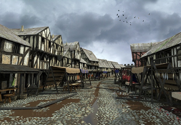
This is a research-based recreation of one of the main streets of medieval Swansea:
Wind_Street_Lorenzo-600x0.jpg

from http://www.medievalswansea.ac.uk/en/

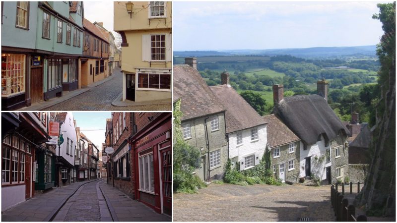
To illustrate how little depth there really is between side-walk and street check out this link of the most picturesque medieval city streets in England (with the caveat that I'm not sure they are actually medieval):

And here's some more facticious material from York:

Some more material:

Parisian Market around 1850:
Adolphe-Monfallet.jpg

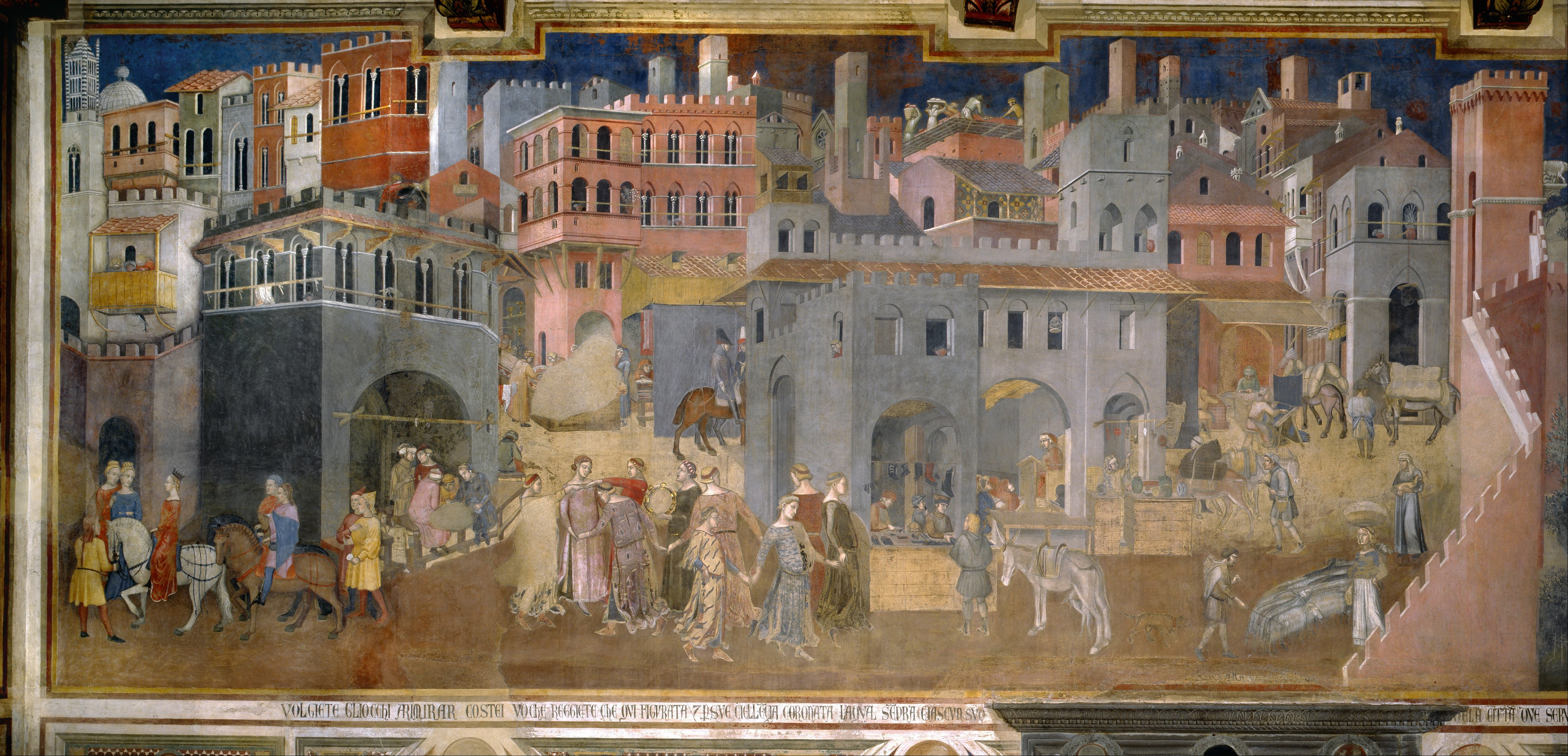
Effects of Good Government in the city - Ambrogio Lorenzetti 1338)
Ambrogio_Lorenzetti_-_Effects_of_Good_Government_in_the_city_-_Google_Art_Project.jpg

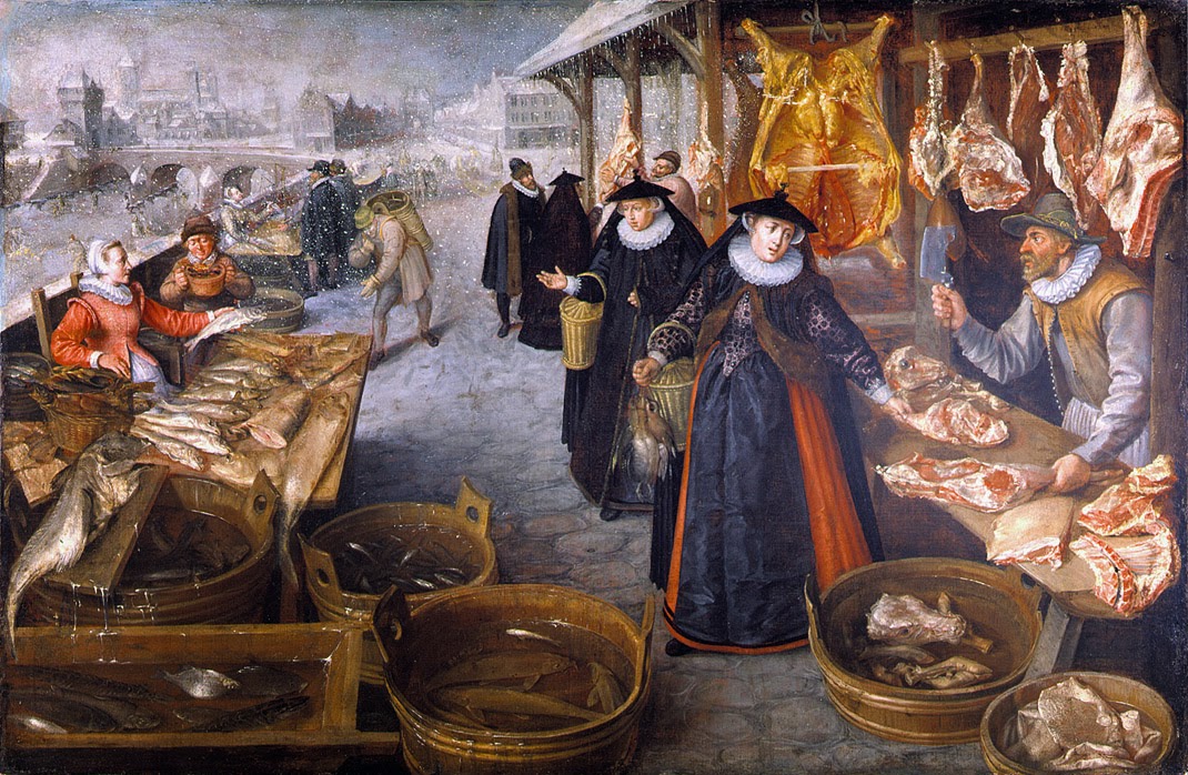
Meat and Fish Market - Valckenborch around 1559
Lucas_van_Valckenborch_-_Meat_and_Fish_Market_%28Winter%29.jpg


Sweet as parade in Brussels 1615:
1280px-Sallaert-antoon-ommeganck.jpg


And then there are a ton of super nice paintings by Jacques Carabain:
16f7e5132caf8156511bdd66ed93262b--jacques-victorian-paintings.jpg
 

AerioOndos

Donkey Lord
Staff member
Pronouns
they/them
The full block reminded me more of Pompeii than of some medieval towns I’ve been to. Especially the stepping stones visible in Cash’s second image.

While cool, I’d say it might Ben something fun for Weeping Town or another place that will get higher rainfall than KL. The slab idea is seen earlier was cool, but it also makes the road feel too difficult for carts and wagons to pass through.
V small wagons yes, I call them handwagons, that are pulled by people. But not large ones.
Though I did love the look of the street when the slab idea was used.
Maybe there could be some roads that aren’t cart-compatible?

Implying height with different blocks is definitely a possibility, it’s done well in fair market.
 

EStoop

Knight of Fairmarket
I'd like to keep the roads of Kingslanding simple (and flat), working with several new street palettes to make a distinction between the various roads.

For example, the main (straight) lanes such as the Street of Sisters and the God's, King's and Muddy Ways would do well with a nice wide road with sidewalks on both sides, possibly with trees and maybe even streetlamps.
Other roads, such as the Riverrow and remaining prominent roads would work well in all cobble without a sidewalk (or maybe on one side?), while all the remaining roads and alleys should be dirt and mud.

As for the road palettes themselves, I don't think small speckles of dirt and gravel should be part of a cobble road mix, but rather large dirty patches on a cobbled road where the cobblestones are either missing or covered by all kinds of filth. Distinction between roads and sidewalks can be made by using differing palettes for both of them, such as stone brick for sidewalks and cobble or dirt for roads.

Some street inspiration:
Cobbled road with sidewalk and central drainage:
Podmurna 2.jpg

Cobbled road with central drainage:
9614bc2-min.jpg

Cobbled road with drainage on either sides:
e84d981.jpg

Brick sidewalks and dirt/cobbled road:
resolve (5).jpg
9267498175_45c3f620bd_o-min.jpg
 

thecoddfish

Emissary
Staff member
I really like your proposal Stoop. I think that is the kind of cohesive plan that we need to be putting in place. Perhaps some draft tests to demonstrate these various street styles would be the next step in this process.
 

lemonbear

Nymeria
Staff member
Pronouns
she/her
Would it be odd to have a central drain made from stair blocks or slabs? That would keep the road primarily flat.
 
  • Like
Reactions: Azulejo

starcat98

Envoy
Staff member
I took a shot at a road test using the suggestions put forth from everybody here:

2020-11-16_12.59.50.png
2020-11-16_13.00.18.png

Kudos to Stoop, as the primary inspiration were the streets of Fairmarket. I originally tried using slabs for the central drainage channel, and in my opinion it didn't look too bad, but I switched to stairs as they seem a little less intrusive. The only thing I haven't attempted yet is making the street darker towards the center as Tham suggested above. This is of course just a rough sketch though, let me know what you think!