Hey everyone,
As promised in a previous KL post, I'm making this thread in order to hopefully clarify a few stylistic elements of the KL remaster. While we're carrying out the remaster on a per-district basis and thus distributing the responsibility of style development across multiple people, it's still important to have global cohesion with the project and ensure that personal idiosyncrasies don't impact the result that much.
I intend this to be more of a discussion-oriented thread, so people are free to leave style-related thoughts here. Is there anything you were hoping I'd address that wasn't included? Feel free to leave a reply. I'll edit the OP reflecting whatever the general consensus is.
1. Mapping substyles
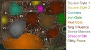
I'm still leaving the concrete styles underspecified at the moment (development of those will fall on the district leader), but the following is a map and "materials guide" showing which sorts of unique blocks (or other stylistic elements) can be used to differentiate particular substyles. The way this is read: the below descriptions for each of the substyles in the map specify a list of features (e.g., "+ red slate") that can be used in addition to the basic KL style.
Note that the colors in the map are gradiented, indicating that the uses of these special features should be most concentrated in the point of interest (e.g., city square), and then transition outwards from there. Most of the rules here aren't 100% strict but should be used to guide district syles.

2. Overhang policy
One particular area where we need to be careful to ensure consistency is in roof overhangs. The server currently balances between two approaches to roof overhangs on gable facades: either the roof juts out one block and is supported by wood stairs underneath, or the roof is flush with the wall and there is no overhang. Therefore, it's important to make sure that all districts follow a similar policy with respect to roof overhangs.
My proposed policy for roof overhangs in the KL remaster is this (in flowchart form):
See /warp duskendale for an example of a build which more or less follows this policy, to good effect.
3. Timber frame patterns
The main thing I want to address here is useage of the close-studding variant. It's a new-ish block, and rather tricky to use effectively I think. Generally people have a good grasp on timber frame patterns otherwise.
Within a house: don't mix close-studding with other types of motifs. I've noticed people sometimes try to use close-studding to "frame" other patterns; this should generally be avoided. Here's an intentionally bad example showing what not to do. Close-studding IRL is often a more dominant motif, with the pattern consisting of columns of vertical beams. Here's a lazy modification showing a step in the right direction (still needs improvement/detailing, but illustrates the concept).
Across houses: try not to overuse the close-studding block in general! In a place like KL with a lot of other details going on in the streets, the block can look quite busy when used a little bit in every house. Rather than using the block a little bit in every facade, only use it for a handful of facades (but make it a prominent part of those facades). I recommend following the 80/20 rule: about 80% of the houses should just have "normal" timber patterns without close-studding, and about 20% should use close-studding as a dominant material for some of the facades.
Some example images showing what I mean: [1], [2], [3]. Note how in each of these you'll have one house or facade which doesn't use close-studded timber at all, and then another house or facade which is pretty much entirely close-studded timber.
There are a couple other patterns I've found attested IRL, such as using close-studding at the base of a house [4] or as a decorative row, typically at the base of an overhang [5]. These sorts of patterns are also fine, but I recommend restricting them to larger or wealthier houses. /warp KL1 has some good examples of close-studding used effectively in this way for large square houses.
4. Stylistic details
There are a couple other minor stylistic details that I want to address.
Balconies, fence gate supports, etc: these are common ways to make a facade more interesting, but it's easy to overuse them and make a scene just look too messy. Like with my suggestion for close-studding, I recommend following an 80/20 rule here: 20% of the houses can have interesting features such as balconies, while 80% of the houses should have simpler designs so as to not crowd the visual scene. Things such as shared balconies are also fine; just to make sure that each house isn't individually "trying to do its own thing" and creating a final result which has too much going on.
Wood cover trapdoor windows: these should be much rarer than they currently are. I can't find any indication that these were common shutter designs in historical houses (though I did find a couple examples, e.g. [6]), and in general they feel like more of a defensive feature.
5. Fixing awkward plotting
The original KL plotting is filled with awkward "inside corners", where two gables come together at a 90 degree angle (such as here or here). District leaders and plot builders should try to replot or otherwise address these wherever possible. There are a few ways to address these: (1) change the roof shape so the rooves of both plots run in the same direction, rather than perpendicular to each other. (2) offset the plots a little bit so they're not directly touching each other; works especially well if it can connect to a shared yard. (3) exterior details can sometimes be used to make these intersections a bit less awkward, e.g. here.
As promised in a previous KL post, I'm making this thread in order to hopefully clarify a few stylistic elements of the KL remaster. While we're carrying out the remaster on a per-district basis and thus distributing the responsibility of style development across multiple people, it's still important to have global cohesion with the project and ensure that personal idiosyncrasies don't impact the result that much.
I intend this to be more of a discussion-oriented thread, so people are free to leave style-related thoughts here. Is there anything you were hoping I'd address that wasn't included? Feel free to leave a reply. I'll edit the OP reflecting whatever the general consensus is.
1. Mapping substyles
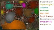
I'm still leaving the concrete styles underspecified at the moment (development of those will fall on the district leader), but the following is a map and "materials guide" showing which sorts of unique blocks (or other stylistic elements) can be used to differentiate particular substyles. The way this is read: the below descriptions for each of the substyles in the map specify a list of features (e.g., "+ red slate") that can be used in addition to the basic KL style.
Note that the colors in the map are gradiented, indicating that the uses of these special features should be most concentrated in the point of interest (e.g., city square), and then transition outwards from there. Most of the rules here aren't 100% strict but should be used to guide district syles.

The following materials are useable anywhere in KL.
+ light grey gradients (cobble, light grey stone, river cobble, etc.)
+ dark grey gradients (small stone brick, dark cobble, etc.)
+ brown gradients (dark sandstone, stormlands cobble, etc.)
+ dun gradients [rarer]
+ northern/oak white timber
+ northern/oak brown timber
+ oak, spruce, birch, jungle, northern woods
+ light thatch
+ gray slate
+ brown slate [rarer]
One of the generic large square styles. Similar to basic KL style, but a bit more ornate, and with darker roof materials. Duskendale-esque stylings. See KL1 district for a good example.
+ bedrock rooves
+ basalt brick rooves
+ dark thatch rooves
+ crow-stepped gables
+ bedrock rooves
+ basalt brick rooves
+ dark thatch rooves
+ crow-stepped gables
The other generic large square style (no current examples). A bit less grand than the first generic square style, and more festive/cottage-like.
+ northern pale yellow timber
+ dark thatch rooves
+ northern pale yellow timber
+ dark thatch rooves
A trade/craft-heavy square. General germanic stylings, indicating signs of diaspora from other Westerosi regions.
+ red white timber
+ northern blue/green timber [rare/only on square]
+ red slate
+ red white timber
+ northern blue/green timber [rare/only on square]
+ red slate
Somewhat understated square style compared to the others; similar to basic KL style but with a bit of green slate.
+ green slate
+ green slate
More bustling, blue-collar vibes. Higher density of orange brick as a material due to proximity to the port and river.
+ orange brick
+ orange brick
Regions of KL that are older and more closely tied to Targaryen history; generally have some grander architecture and materials that reflect Targaryen heraldry.
+ northern red timber
+ red white timber
+ crow-stepped gables
+ dun gradients [more common]
+ northern red timber
+ red white timber
+ crow-stepped gables
+ dun gradients [more common]
Manses surrounding the Great Sept owned by the rich and pious. Grand, but not ostentatious.
+ northern grey brick timber
+ northern grey brick timber
The red light district of KL. Flashy and colorful brothels.
+ colored woods
+ red white timber
+ colored woods
+ red white timber
Combined Flea Bottom and Pisswater Bend region. Exact style not yet determined; see this thread to help with the testing!
TBD (probably no new materials, but perhaps variations on the base KL style to make it extra shitty)
TBD (probably no new materials, but perhaps variations on the base KL style to make it extra shitty)
2. Overhang policy
One particular area where we need to be careful to ensure consistency is in roof overhangs. The server currently balances between two approaches to roof overhangs on gable facades: either the roof juts out one block and is supported by wood stairs underneath, or the roof is flush with the wall and there is no overhang. Therefore, it's important to make sure that all districts follow a similar policy with respect to roof overhangs.
My proposed policy for roof overhangs in the KL remaster is this (in flowchart form):
Code:
+-- Does a house have a large or prominent facade (esp. facing a square or shared yard)?
    +-- Yes
    |   +-- Is the house mostly obscured from the side (e.g., by other houses)?
    |       +-- Yes
    |       |   +-- Then add a 1 block roof overhang on the gables.
    |       +-- No
    |           +-- Adding a roof overhang may make it look awkwardly top-heavy from the side. Give it a try, but otherwise go without an overhang.
    +-- No
        +-- Then go without an overhang; overhangs on smaller or denser houses will look too busy.
See /warp duskendale for an example of a build which more or less follows this policy, to good effect.
3. Timber frame patterns
The main thing I want to address here is useage of the close-studding variant. It's a new-ish block, and rather tricky to use effectively I think. Generally people have a good grasp on timber frame patterns otherwise.
Within a house: don't mix close-studding with other types of motifs. I've noticed people sometimes try to use close-studding to "frame" other patterns; this should generally be avoided. Here's an intentionally bad example showing what not to do. Close-studding IRL is often a more dominant motif, with the pattern consisting of columns of vertical beams. Here's a lazy modification showing a step in the right direction (still needs improvement/detailing, but illustrates the concept).
Across houses: try not to overuse the close-studding block in general! In a place like KL with a lot of other details going on in the streets, the block can look quite busy when used a little bit in every house. Rather than using the block a little bit in every facade, only use it for a handful of facades (but make it a prominent part of those facades). I recommend following the 80/20 rule: about 80% of the houses should just have "normal" timber patterns without close-studding, and about 20% should use close-studding as a dominant material for some of the facades.
Some example images showing what I mean: [1], [2], [3]. Note how in each of these you'll have one house or facade which doesn't use close-studded timber at all, and then another house or facade which is pretty much entirely close-studded timber.
There are a couple other patterns I've found attested IRL, such as using close-studding at the base of a house [4] or as a decorative row, typically at the base of an overhang [5]. These sorts of patterns are also fine, but I recommend restricting them to larger or wealthier houses. /warp KL1 has some good examples of close-studding used effectively in this way for large square houses.
4. Stylistic details
There are a couple other minor stylistic details that I want to address.
Balconies, fence gate supports, etc: these are common ways to make a facade more interesting, but it's easy to overuse them and make a scene just look too messy. Like with my suggestion for close-studding, I recommend following an 80/20 rule here: 20% of the houses can have interesting features such as balconies, while 80% of the houses should have simpler designs so as to not crowd the visual scene. Things such as shared balconies are also fine; just to make sure that each house isn't individually "trying to do its own thing" and creating a final result which has too much going on.
Wood cover trapdoor windows: these should be much rarer than they currently are. I can't find any indication that these were common shutter designs in historical houses (though I did find a couple examples, e.g. [6]), and in general they feel like more of a defensive feature.
5. Fixing awkward plotting
The original KL plotting is filled with awkward "inside corners", where two gables come together at a 90 degree angle (such as here or here). District leaders and plot builders should try to replot or otherwise address these wherever possible. There are a few ways to address these: (1) change the roof shape so the rooves of both plots run in the same direction, rather than perpendicular to each other. (2) offset the plots a little bit so they're not directly touching each other; works especially well if it can connect to a shared yard. (3) exterior details can sometimes be used to make these intersections a bit less awkward, e.g. here.


