Block Change Request: new orange brick blocks for a brick palette

Batelgause

Royal Messenger
Request: new orange brick blocks for a brick palette

Request Type: General Addition

Try to describe all workarounds and associated issues that make it necessary to add this block in your eyes.
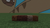
This would help creating a proper orange brick palette . we only have 2 orange brick blocks atm and although the orange small brick is quite nice , i cant say the same for the vanilla brick block . I put an image of a recent tower test i made with brick blocks below and as you can see the brick stands out a lot . I think an easy solution for this is basicly recolouring some of the already existing textures we have . i put a suggestion of that below too :)

Types of evidence to support your request: Historical

Historical Evidence
View attachment 170782023-02-26_01.52.19.png

File(s) attached
 

Attachments

  • 2023-01-15_15.25.42.png
    2023-01-15_15.25.42.png
    1.3 MB · Views: 24
  • Like
Reactions: DutchGuard

EStoop

Knight of Fairmarket
I think the main issue here is that brick is a manufactured product. It's made using molds and as a result is fairly uniform in whichever building it is used. Mixing it with a secondary brick texture is a necessary evil in order to break up the monotony of the textures both our brick blocks suffer from, but it results in an inaccurate depection of brick masonry.

Both brick blocks are inaccurate as well:
  • Regular brick is much too large and has a wide variety of sizes, it's basically a recolour of our sandstone blocks. As mentioned before, brick is a manufactured product and differences in sizes like this are exceptionally rare.
  • Small brick in turn is much too small and only depicts the headers (the short side of the brick), it's a masonry bond almost exclusively used for rounded walls.
  • Both blocks have a mortar that is much too dark.
Below is an example of a brick minecraft texture that is more or less accurate (credit to Thamus).
ss2022-07-25at11.08.15.jpg
 

Wazgamer

Lord Paramount of The Riverlands
Pronouns
they/them
Okay, a kicking-off point I have for this is the use of different bonds. Echoing what stoop said we essentially only have 1. Entirely unrealistically scaled blocks and 2. header brick blocks.

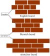
I don't believe we should change these textures aside from maybe editing the default brick blocks to be slightly smaller. However to add some variation maybe we could use different bonds, mimicking how bricks are laid in real life. There are probably loads of regional bonds but the most prominent are the English and Flemish bonds. I was thinking we could maybe rename these to like "Fairmarket" bond and I dunno where else is so brick-heavy maybe Stoneysept or Riverrun? or elsewhere in Westeros. I made some quick mock-ups based on our brick texture just to show the pattern on a 32x32 surface. Finally, I think to add extra texture we could introduce 2-3 new blocks alongside this.
  1. Mossy brick (brick with some moss or vines growing between the grout and over the bricks)
  2. Blackened brick (brick with some grey-black discolouration coming from things like chimney smoke)
  3. Stripped brick (Brick where the front face has been stripped away slightly so you see the insides of the brick. So it would appear like cracked I guess)
I don't think this would be reinventing the wheel as such just adding to our extremely lacking range of bricks and also giving them some textural variations which most palettes on the server have or are able to achieve already.

P.S i recommend opening the brick textures because they tiny :D


Bonds.jpeg

English bond:
eng bond.png
Flemish bond:
Flem bond.png
 

EStoop

Knight of Fairmarket
Okay, a kicking-off point I have for this is the use of different bonds. Echoing what stoop said we essentially only have 1. Entirely unrealistically scaled blocks and 2. header brick blocks.

I don't believe we should change these textures aside from maybe editing the default brick blocks to be slightly smaller. However to add some variation maybe we could use different bonds, mimicking how bricks are laid in real life. There are probably loads of regional bonds but the most prominent are the English and Flemish bonds. I was thinking we could maybe rename these to like "Fairmarket" bond and I dunno where else is so brick-heavy maybe Stoneysept or Riverrun? or elsewhere in Westeros. I made some quick mock-ups based on our brick texture just to show the pattern on a 32x32 surface. Finally, I think to add extra texture we could introduce 2-3 new blocks alongside this.
  1. Mossy brick (brick with some moss or vines growing between the grout and over the bricks)
  2. Blackened brick (brick with some grey-black discolouration coming from things like chimney smoke)
  3. Stripped brick (Brick where the front face has been stripped away slightly so you see the insides of the brick. So it would appear like cracked I guess)
While different masoning patterns would be interesting, I think that is a level of detail that would be lost on most people. Instead I'd suggest to update to existing blocks along these lines:
  • Small brick: Change them to a Flemish bond (which allows us to introduce diapering relatively easy later).
  • Large brick: Change them to uniformly sized larger bricks (early medieval bricks in Northern Europe were larger than current day bricks). These could represent older brick masonry. I recommend using a Flemish bond for this as well, or otherwise a Monk bond.
Making these changes would update the current blocks without needing to retouch every brick building we have, which are mainly situated in the Riverlands.
I'd refrain from adding new brick blocks before we had a proper discussion about it, since there are a lot of possibilities to play around with not just in regards to brick, but other related ceramic materials as well such as tiles, roof tiles and even mudbricks in terms of application, colour and shape.

Edit | As for localised texture names, I'd refrain from using location names for textures. Practice teaches us blocks will be used outside of that range regardless and using the actual name of something makes it easier to find real life examples. For example, rename the small brick to just brick or northern brick (if we intend to add a southern Roman-like equivalent) and the large brick to large brick, and while we're at it change the brick designation of rectangular cut natural stone to ashlar (which is the correct name for that type of cut), example: Reach Ashlar (instead of Reach Brick).
 
Last edited:

Wazgamer

Lord Paramount of The Riverlands
Pronouns
they/them
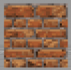
So I was fucking around a bit and made a texture (please texture gods emot and tham dont shame me I only read a couple things from your suggestions and probably didn't apply any of them well). But this shows what an English bond would look like utilising our current small brick texture for reference and adding gray mortar.
Screenshot 2023-03-09 at 09.33.02.png
 

Emoticone11

The Dark Lord Sauron
Staff member
Not too shabby Waz! Could you post the 32x32 image tile as well?

BTW, I experimented with converting the current brick blocks to light mortar a while back, but found that it didn't play very nicely with the other blocks in the pack given the overall shading style.
 

Wazgamer

Lord Paramount of The Riverlands
Pronouns
they/them
Here you go bestie
Not too shabby Waz! Could you post the 32x32 image tile as well?

BTW, I experimented with converting the current brick blocks to light mortar a while back, but found that it didn't play very nicely with the other blocks in the pack given the overall shading style.
 

Attachments

  • _edit.png
    _edit.png
    1.8 KB · Views: 15

inactive

Emissary
Guest
Okay, a kicking-off point I have for this is the use of different bonds. Echoing what stoop said we essentially only have 1. Entirely unrealistically scaled blocks and 2. header brick blocks.

I don't believe we should change these textures aside from maybe editing the default brick blocks to be slightly smaller. However to add some variation maybe we could use different bonds, mimicking how bricks are laid in real life. There are probably loads of regional bonds but the most prominent are the English and Flemish bonds. I was thinking we could maybe rename these to like "Fairmarket" bond and I dunno where else is so brick-heavy maybe Stoneysept or Riverrun? or elsewhere in Westeros. I made some quick mock-ups based on our brick texture just to show the pattern on a 32x32 surface. Finally, I think to add extra texture we could introduce 2-3 new blocks alongside this.
  1. Mossy brick (brick with some moss or vines growing between the grout and over the bricks)
  2. Blackened brick (brick with some grey-black discolouration coming from things like chimney smoke)
  3. Stripped brick (Brick where the front face has been stripped away slightly so you see the insides of the brick. So it would appear like cracked I guess)
I don't think this would be reinventing the wheel as such just adding to our extremely lacking range of bricks and also giving them some textural variations which most palettes on the server have or are able to achieve already.

P.S i recommend opening the brick textures because they tiny :D


View attachment 17080

English bond:
View attachment 17082
Flemish bond:
View attachment 17083
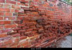
To pick this old thread up - I like the idea you have of 'stripped brick' which is called spalling - the outside facing side of the brick has worn away and crumbled. I think the best way to show that would just be to shade over a couple of bricks, just to show that the brick face has crumbled away a bit.

Also worth remembering for future reference, they would have used lime mortar, and the current mortaring in the texture you made looks a wee bit too dark.
 

Attachments

  • spalling 2.jpg
    spalling 2.jpg
    169.5 KB · Views: 8
  • spalling.jpg
    spalling.jpg
    403.2 KB · Views: 8
  • Like
Reactions: Batelgause

DutchGuard

Shadowbinder
Staff member
Pronouns
he/him
To pick this old thread up - I like the idea you have of 'stripped brick' which is called spalling - the outside facing side of the brick has worn away and crumbled. I think the best way to show that would just be to shade over a couple of bricks, just to show that the brick face has crumbled away a bit.

Also worth remembering for future reference, they would have used lime mortar, and the current mortaring in the texture you made looks a wee bit too dark.
Brick spalling is usually a result of either really poor quality bricks, below a waterline or below ground, or a mortar which is too hard, forcing water into the brick instead of the sacrificial mortar, and then spalling as a result of salts and freeze/thaw. There is a survival bias here, but spalling bricks is rarely an issue with traditional buildings unless it they've been repointed in hard cement.

Lime mortar comes in all sorts of shades, coal dust or ash was often added as a pozzolan which gave it a grey colour. Some limestone (such as blue lias) is naturally grey so would produce a grey colour in a lime mortar.

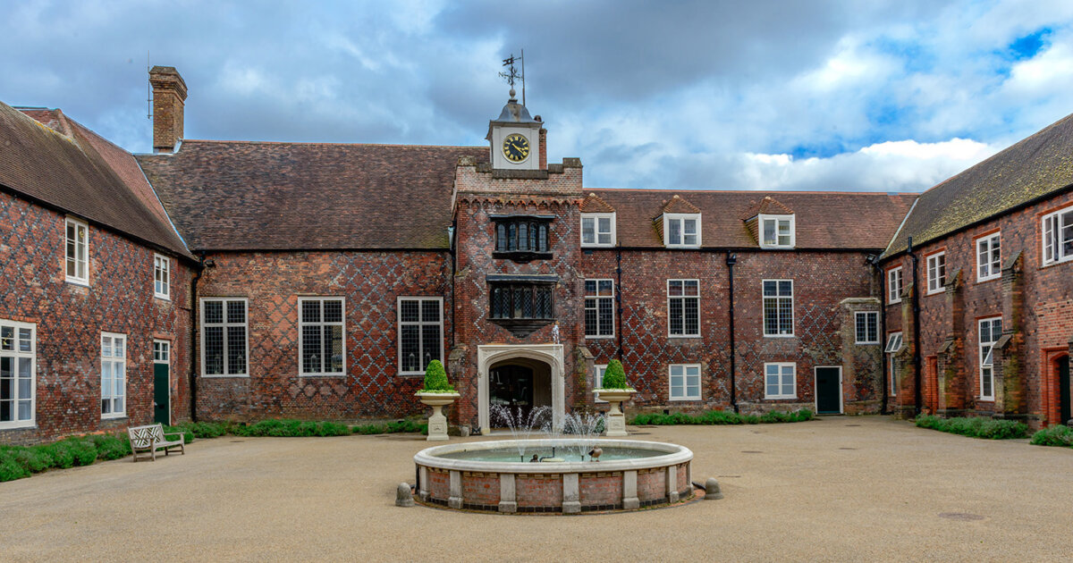
Also, throwing back to Stoop's first comment, yes to diapering! That would add a lot of visual interest to some of the more high status buildings.
Here's one of my favourite Tudor buildings in London, Fulham Palace:

fulham-palace-image_Cropped-for-web.jpg
 

inactive

Emissary
Guest
Brick spalling is usually a result of either really poor quality bricks, below a waterline or below ground, or a mortar which is too hard, forcing water into the brick instead of the sacrificial mortar, and then spalling as a result of salts and freeze/thaw. There is a survival bias here, but spalling bricks is rarely an issue with traditional buildings unless it they've been repointed in hard cement.

Lime mortar comes in all sorts of shades, coal dust or ash was often added as a pozzolan which gave it a grey colour. Some limestone (such as blue lias) is naturally grey so would produce a grey colour in a lime mortar.

Also, throwing back to Stoop's first comment, yes to diapering! That would add a lot of visual interest to some of the more high status buildings.
Here's one of my favourite Tudor buildings in London, Fulham Palace:

fulham-palace-image_Cropped-for-web.jpg
Looks neat! More decorative brickwork would be great.

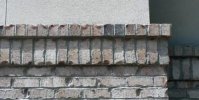
I also think brick slabs that are done like rowlock/soldier courses would be a good addition - you see them on the top of brick walls usually to tie it together.
I also put in a request for Roman bricks a while ago iirc, that would be a good thing.
 

Attachments

  • course.jpg
    course.jpg
    36.5 KB · Views: 6
  • Like
Reactions: DutchGuard

Emoticone11

The Dark Lord Sauron
Staff member
I definitely think that our current brick palette is lacking, and that there's room to improve through minor updates + CTM for current textures, as well as some expanded brickwork variants. Would want to avoid getting too carried away so as to not cause Stoop to redo Fairmarket again :p

Moving this to in-progress.
 

EStoop

Knight of Fairmarket
I definitely think that our current brick palette is lacking, and that there's room to improve through minor updates + CTM for current textures, as well as some expanded brickwork variants. Would want to avoid getting too carried away so as to not cause Stoop to redo Fairmarket again :p

Moving this to in-progress.
I wouldn't mind updating brick palettes in Fairmarket if anything happens to break, but I can assure you I will not redo anything as I am quite content with the project as it is.
More than half of the Trident is due for an update or to get started, which is likely to use a brick palette to one extend or another. I would rather have those be the best they can be with a complete set of bricks rather than to limit ourselves because we don't want to mess too much with Fairmarket.

If you need some pointers or ideas for brick textures, or anything else ceramic related, feel free to reach out. I've been working on a block request backed by an entire document worth of information for a long while now, but polishing it into a state to put onto the forums takes me a lot longer than I would like.