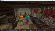
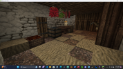
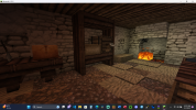
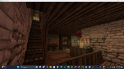
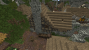
Hey Freddie,
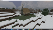
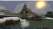
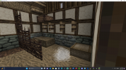
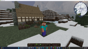
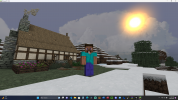
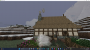
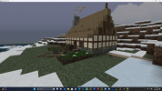
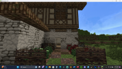
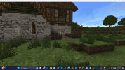
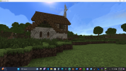
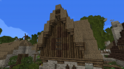
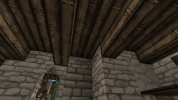
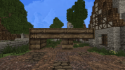
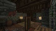
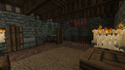
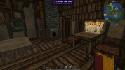
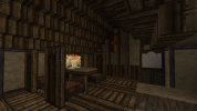
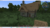
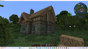
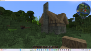
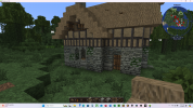
This house looks like a pretty nice start! The overall layout and proportions look good, and that's often the hardest part of making a house. I do have some feedback to give on the exteriors and interiors, which I'll list below:
Exterior
1. When working with stone blocks (as well as many other types of blocks), it's important to create a
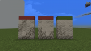
gradient rather than mixing together different blocks type randomly. This means that you should transition smoothly between a series of blocks, with each "step" in the gradient either going to a slightly different color or a different texture. If you take too big of a jump between two colors/textures, it can create some harsh contrast. A common gradient technique is to go from darker at the bottom to lighter at the top, but there are other more advanced techniques too.
Here's an image showing what I mean:

Notice how the leftmost example looks too noisy because it mixes together the blocks randomly, creating a "salt and pepper" effect. The middle example is better, but still has harsh contrast between the blocks. The last gradient is the best, since it takes subtle steps between each color/texture.
There's a tutorial on the server at
/warp gradient that you should also check out.
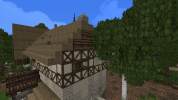
2. Most of the rooves in Woodwright use a "no overhang" style, where the end of the roof is flush with the walls rather than sticking out one block, as shown in the left image below. This is commonly used for smaller or more rural houses because sometimes the overhangs can look top-heavy. If you do have an overhang, it should be with a steeper roof type, and you should make sure to support the gables from underneath, like in the right image below.


3. Woodwright doesn't use the brown daub timber frame blocks at all; you should use the white daub variants instead.
Interior
1. Make sure to add
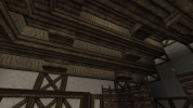
rafters to your ceilings rather than leaving them completely flat; this makes the interiors more structurally sound and also looks better. A common design is to use alternating upside-down stair blocks and slab blocks, such as shown below:


Likewise, whenever you use slate or thatch for your roof material, it should be covered up from the inside (it doesn't need to be covered completely, but should be enough to look realistic). An example of this:

2. When using blocks that have multiple "sides", such as mirrors, cabinets, workbenches, etc., you should try to cover up all sides except for one with either half door blocks or other furniture. Here's a picture of what I mean:
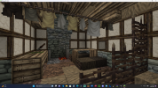
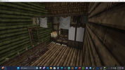
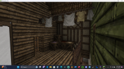
3. Try to avoid using clutter blocks like crates/etc. to fill empty space in houses, such as
here. Storage would often be well-organized in cabinets, cellars, or attics rather than strewn about the house. Instead, try to brainstorm what sorts of things would typically be in a medieval house that you can represent. You can find some examples of furniture at
/warp furnish on the server.
Summary
While that may seem like a lot of feedback, overall you're off to a pretty good start! It takes time to get a handle on the more minor details of our building techniques. Before moving on with the next challenge, I would recommend re-visiting Woodwright and taking some look at the houses there with this feedback in mind, and study how those houses implement the above advice. When you're ready, please make a medium-sized house in the style of /warp stonedance. Let me know if you have any questions about any of the feedback or the challenge style. Good luck!
